Journal
Article
500 pennies for our thoughts
(in B&T Magazine)
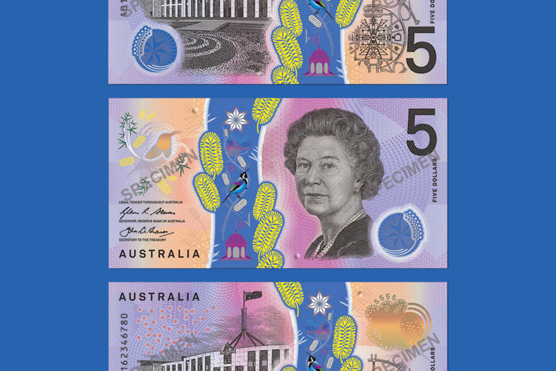
With the news of the Reserve Bank of Australia’s release of a new Australian $5 note, B&T Magazine reached out to Folk to ask for our considered design perspective.
We very happily obliged.
Graham Barton, our creative director, penned the following.
Reserve Bank Releases Design Of New $5 Note
Comment by Folk
I think the Queen looks like the rest of us feel. They’re not great are they?
On face value, it feels like a missed opportunity – to signal something of Australia’s modernity and history. And screams design-by-committee.
Clearly, practicality has been prioritised over aesthetics. Assisting the vision impaired and foiling forgers. Which is difficult to argue against. But not impossible.
Grasping at prickly straws. It’s commendable to retain a distinctly Australian signature, resisting the temptation to simply gravitate to another’s visual style – be it drop-shadowy-Americana or Euro-minimalism. But, if this is reflective of a nation, it’s unsurprising it’s getting paid out so much.
_
See the full article here. (We featured. Which was nice.)