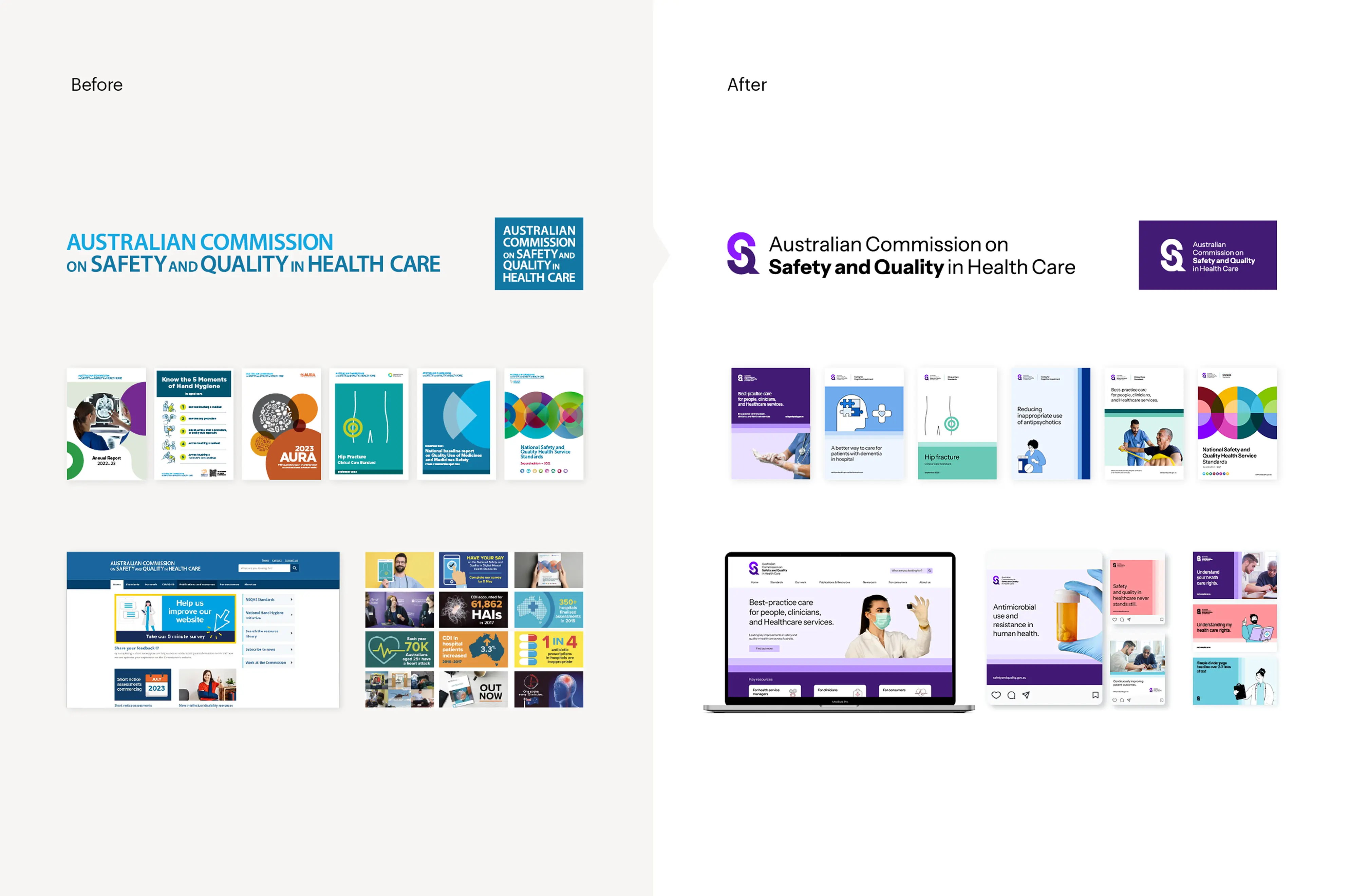
Australian Commission on Safety and Quality in Health Care

From fragmented to unified: a clear identity for Australia’s healthcare quality
authority

Impact area

Health and wellbeing

Services

Discovery research

Brand architecture

Brand strategy

Brand identity

Second introduction here

Background
The Australian Commission on Safety and Quality in Health Care (the Commission) plays a vital role in shaping a better, safer health system for all Australians. Operating within a complex healthcare ecosystem, the Commission engages with stakeholders ranging from hospital leaders and GPs to policymakers and consumers.

Multiple sub-brands had emerged over time, visually competing with or overshadowing the brand presence of the Commission itself. The brand needed clarity, cohesion and modernisation to reassert its authority and support greater visibility, attribution and recognition across the health sector.

We delivered a revitalised brand strategy and identity that clarified who the Commission is, consolidated its authority, and set it up for effective communication in a digital-first world.

Solution: Strategy

Clarifying the face of safety and quality in Australian healthcare

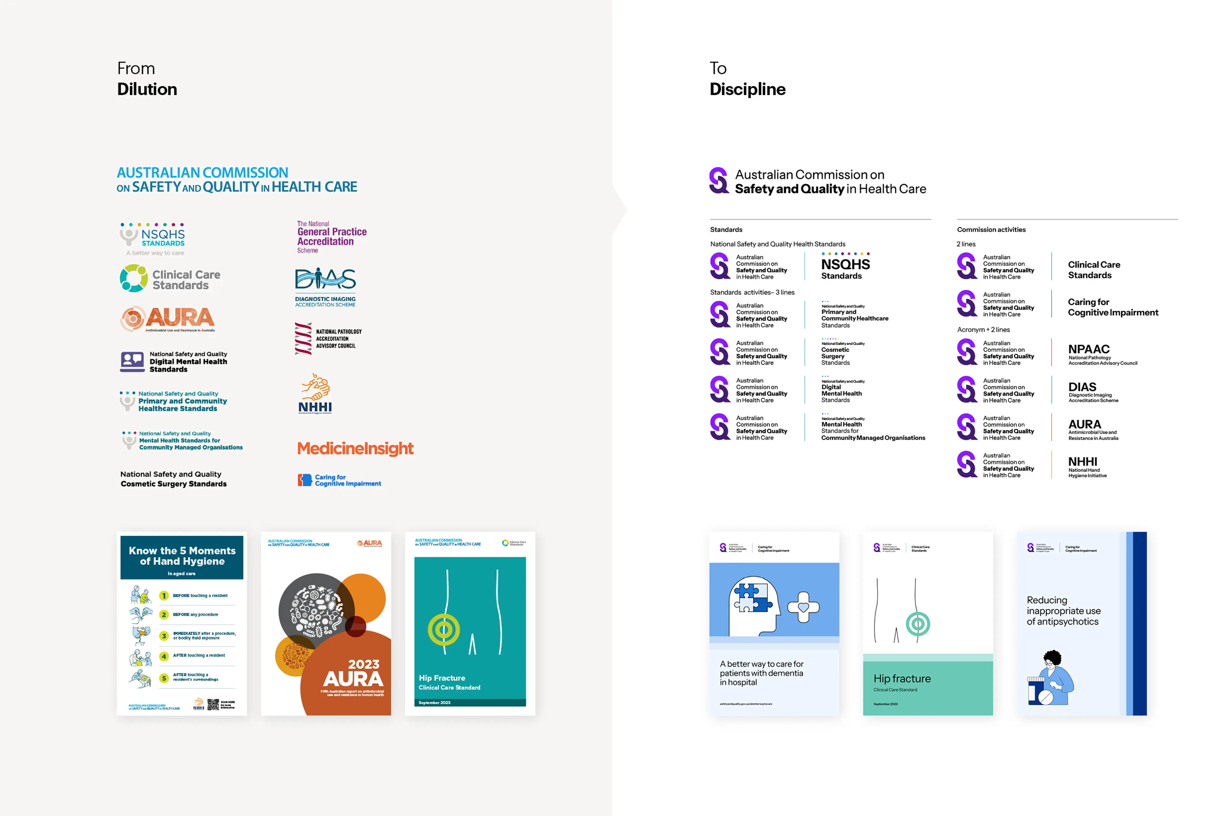
For the ‘sub-brands’ to recede, a new Commission brand needed to step to the fore: what was the image the Commission needed to project?

Brand strategy culminated in the brand idea ‘vital presence’: a concept that reflects the Commission’s positive role in enabling and guiding Australia’s health system to better outcomes.

This idea balanced the brand’s regulatory authority with its supportive, educational purpose. It shaped positioning, tone from a fresh set of brand attributes, such as “independent, insightful and empowering”, that aligned with the Commission’s identity as a trusted, on-your-side, national advisor.

Reframing the brand architecture

The significant challenge – and salient opportunity – was the brand’s architecture.

Years of different initiatives had led to visual sprawl. Initiatives had taken on lives of their own, often with their own logos and styles. Impossible for any marketing-design team to wrangle.

We clarified the distinction between true sub-brands—of which only the National Standards qualified—and the core initiatives aligned to the central brand, reinforcing AQCSHS’s presence to memory.

Using a masterbrand model, we created a disciplined and cohesive framework that allowed initiatives to retain aspects of their existing visual identity – like colour – while aligning to a central system.

This shift clarified the Commission’s attribution, simplified design and made rollout significantly easier for internal teams.

Designing a modern, unmistakable identity

‘Vital presence’ led the tone of the identity. Positively colourful, calming and crystal clear.

A new logo established recognition and usability across digital and physical formats. Disciplined use of all design elements allow for an assured and cohesive identity. From the previous nine-word-cluster of all-caps, the new logo is at-a-glance distinct.

The S-Q monogram represents the Commission’s constant collaboration and interaction with partners across the health system. The long name made digestible using emphasis and title case typography.

Vital attributes for a national identity

The graphic device ‘steps’ adds a visual signature that speaks to the Commission’s approach to quality improvement.

An approachable illustration style, healthy colour system and deliberate typography gave teams the tools to design consistently across channels.

The new brand reflects the Commission’s role, strengthening connections with healthcare partners and affirming its national impact in leading safety and quality improvement.