
Department of Health (Tasmania)
Right care, right place, right time
The challenge
If the past two years have taught us anything, it’s that easy access to relevant and reliable health care information is key to keeping people safe and healthy.
Along with the challenges brought about by the global pandemic, Tasmanians face their own health system challenges in the state. With an ageing population (more so than the rest of Australia) and increasing co-morbidity, there is an unsustainable strain on hospitals and acute healthcare settings as people often don’t know where to go for the most appropriate care.
With this in mind, the Department of Health (Tasmania) identified the opportunity to rethink their digital web communications strategy to help Tasmanians access information about primary or community health services.
An initial review of their digital ecosystem and technology, (which had been live for over 10 years, growing organically over time) identified issues including poor search engine performance, duplicated and dated content, and accessibility and mobile access issues – all of which were impacting user experience, trust and confidence, and making information about health services difficult to find and understand.
Designing for Tasmanians – a unique healthcare landscape
While Folk has deep experience in other healthcare jurisdictions, it was important to step back and understand what’s different and matters most for Tasmanians in how they access and interact with information about health care.
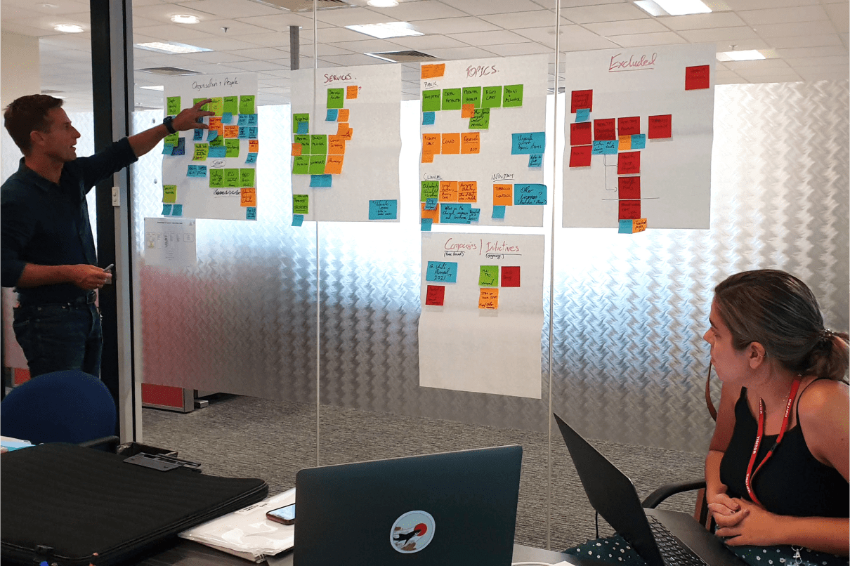
Taking a human centred design approach, we heard from members of the public, patients, and health care professionals across Tasmania to gain this perspective. We heard:
- Literacy and health literacy rates in Tasmania are generally lower than the rest of Australia. Accessibility and readability of content was a key priority.
- The health care system in Tasmania is generally simpler than in other states due to its size and the whole state being one Primary Health Network (differing from other states that have multiple PHNs that are then required to coordinate).
Understanding what makes Tasmania unique was fundamental in defining our experience and content principles and subsequent website design to ensure we could create a simple, familiar, and focussed web experience for our users.

Content fit for our audience
Our discovery phase told us:
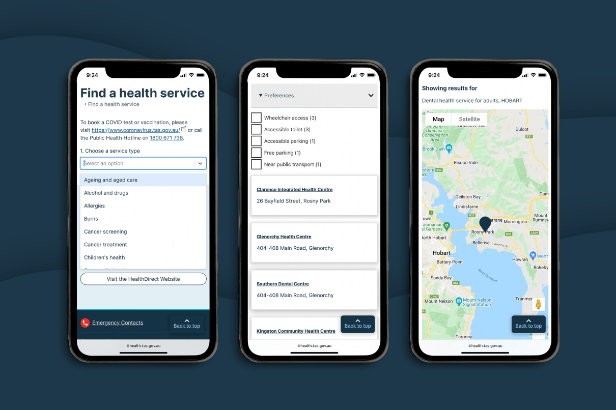
- Users (both public and health professionals) are most interested in service information on our website. They want straight forward, simple information about how to access services offered by the Department.
- People don’t understand government departmental structures – and so when we construct a website based on these business units and the content they own and update, all we do is confuse people more.
Content strategy and design for the Department was crucial in improving access to health care services. Ensuring people can both find and understand content on our site (and within our ecosystem), to be able to access the right care, at the right time and in the right place.
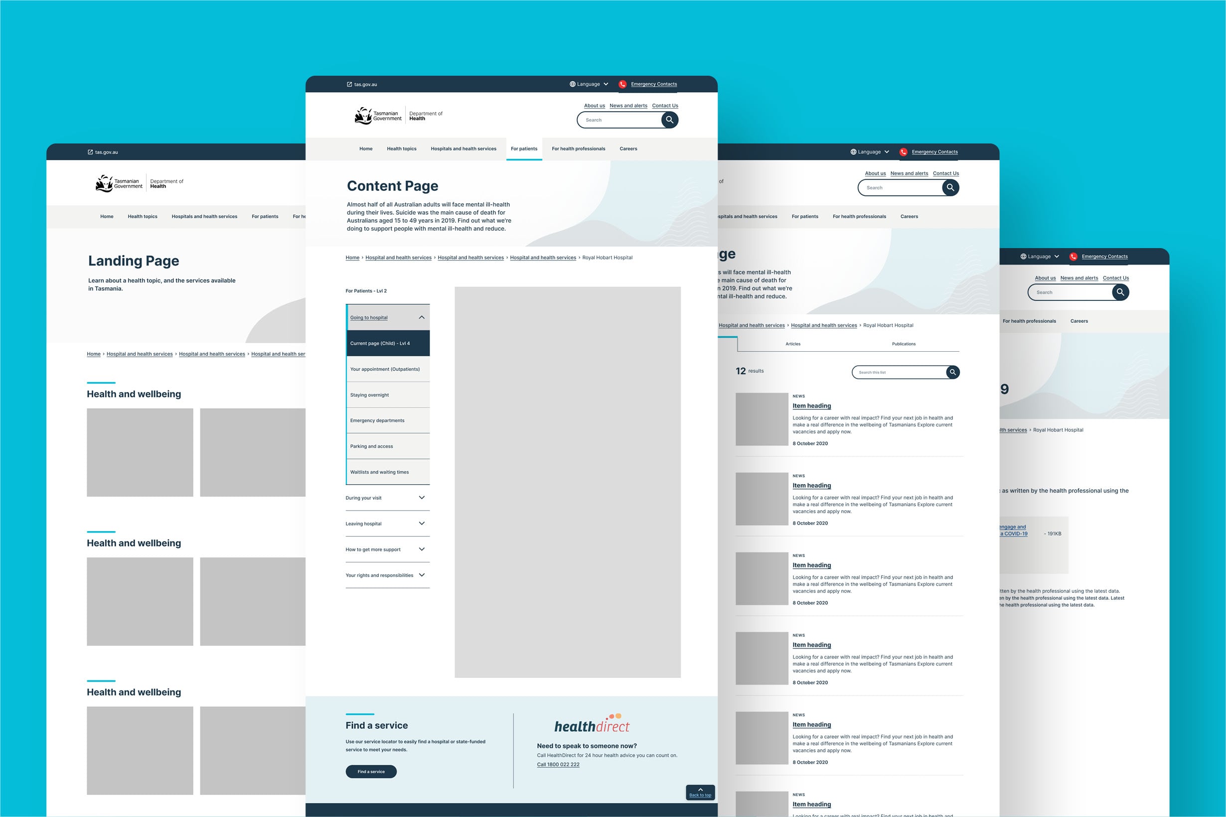
The site information architecture was developed to reflect our users’ mental models of health – based on audience types and health topics using plain and clear language and labels. Information is structured in a way that guides people to service information, no matter where they land on the site.
Design & build
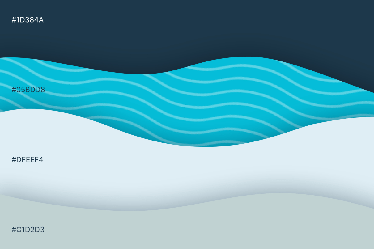
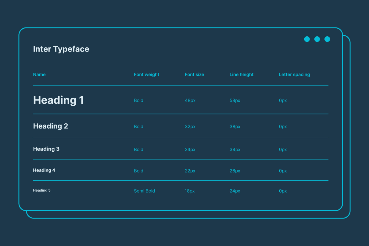
Our design work started with giving the Department brand identity a refresh. By brightening the colours and creating updated and modern graphics, we communicate a trustworthy and current source of information to users, improving the perception of the Department.
With a revitalised look and feel, we were then able to develop a design system of components and patterns to create a clean, simple and modern experience for Tasmanians. The design system will build consistency and familiarity across Department properties, as they continue to update their network of sites. It also creates efficiencies for the Department when creating new sites, digital products or pages.
Working with our development partner, Morpht, the site was then built using this design system.
The outcome
We’ve rationalised and strengthened the Department’s web presence, delivering a more engaging, modern experience that improves access to health information and services for all Tasmanians.
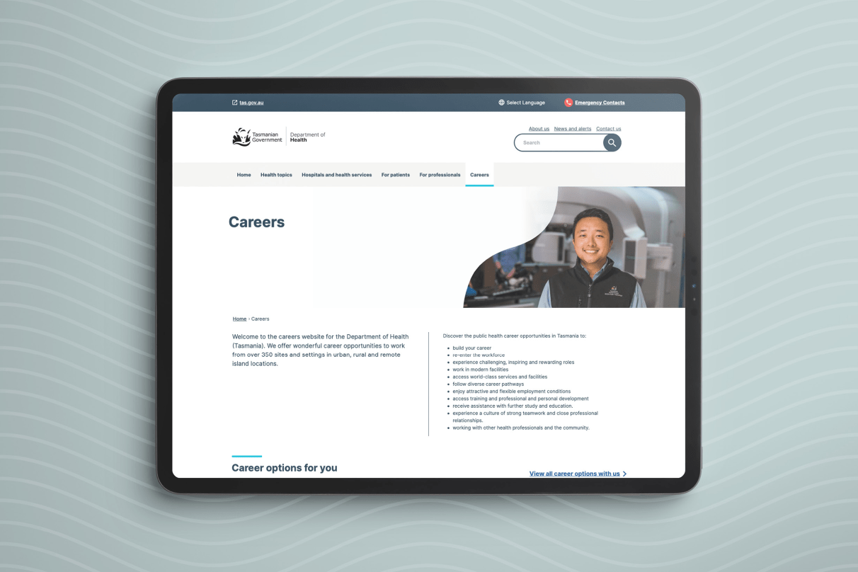
The new site will also have positive benefits for the Department, with a revamped careers area which will help to attract health care professionals to roles within the state, and by creating an easy to maintain site network that enables site editors at the Department to quickly create and update accessible and user-friendly pages.
We will continue to work with the Department to build on these strong foundations and extend the digital experience.