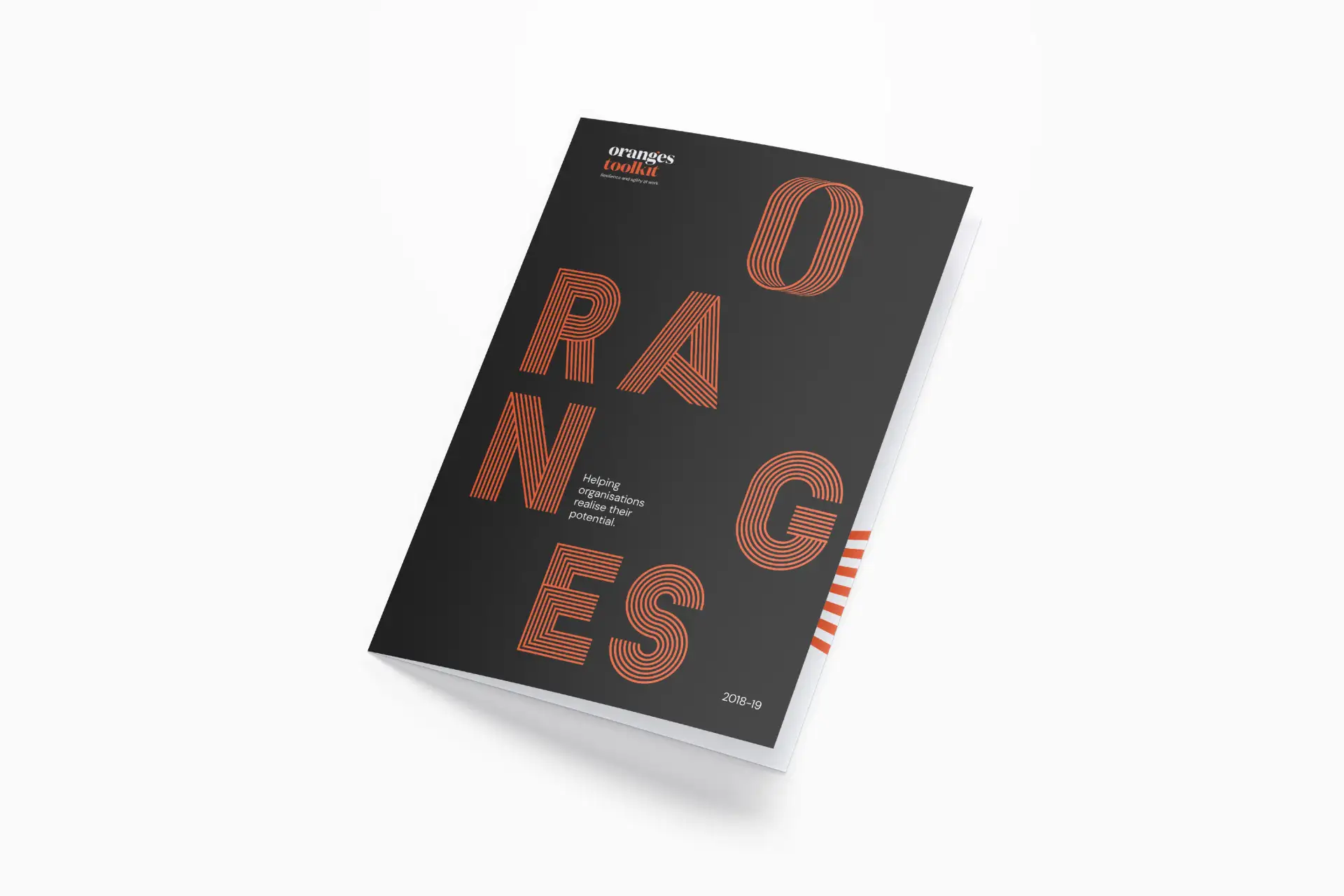
The Oranges Toolkit builds individual and organisational well-being and performance through the practical application of neuroscience and positive psychology.
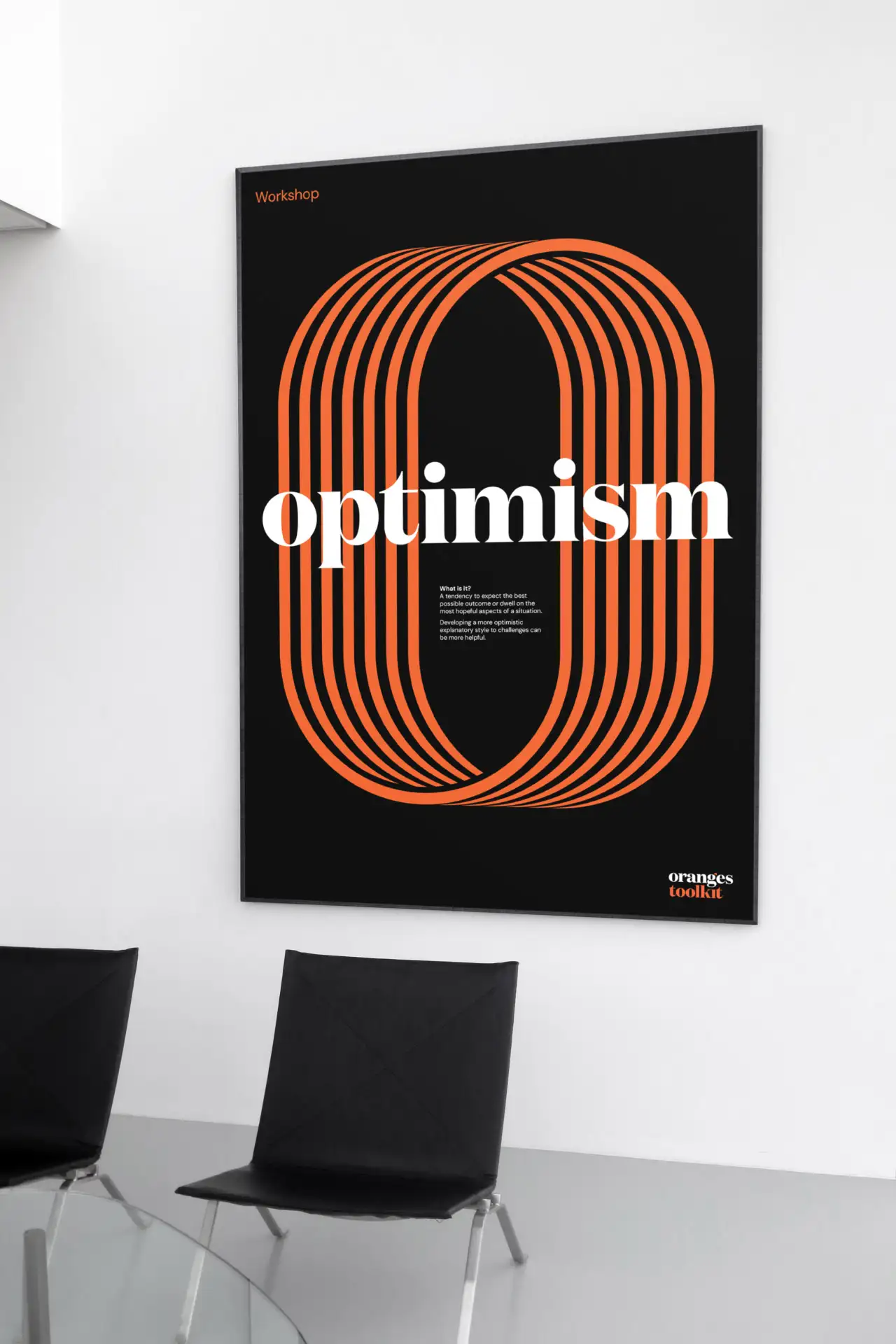
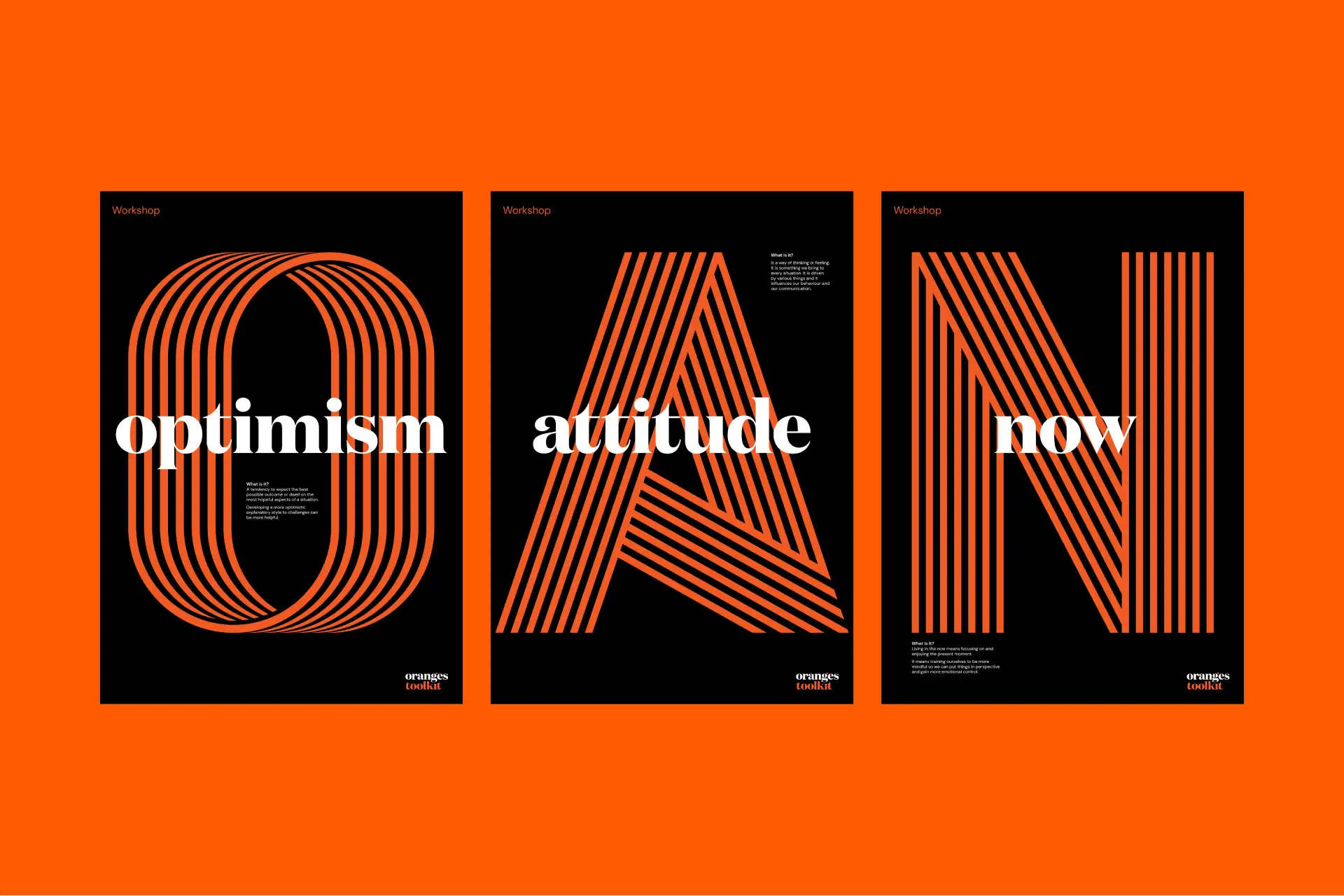
Born out of Camp Quality, where volunteers and employees were burning out from the impact of supporting people through their trauma, the Oranges Toolkit developed a program to train and build mental resilience: Optimism, Resilience, Attitude, Now, Gratitude, Emotions, Strengths, (ORANGES).
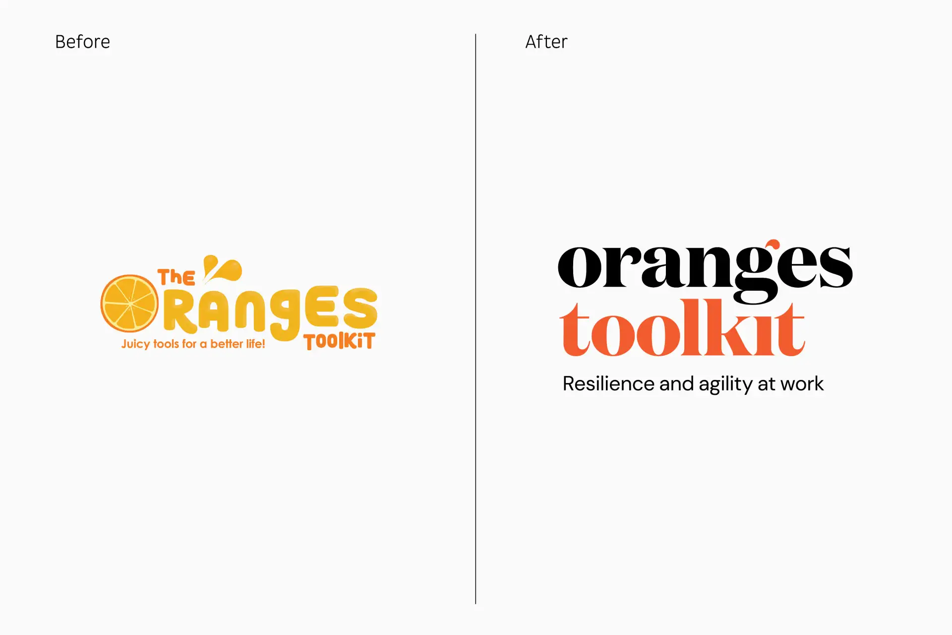
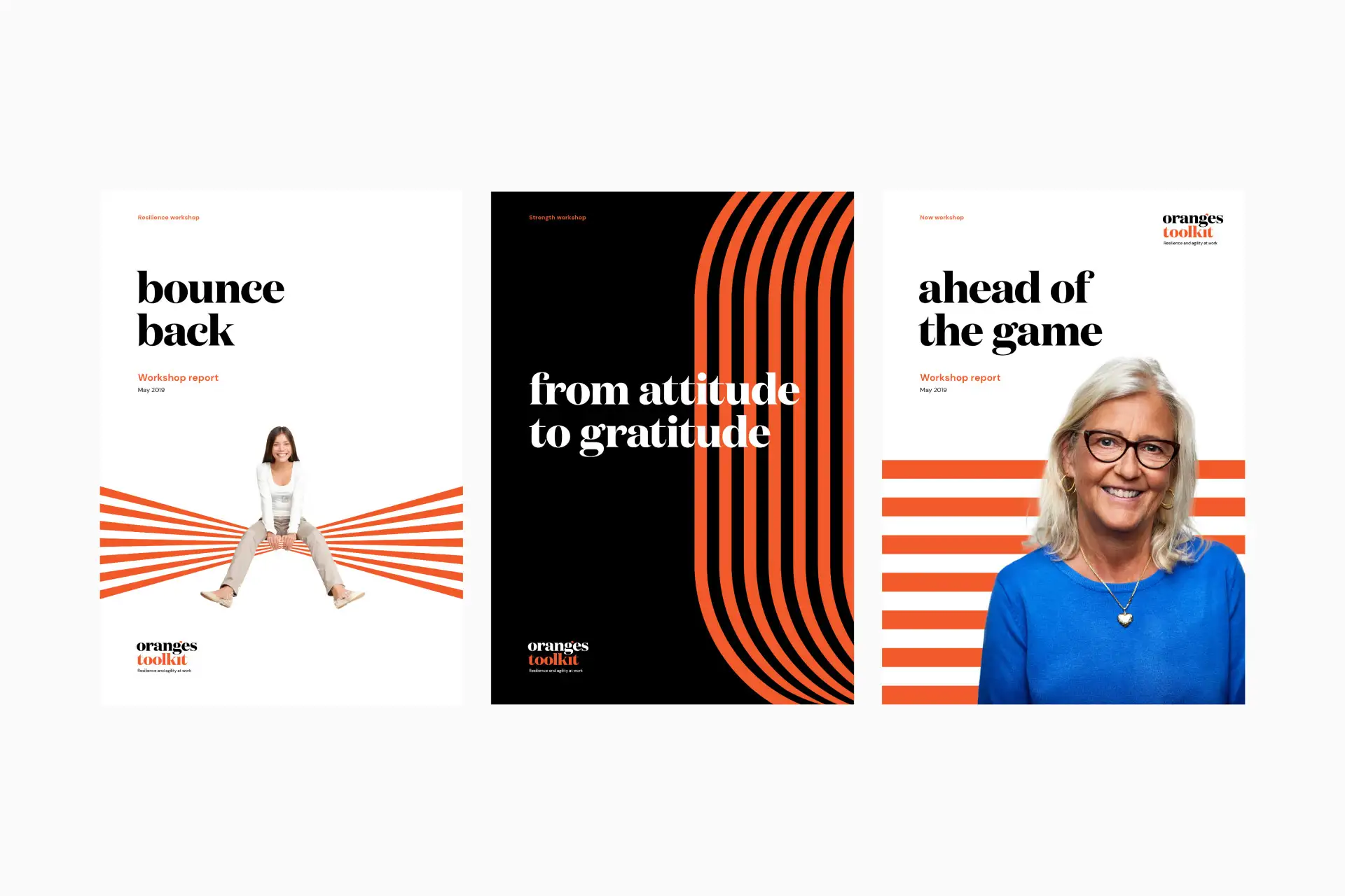
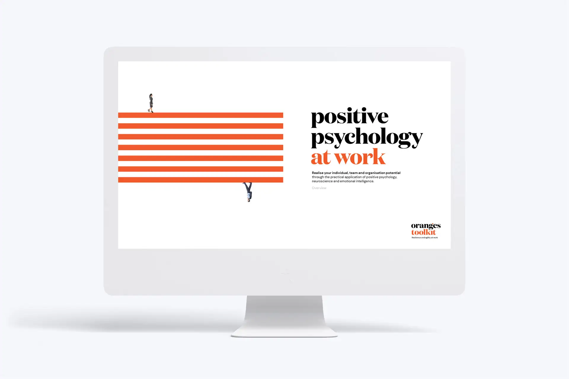
Despite being hard-nosed and science-based, the training is fun. Involving. Quirky, even. We needed to keep the informal zestful agility, and add some evidenced-based, ROI, credibility.
The Oranges Toolkit rebrand was a pro bono project by Folk.