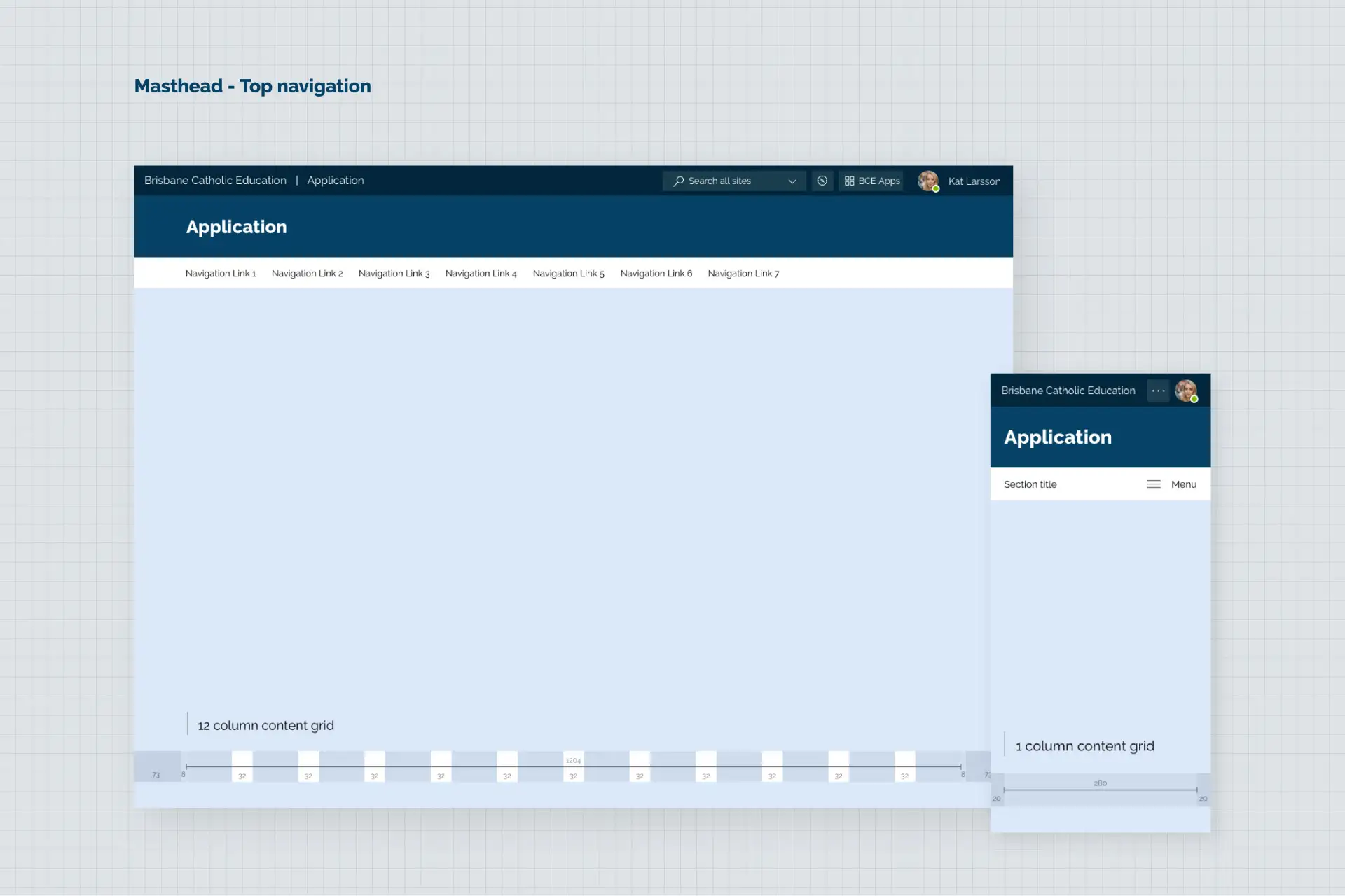
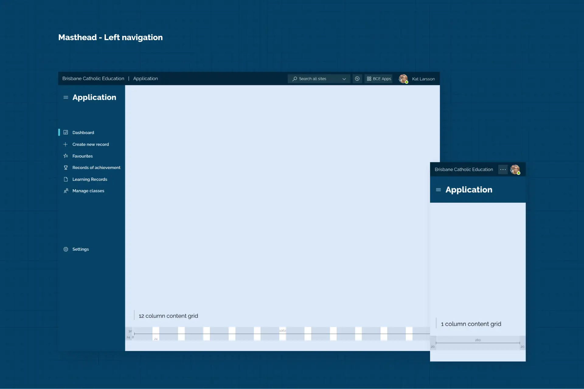
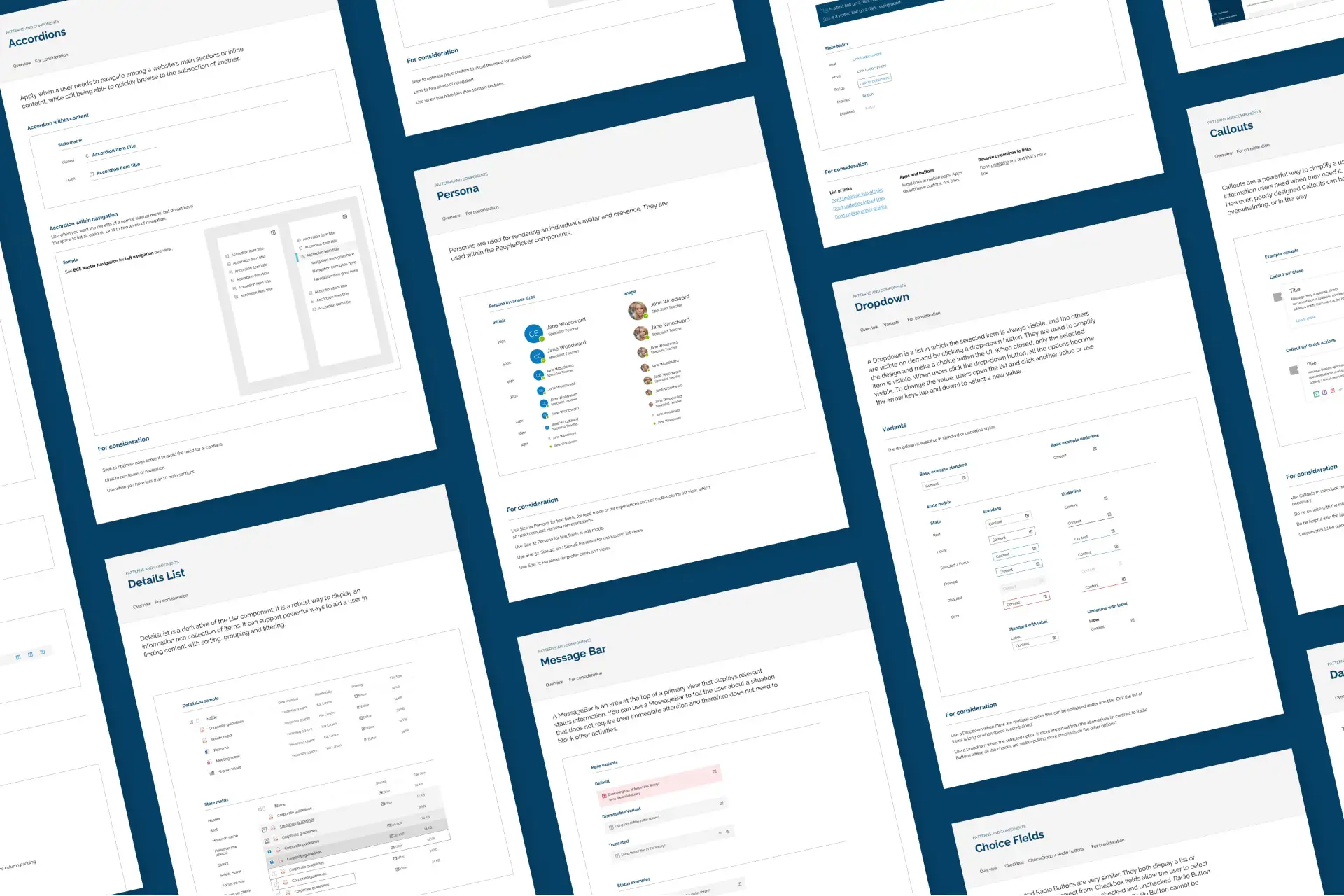
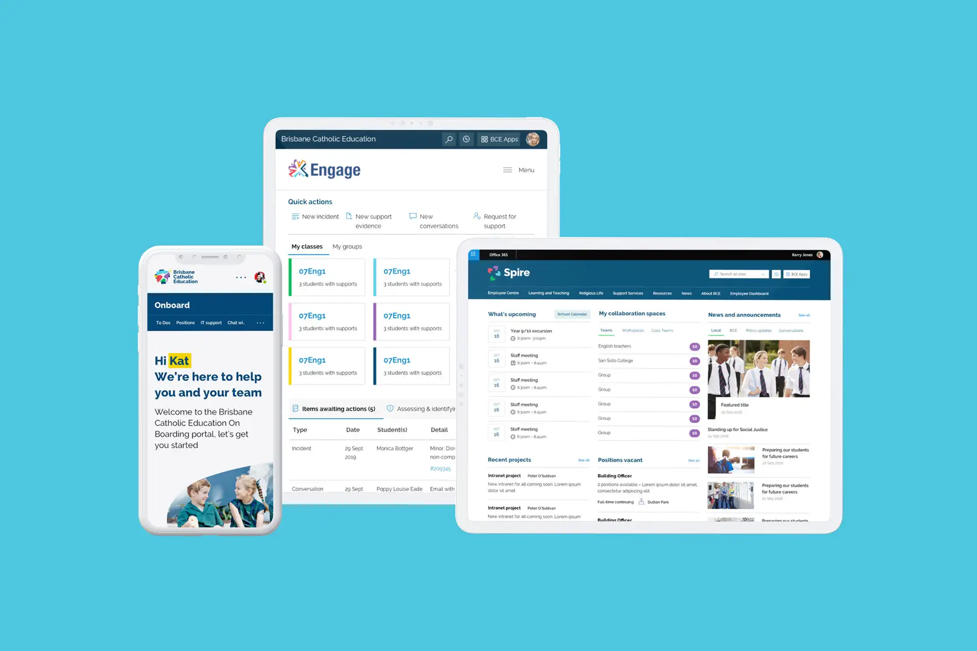
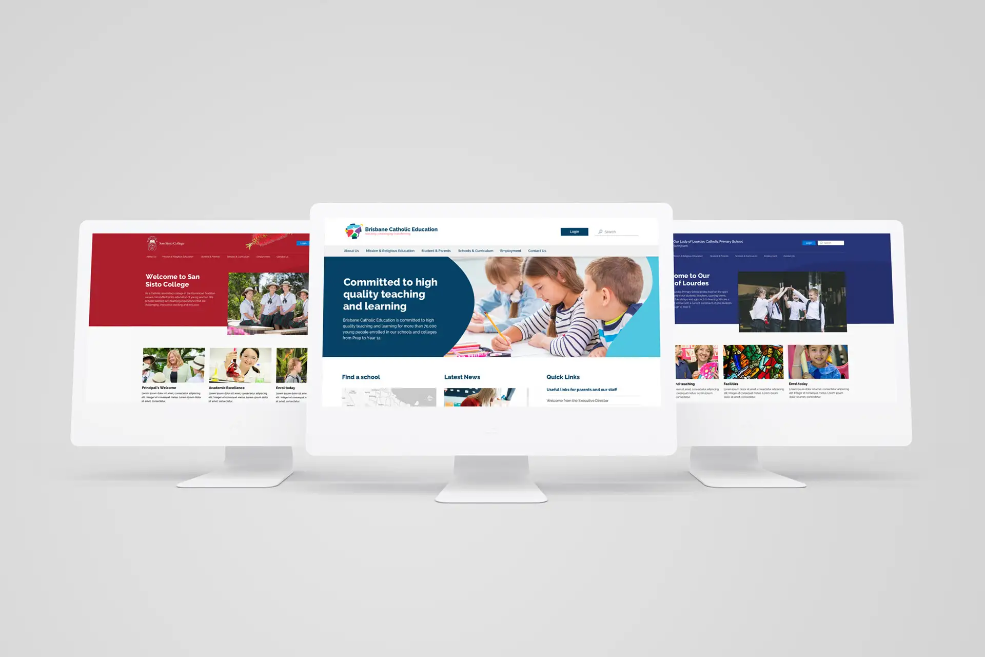
Two high-school students in uniform working at desks, one using a laptop and one smiling at the camera.

Brisbane Catholic Education

Design System

Impact area

Empowering people

Services

Digital transformation

Product design

Visual identity

With 75,000 students in 142 Schools supported by 11,500 staff, Brisbane Catholic Education (BCE) is a learning community that provides quality teaching and learning outcomes from Prep to Year 12. Like many education providers, BCE has a large and complex portfolio of systems and tools to support students, parents, teachers and staff.

A gap around UX/UI guidelines had led to disparate, inconsistent user experience and reinvention and inefficiency in the UX, design and development stages of web and mobile application development.

Man standing beside a wall covered in handwritten notes and sticky tabs used for problem-solving and planning.

What we did

Folk was engaged as a design consultancy to create an enterprise design system for BCE digital products and services with the ultimate goal of improving student learning outcomes.

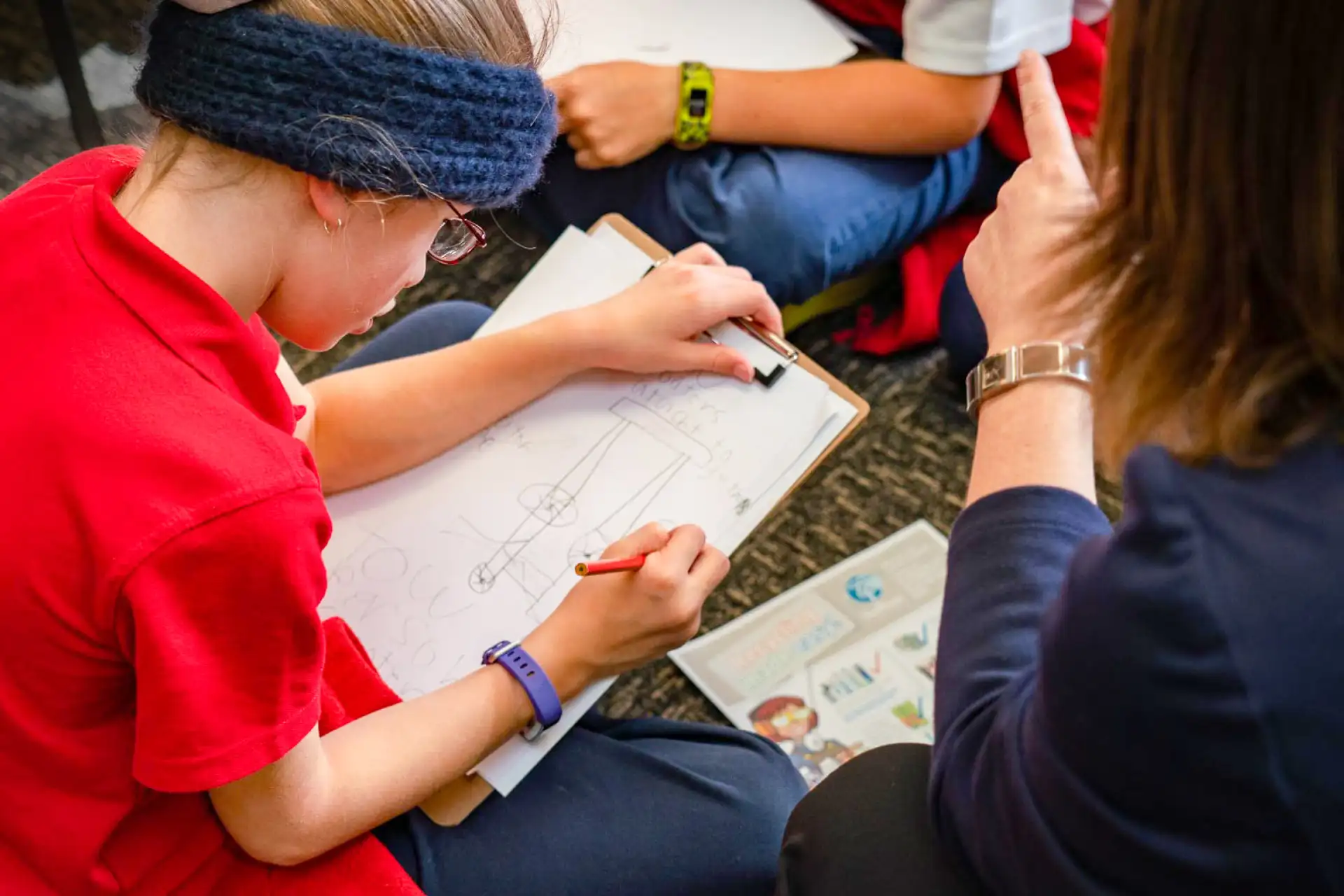
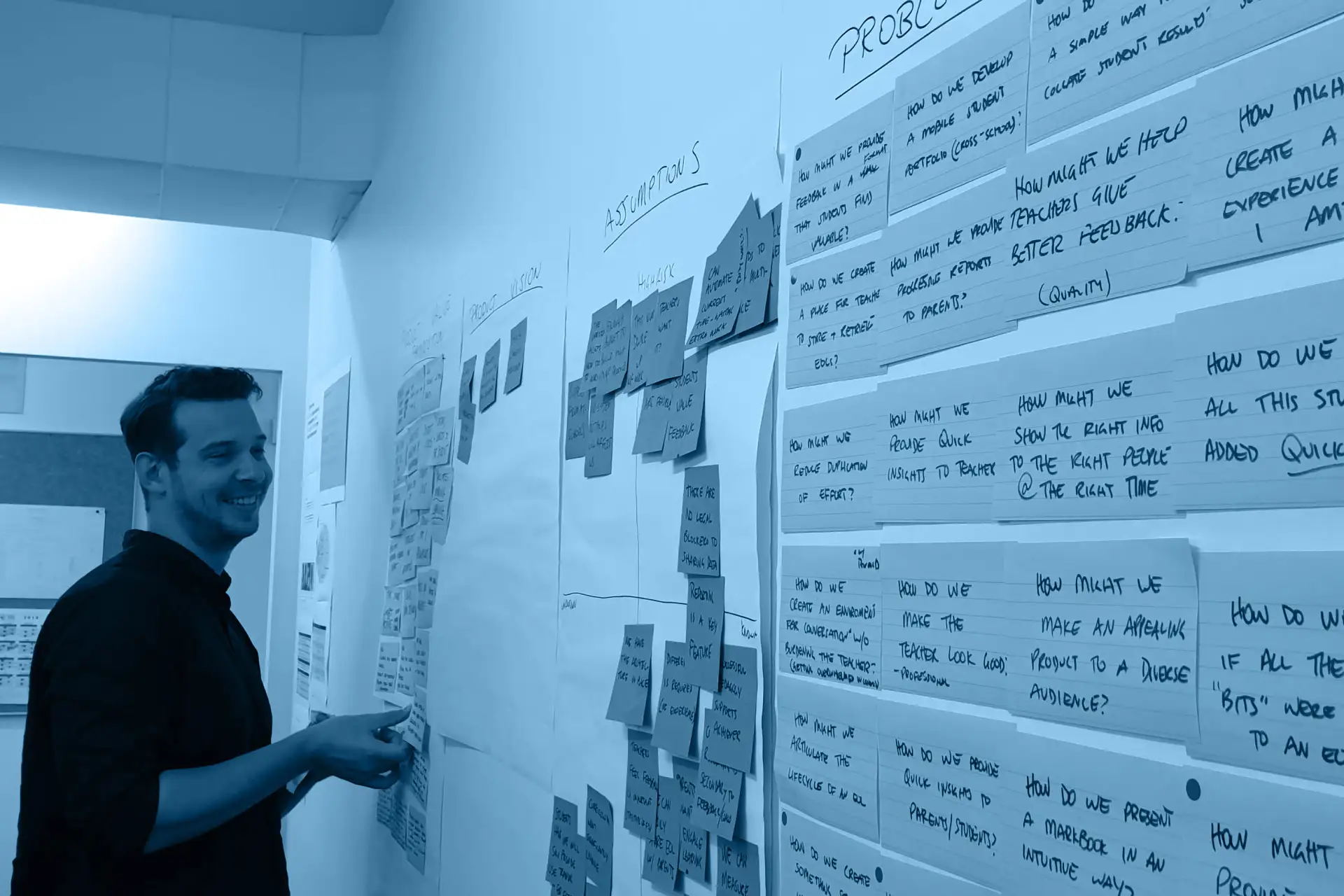
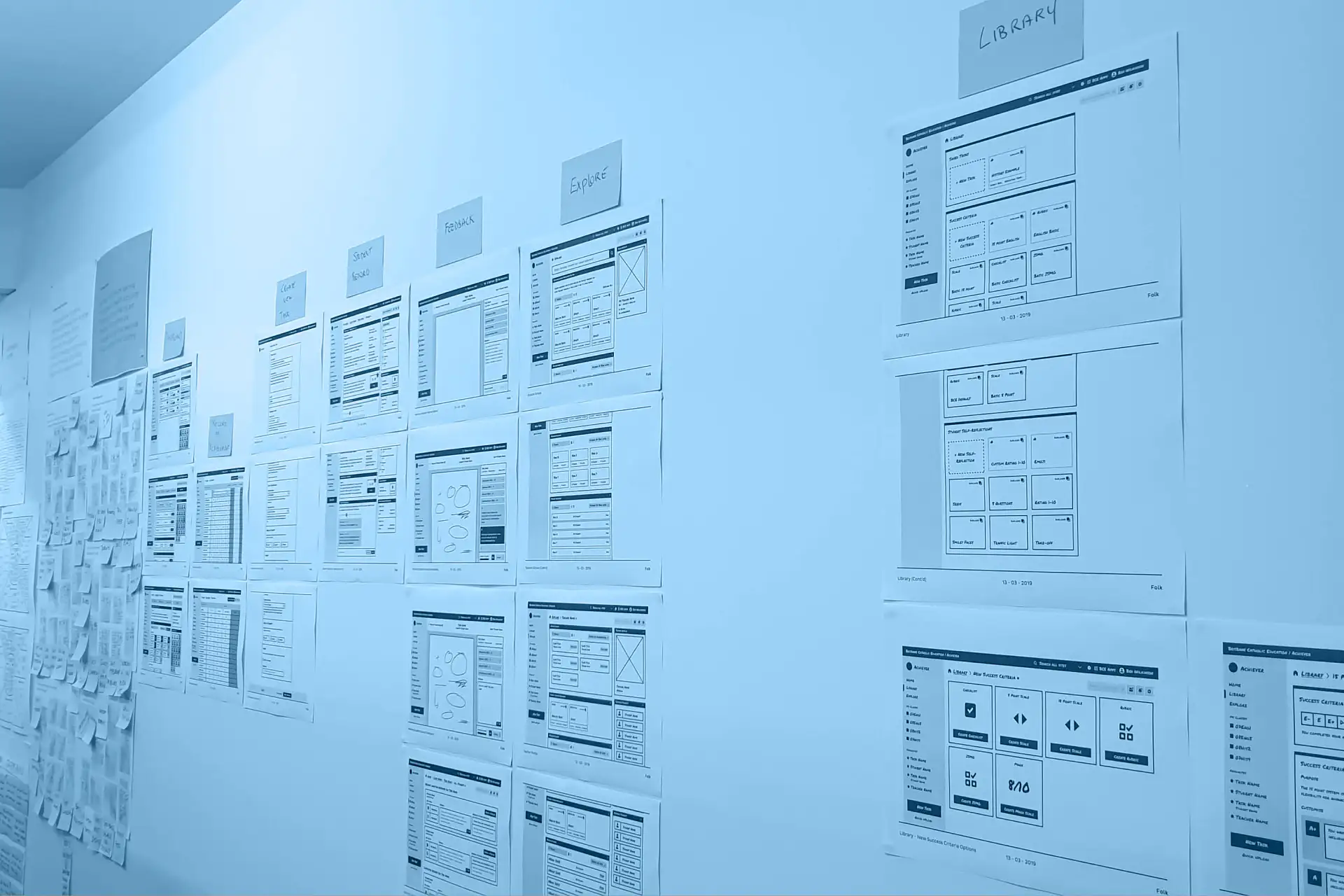
To achieve a future state solution, we knew how important it was to work closely with BCE delivery teams to understand how the as-is design tools and product experiences aligned and supported the organisation’s strategic vision.

Through consultation and workshops we are able create a shared understanding of the key systems and the associated gaps, opportunities and user pain points.

A long wall displaying multiple printed UI wireframes and labelled sections for a digital product layout.
Brisbane Catholic Education ID badge for Kerrie Jones displayed on a yellow and white background.

Folk worked alongside with BCE’s internal team to establish foundations that are fit for the future and could be built upon when creating digital products.

Overhead view of brand guideline slides showing visual identity, typography, and graphic elements.
Grid of six green and navy outlined icons representing design principles: Empowered, Human-centred, Recognisable, Universal, Simplified and Structured.
Person typing on a laptop displaying the Spire employee dashboard with sections for leave, development, contact details and accreditation status.

We developed a digital design system to support the brand vision and the strategic product development roadmap.

Typography showcase displaying the Raleway typeface, a paragraph about typographic scale, and the full alphabet set in upper and lowercase.Vertical colour palette swatches for a UI system including purple, rose, red, gold, orange, green, light blue, dark navy and extra dark navy with hex codes.
Page showing grid system documentation, including breakpoint table and responsive layout examples.

The BCE design system is a collection of reusable components, guided by clear standards, that can be assembled together to build any number of applications.

Interface layout showing a wide desktop and mobile example of a top-navigation masthead with a 12-column and 1-column content grid.Interface layout showing a wide desktop and narrow mobile example of a left-navigation masthead with a 12-column and 1-column content grid.
Multiple design system documentation pages arranged diagonally, including components and UI patterns.

We designed and delivered a digital design system for BCE’s design and development teams to efficiently create engaging, trusted experiences.

The design system supports coherent design and development of the following use cases:

  • Public Websites
  • SharePoint Online
  • Bespoke Applications
  • SAAS applications
Mobile and tablet screens showing Brisbane Catholic Education digital products, including the Onboard portal, Engage dashboard and Spire collaboration interface.
Three desktop monitors presenting different Brisbane Catholic Education school website homepages in red, blue and navy themes.