iPad displaying Spruson & Ferguson’s brand design.

Spruson & Ferguson

A 360° rebrand for a market leader

Impact area

Empowering people

Services

Brand strategy

Messaging

Brand identity

Update: Awarded Bronze at the 2024 Transform Awards ANZ for best visual identity from the professional services sector. See all the winners here.

Established in 1887, Spruson & Ferguson is one of the largest intellectual property (IP) service providers in the Asia-Pacific. With a well earnt and established strong reputation as a top-tier firm in the Australian market and internationally, Spruson & Ferguson were looking to further strengthen their market leading position and market recognition. 

From past to presence

The foundation of the firm’s brand revolves around its status as the foremost experts in intellectual property, a reputation that endures strongly. With the majority of IP firms spruiking the same qualities of ‘innovation’ and ‘expertise’ – paired with a more modern look and feel – Spruson & Ferguson felt it was time refresh to reflect its market leader position, and the need to stand out in the space. 

Looking under the bonnet of the firm they weren’t championing their distinct attributes. They have unrivalled presence in markets across Asia, enabling them to help clients manage the complexity of filing into many jurisdictions. Their processes are designed for responsiveness, clarity and capitalising on the details that make a difference.

Side-by-side comparison of Spruson & Ferguson’s old logo and redesigned logo, highlighting the shift from a blue, grid-based mark to a modern black wordmark with an orange ampersand.
Hands holding a smartphone showing a Spruson & Ferguson Instagram Story with the headline “IP strategies for start ups.” and the brand’s signature orange gradient arc.
Signifier Light & Italic type specimen displayed on a black background, showing the full alphabet, numerals, and the typeface name.

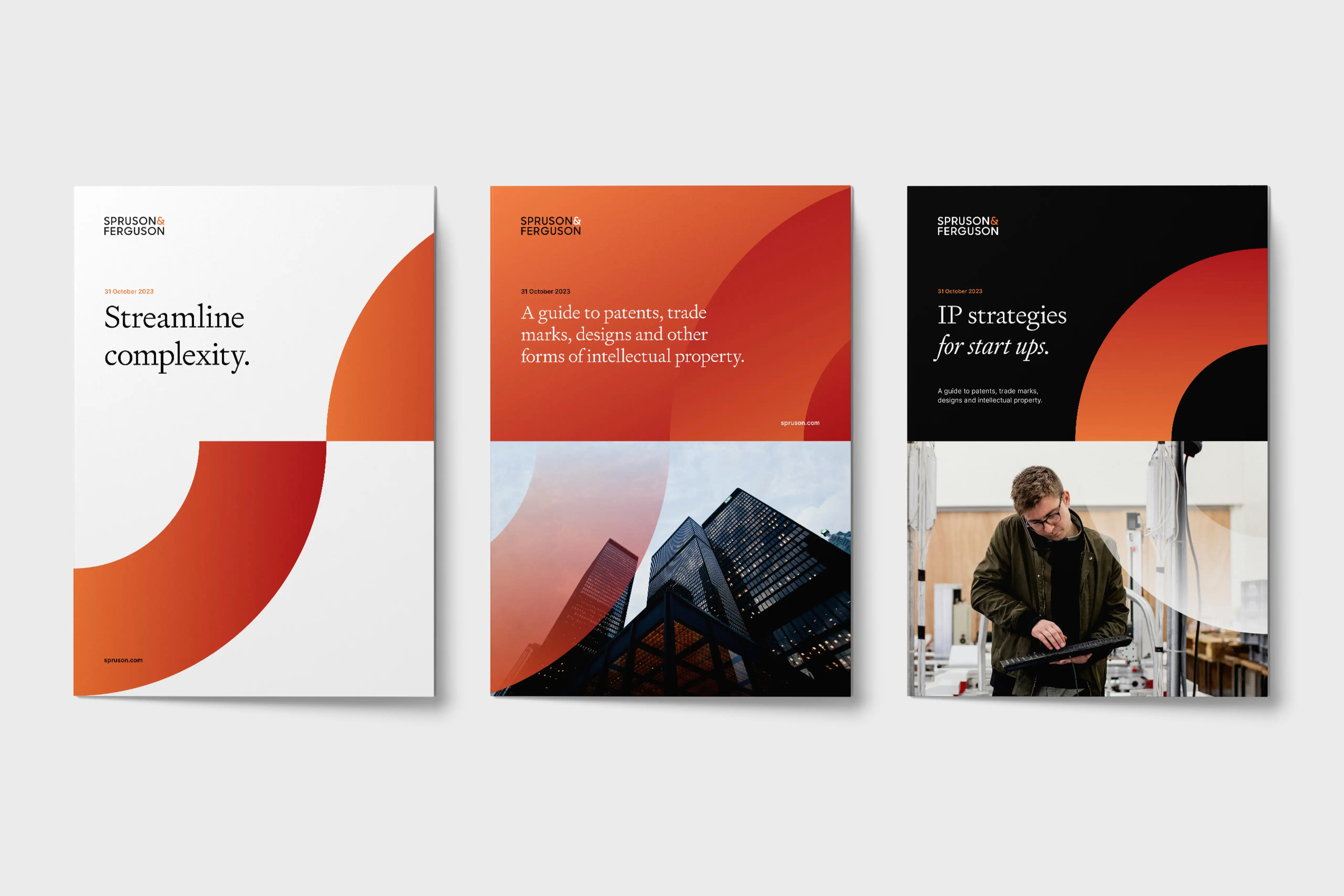
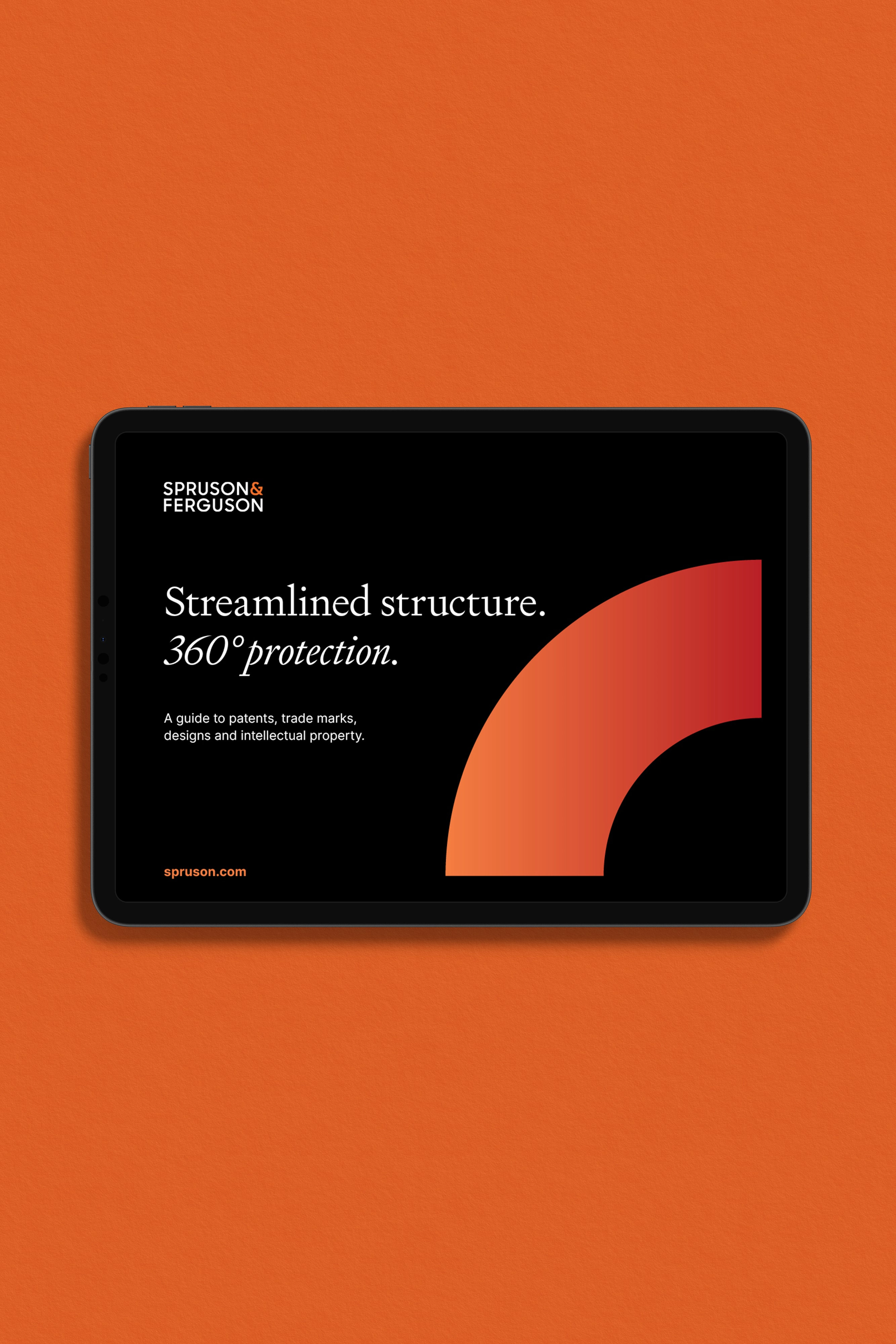
Inspiring confidence

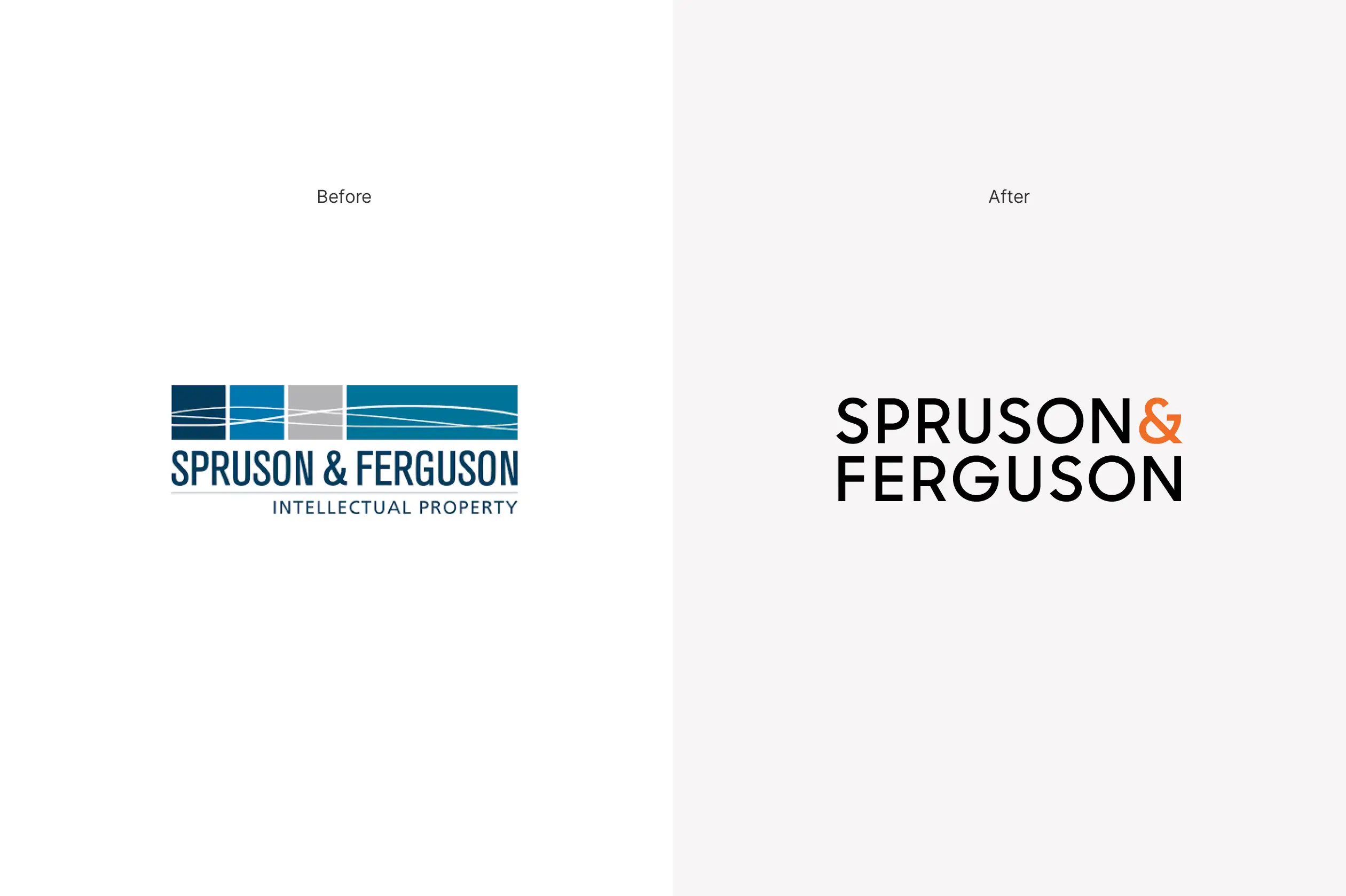
The desire to reinvigorate brand and positioning of the firm was a must, reflective of the quality of work they produced and its leading presence and perception in the market. 

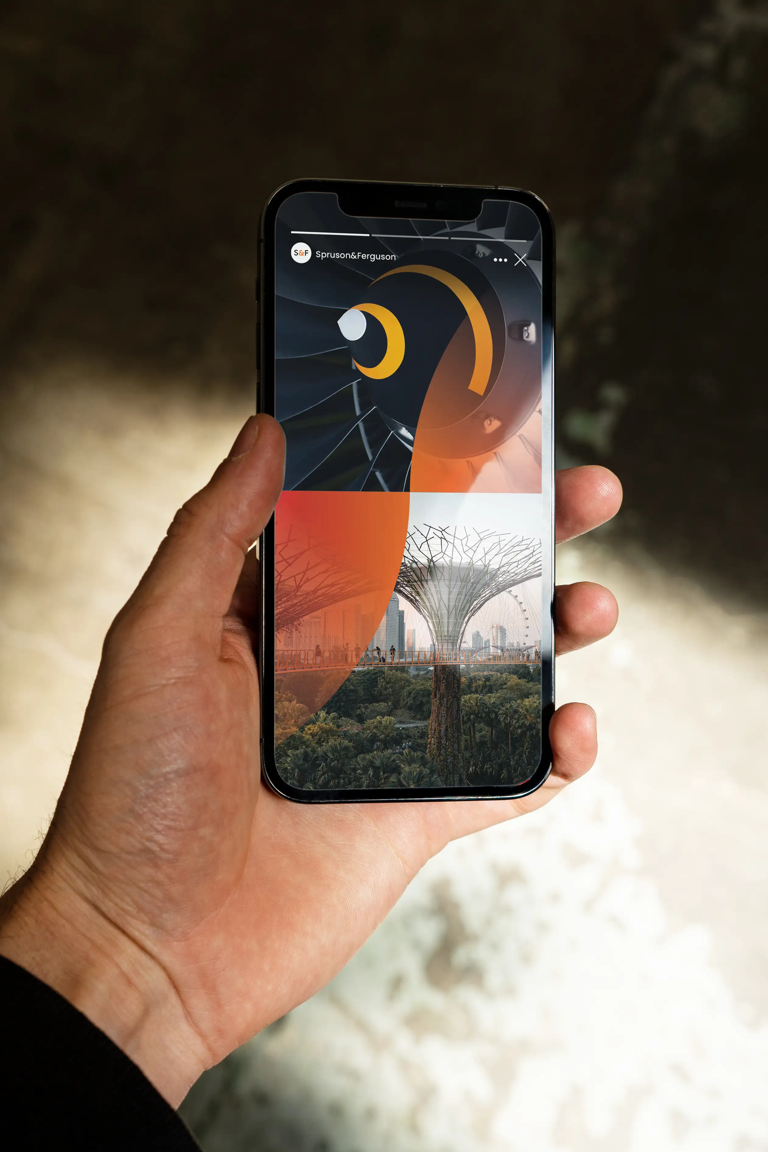
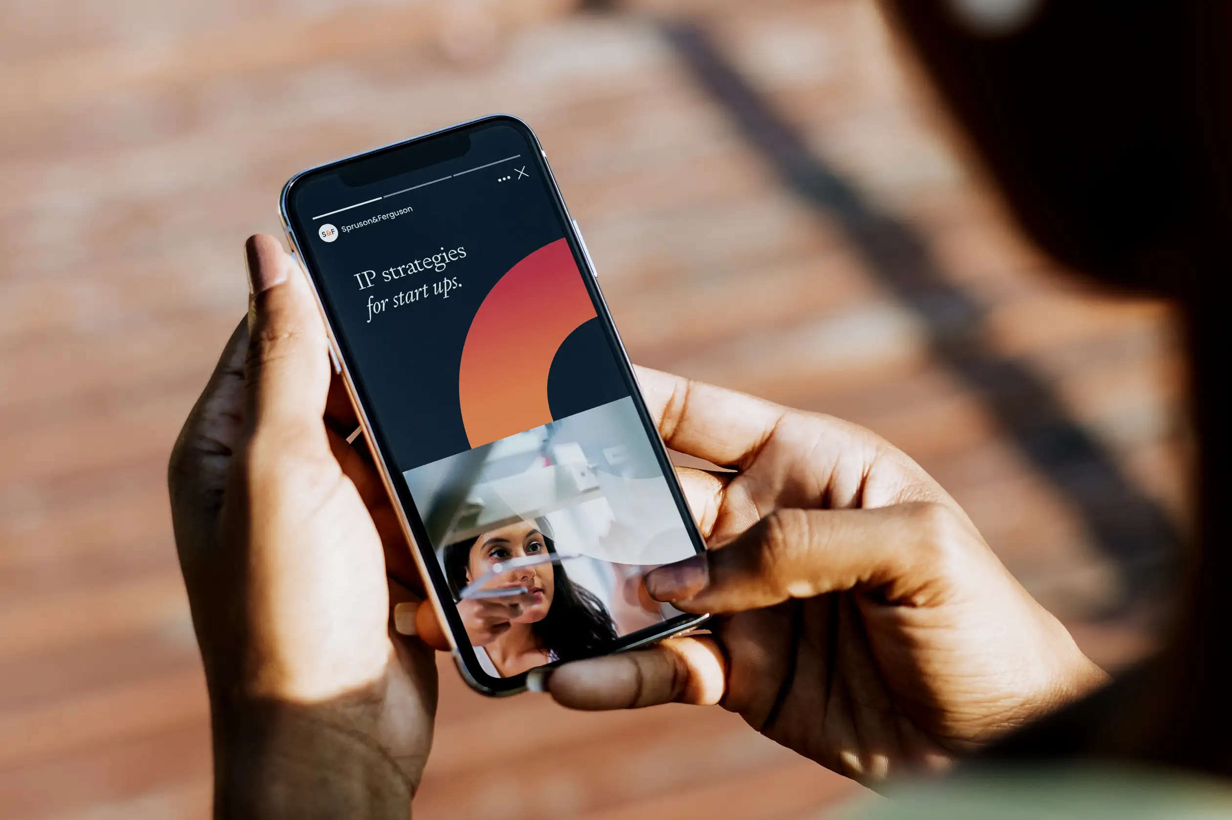
Ready and responsive. 
Focussed and efficient. 
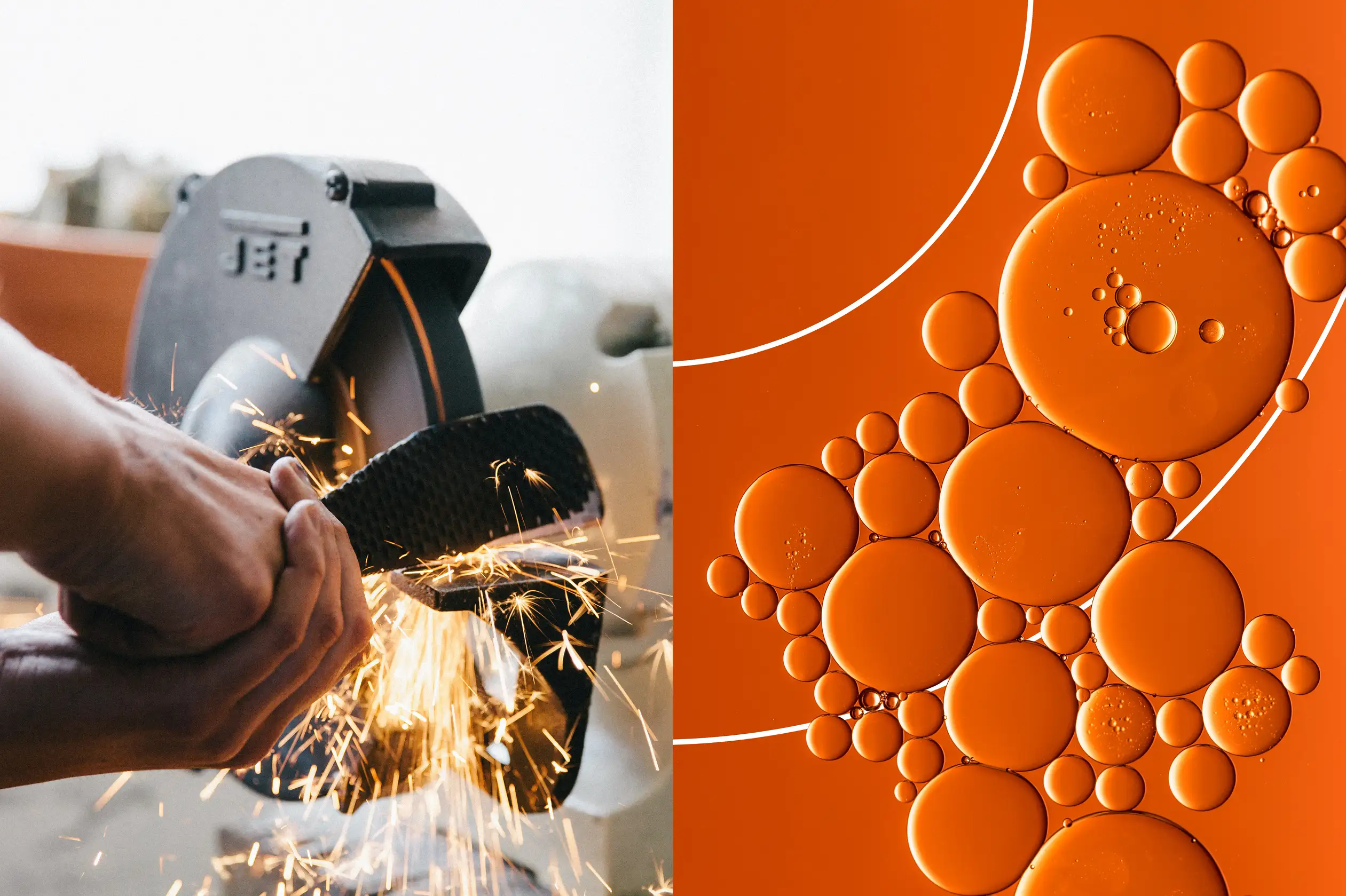
Connected and cut-through.
A seamless experience.
Consistent and secure.

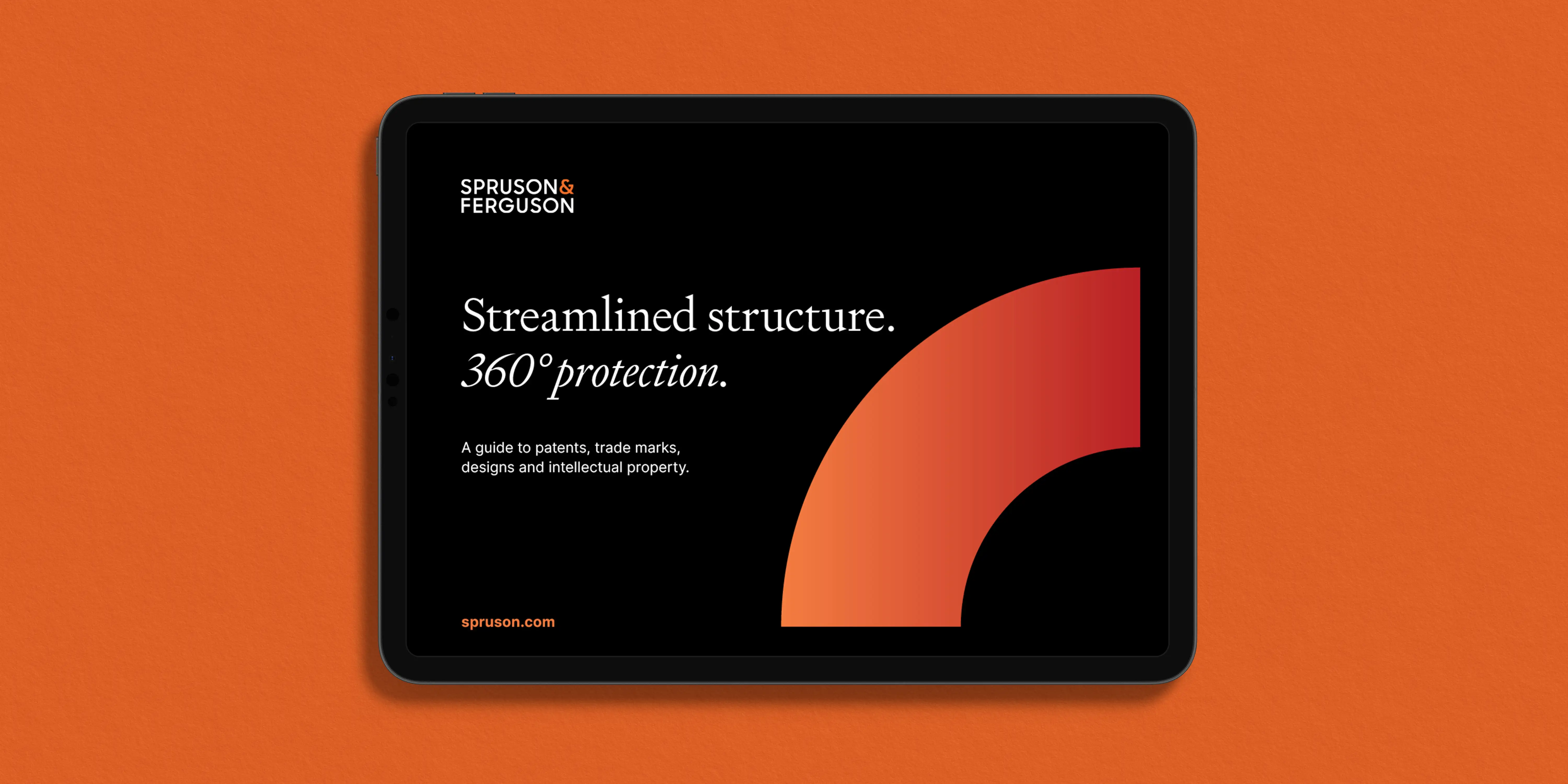
We helped them take the desired leap from existing, evolved identity – to striking, dynamic new brand expression. Differentiating themselves from their competitors with a bold, new value proposition centred on streamlined complexity, connectivity and protection.

Backlit advertising panel in a train station showing Spruson & Ferguson’s campaign with a warm orange gradient, the message “Your ideas are worth protecting.” and an image of a woman working with industrial robotics.

Connected protection 

The brand idea – ‘Connected protection’ – is the concentrated brand strategy thought that informs and inspires the creative expression (design). Within it are the prioritised ideas – the unique set of proposition, values and personality of Spruson & Ferguson – to steer the verbal and visual design: streamlined, connected and strong – across process, performance and location. 

These ideas – of streamlined and connected, structured and strong – are upheld in the main design motif: four quarters of a 360° circle.  

The precise, balanced and geometric letterforms of the logo echo the creative theme. 

We shifted away from traditional cold, corporate colours. A bold, vibrant, high-contrast palette further strengthens the presence and confidence of the rebrand and new value proposition of Spruson & Ferguson in their international markets.

Open Spruson & Ferguson report spread.Stack of Spruson & Ferguson printed guides.
Open Spruson & Ferguson report showing an orange gradient contents page on the left and a text-heavy page with serif headings and a construction site image on the right.Spruson & Ferguson brand booklet opened to show the new visual identity system.
A person holding a smartphone displaying a Spruson & Ferguson Instagram Story.
Three Spruson & Ferguson brochure covers featuring bold curved gradient graphics and minimalist serif headlines.