Mental health support isn’t one size fits all.
Every societal peer-group has its own specific and nuanced cultural context.
This is especially true for defence force veterans and their families. For many, it’s complicated. Whether sought or avoided, it’s commonly approached with caution.
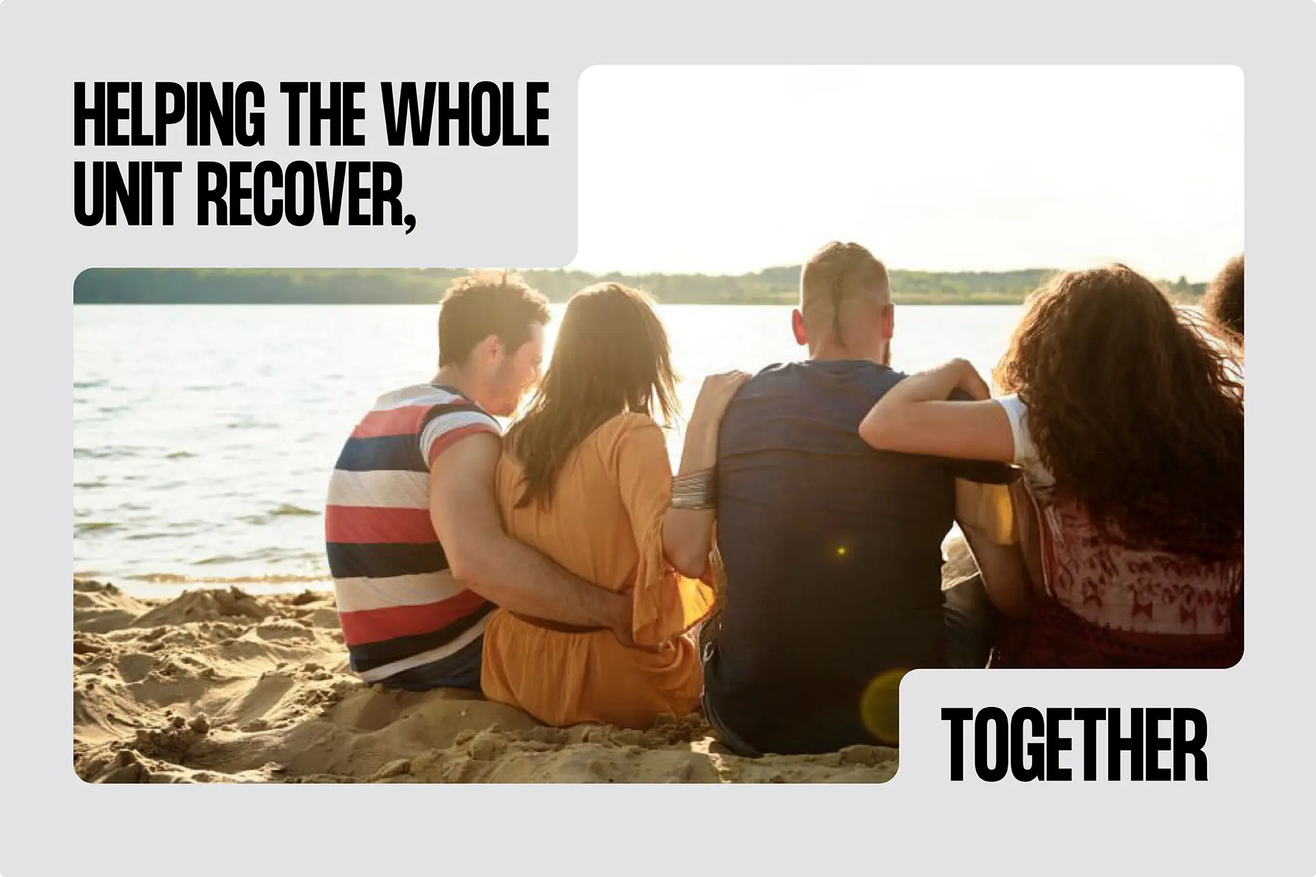
So when SANE asked us to help position a new peer support program – created in collaboration with Open Arms and Phoenix Australia – ‘the familiar’ was prioritised over ‘the fresh’. “Here for you” design. Not, “look at me” design.
A name that resonates
We needed an authentic and credible way in for a nuanced audience. Recognition and resonance.
From long-lists to short, the initiative was named Shoulder to Shoulder. From the outset, any successful name needed to feel like something people already trusted – not a new service trying to win them over. Familiar and meaningful. Surprisingly obvious.
Beyond why. For whom?
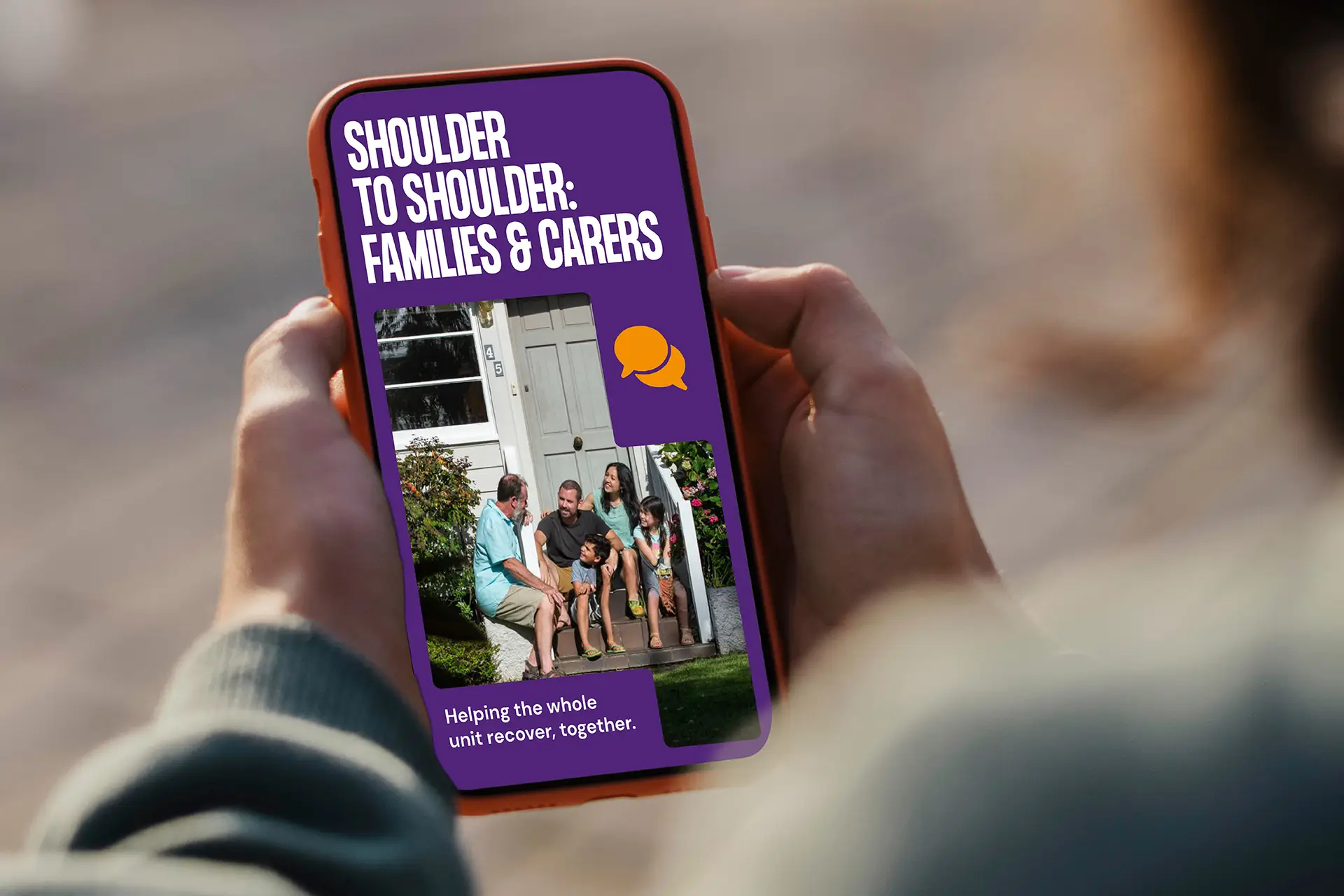
While Shoulder to Shoulder is crucially a partnership between three organisations with distinct roles in the mental health space – the design wasn’t about them. It was for veterans, carers and family members – many of whom have good reason to be wary of institutional language or government-backed promises. So we stepped back.
The identity worked supportively. Reassuringly.
We blended Open Arms’ colours into SANE’s framework to honour both, without letting either take over. The typography was clean and candid – allowing the messaging be seen and heard.
The tone was frank, never chatty. Relatable. As is the name itself, inspired by the community. Simple. Grounded. Lateral, making it meaningful and memorable.
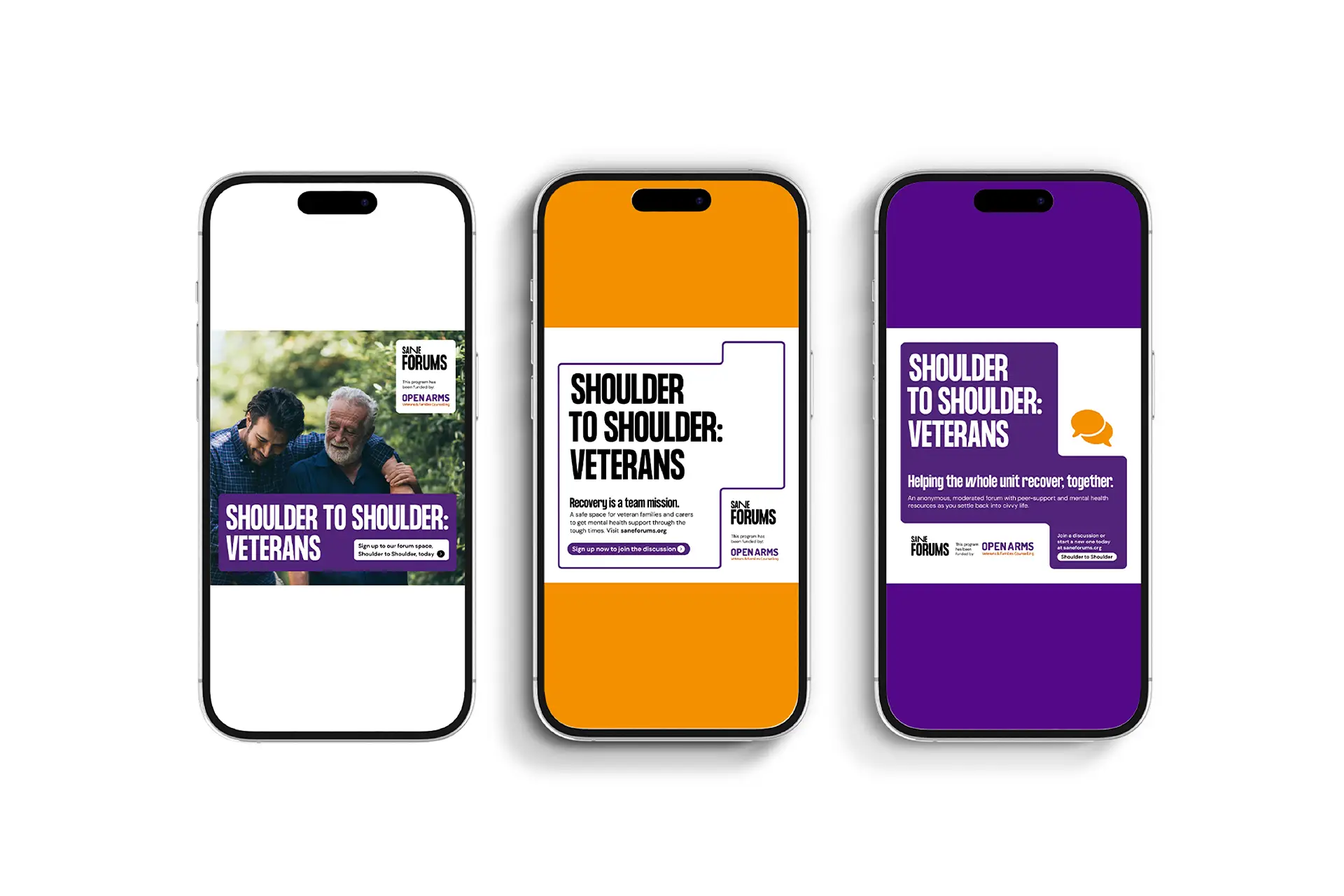
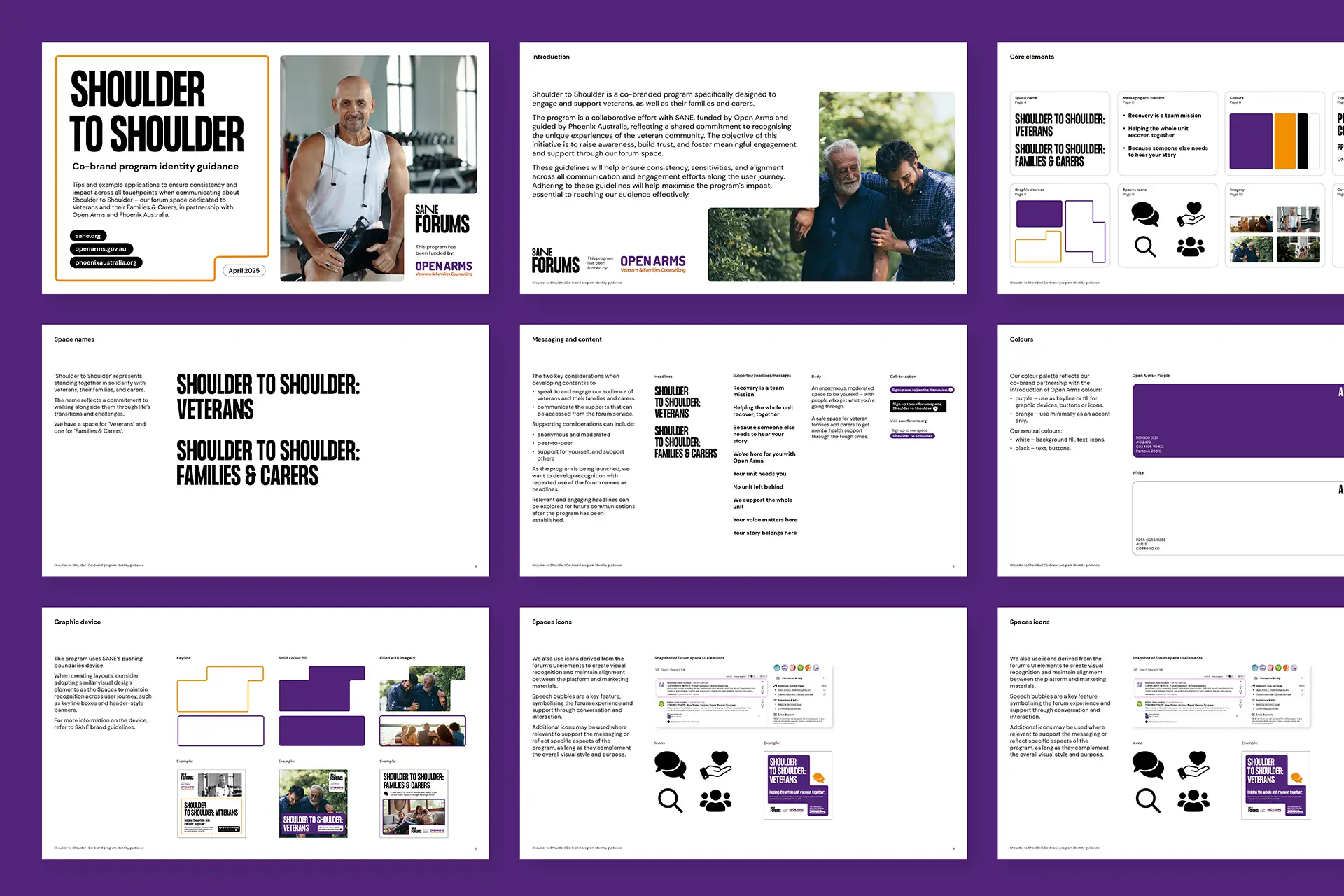
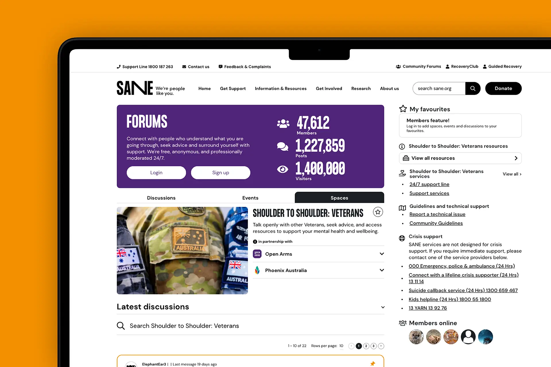
From social click to forum thread – a consistent, quiet reassurance
In identity design, while we often reference ‘look-and-feel’: one serves the other. Feel matters more, never more so than in peer-led mental health spaces like SANE’s forums.
For Shoulder to Shoulder, we designed the entire experience – from a search result or social post to the moment someone lands in a forum. Without fanfare, but with a calm clarity, warmth and trust at each step. It needed to feel familiar, credible, understanding.
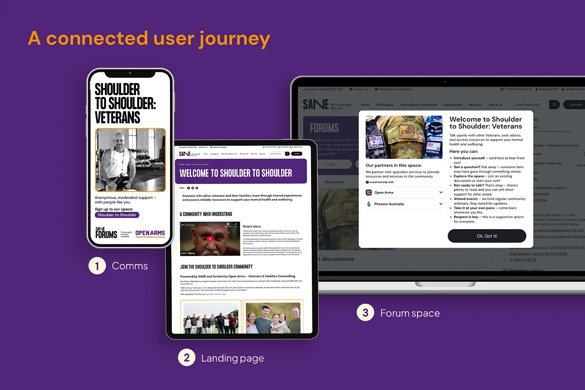
The hardest part is making it feel inevitable
This wasn’t about incredible taglines or visuals. But about credible ones. Relateable and believable.
Words needed to engender trust: headlines, buttons, prompts. Would someone in distress read this and think, “This might help… me”? Would it reach them where they were?
The identity’s tone came from real conversations. Veterans and families telling us what helped, what didn’t, and what made them walk away.
Just enough design
Health and wellbeing initiatives can suffer from the same thing: good intent wrapped in the wrong tone. They speak in ways their audience doesn’t. They might over-explain. Or over-design. Or over-promise. And in doing so, they lose the people they’re trying to help.
Shoulder to Shoulder is a reminder that the most powerful writing and design work often feels inevitable. Appearing effortless, is more. Presenting people with what they need, when they need it, in a way they can recognise, relate to and trust.
