Opportunity
Established in 2006, Valiantys is the global Atlassian consultancy services firm.
100% Atlassian focussed, Valiantys helps increasingly large and often complex organisations digitise processes and modernise teamwork (within the Atlassian/Jira platform).
With a new Global CMO onboard Valiantys saw the opportunity to step back to step up.
Having grown significantly in reach and reputation, moving into ever-more C-suite engagements, its brand positioning and expression needed an equally significant shift.
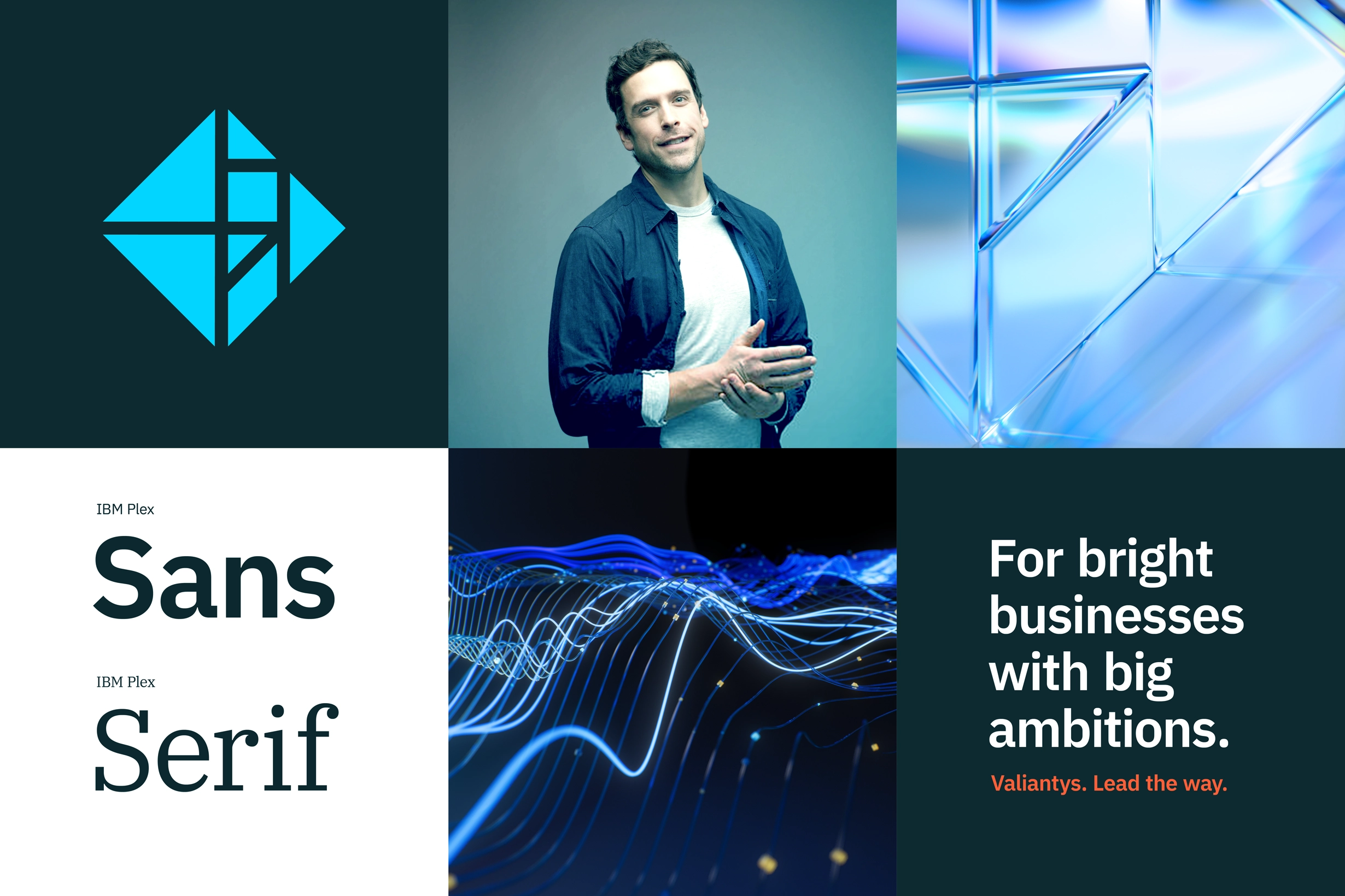
Bigger, bolder, brighter.
Insight
We learnt that by nature and nurture Valiantys – its culture and people – is a remarkably bright, curious and pragmatic problem solver. (It’s also very modest: we had to wheedle this out of them.)
With class-leading technical expertise and specialist knowledge of client domains, Valiantys is able to break down the puzzle that agile practices can often present, and piece together the best path forward.
Simply, clearly and pleasingly, Valiantys enables and empowers their clients’ ability to perform at their ambitious best.

Idea
Individual elements, agile, as one.
The Valiantys logo – which remained unchanged – features a Tangram, deriving from a Chinese legend. A diamond-shaped window made for an Emperor was dropped and broke into pieces. Rather than furious, the Emperor was delighted, to now have a window comprising multiple creative solutions.
The individual elements of the Tangram, previously small, flat and static, became big, brilliant and dynamic. Moving and interacting in different ways to reflect the four key service areas.
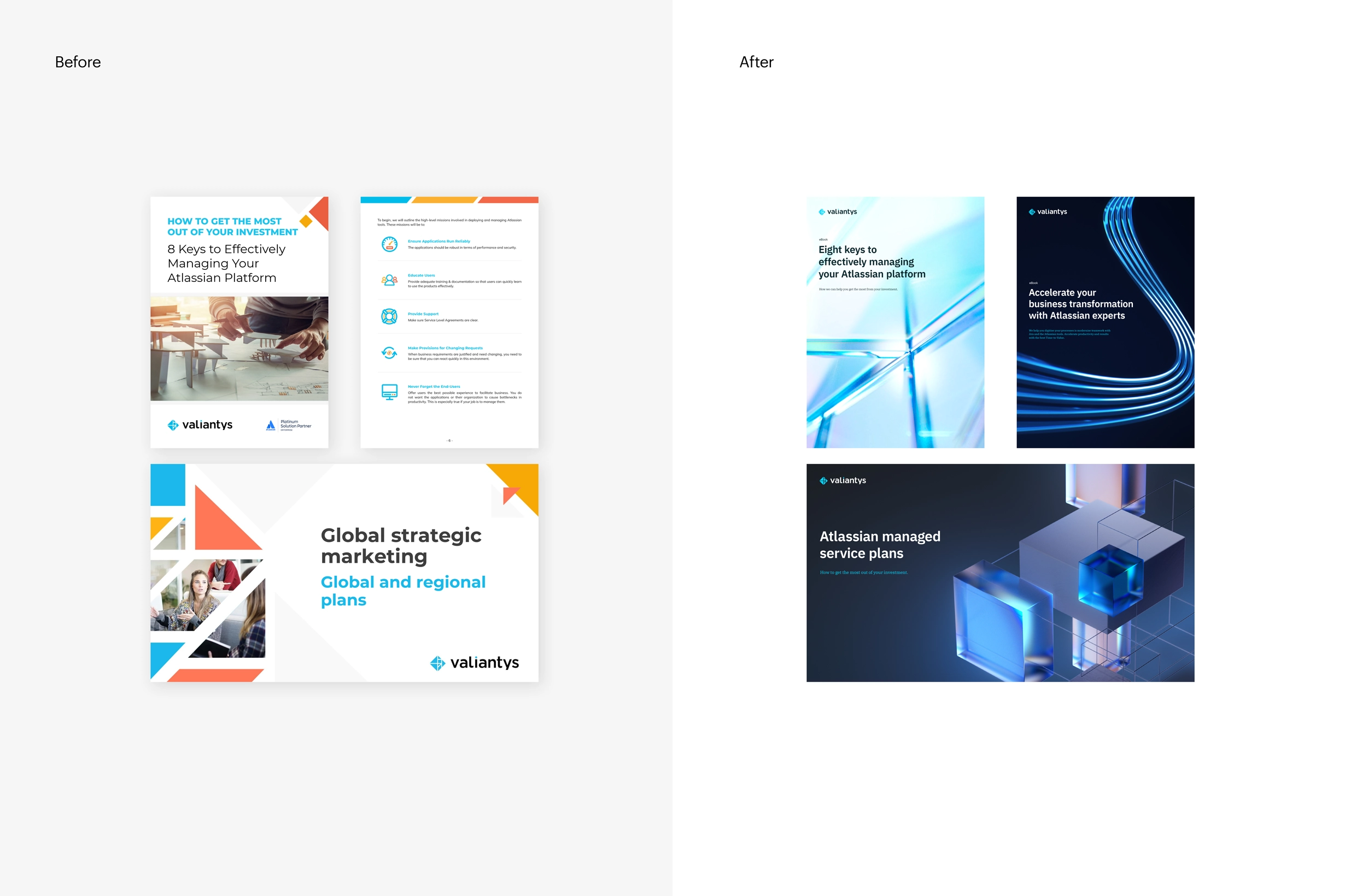
The brand refresh – strategy, identity, video and comms – now connects and communicates Valiantys’ business strategy and audience needs: C-suite, complex and at-scale.
Valiantys enlightens (solves) where there was dark (problem).
With cutting-edge curiosity, it leads the way.
Script: Ryan Curtis. Animation: Never Sit Still.