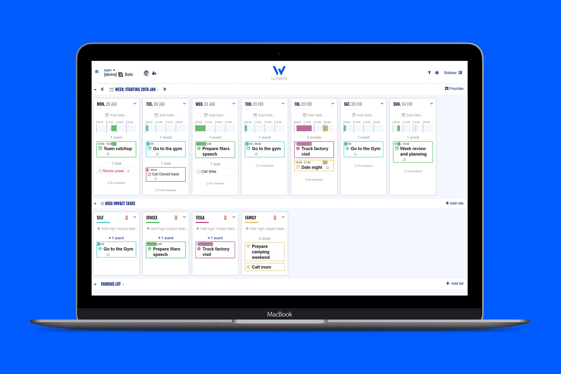
Week Plan is not your average online productivity tool.
Instead of simply collating lists of tasks, to methodically tick off as you go, Week Plan prioritises the tasks-that-matter-most, in order to achieve its users’ greater goals.
Do less, to achieve more. Prioritise to realise.
Week Plan’s methodology taps into the Rocks and Roles concepts from “7 Habits of Highly Effective People”.
The already-in-market tool wanted to shift from a B2C to a more executive B2B space. It needed an identity its subscribers were proud to be a part of, and others would want to be.
“Bold, determined and focus” were our watchwords. Elon Musk and, uniquely, The A-Team were our inspiring Executive and Teams to keep in mind.
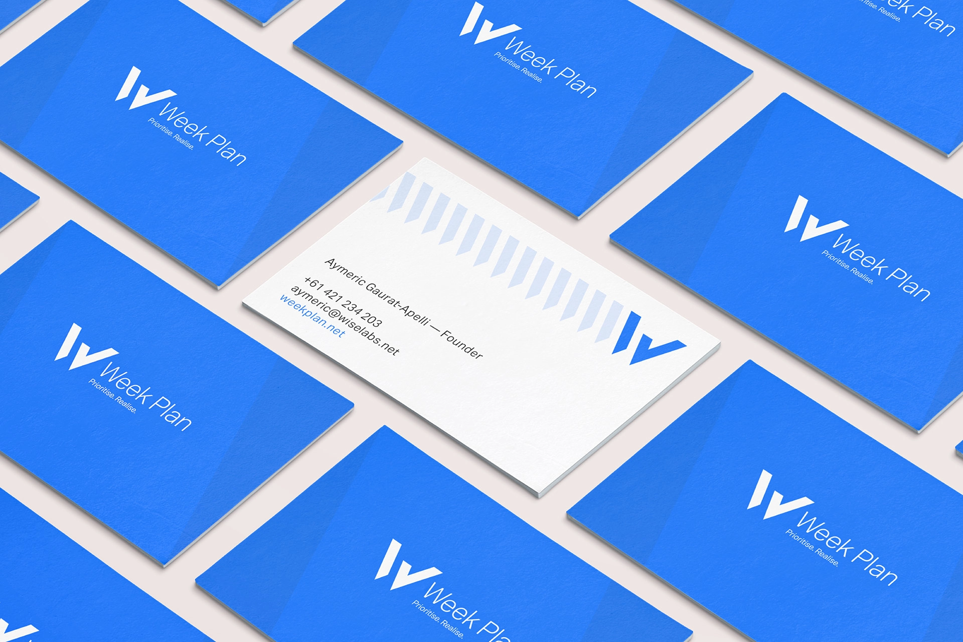
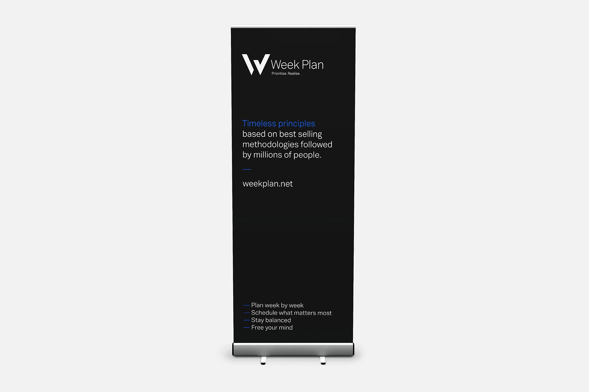
The stylised W logo represents a single task, completed. The greater identity struck the right executive chord: bold, determined and focused.
Tick. We love it when a plan comes together.
Visit Week Plan.net