3D black Colin Biggers & Paisley wordmark mounted on a white wall, showing the refined brand typography.

Colin Biggers & Paisley

Decisive action

Impact area

Empowering people

Services

Discovery research

Brand strategy

Brand identity

Brand roll out

Uniting the whole

Colin Biggers & Paisley had grown rapidly, from a Sydney boutique firm to one of Australia’s largest commercial law practices. Whilst partners had strong individual reputations, the firm’s brand was flying under the radar. In reality there were more like 70+ specialist brands in market and the three industries that defined the firm needed to help elevate the entire practice.

A sense of focus was needed to align the different areas of the practice, and to create a positioning and identity that everyone could rally around and work towards.

Remaining true-to-itself, and setting Colin Biggers & Paisley apart in an oversaturated market, were crucial markers of success for an updated brand.

Before-and-after comparison of the Colin Biggers & Paisley logo, showing the old serif blue logotype on the left and the new bold, modern sans-serif wordmark on the right.

Focusing on connection and clarity

Our research with clients, partners and staff revealed a set of deeply embedded and distinct characteristics. The firm was at their best when they were specialists in specific industries, understanding deeply all facets of those businesses and able to address their needs more holistically, creating connected outcomes and bringing clarity to complexity.

They are action-oriented and highly responsive. A driving force in creating advantage for their clients. All while holding strong social values and fostering a personable and attentive approach.

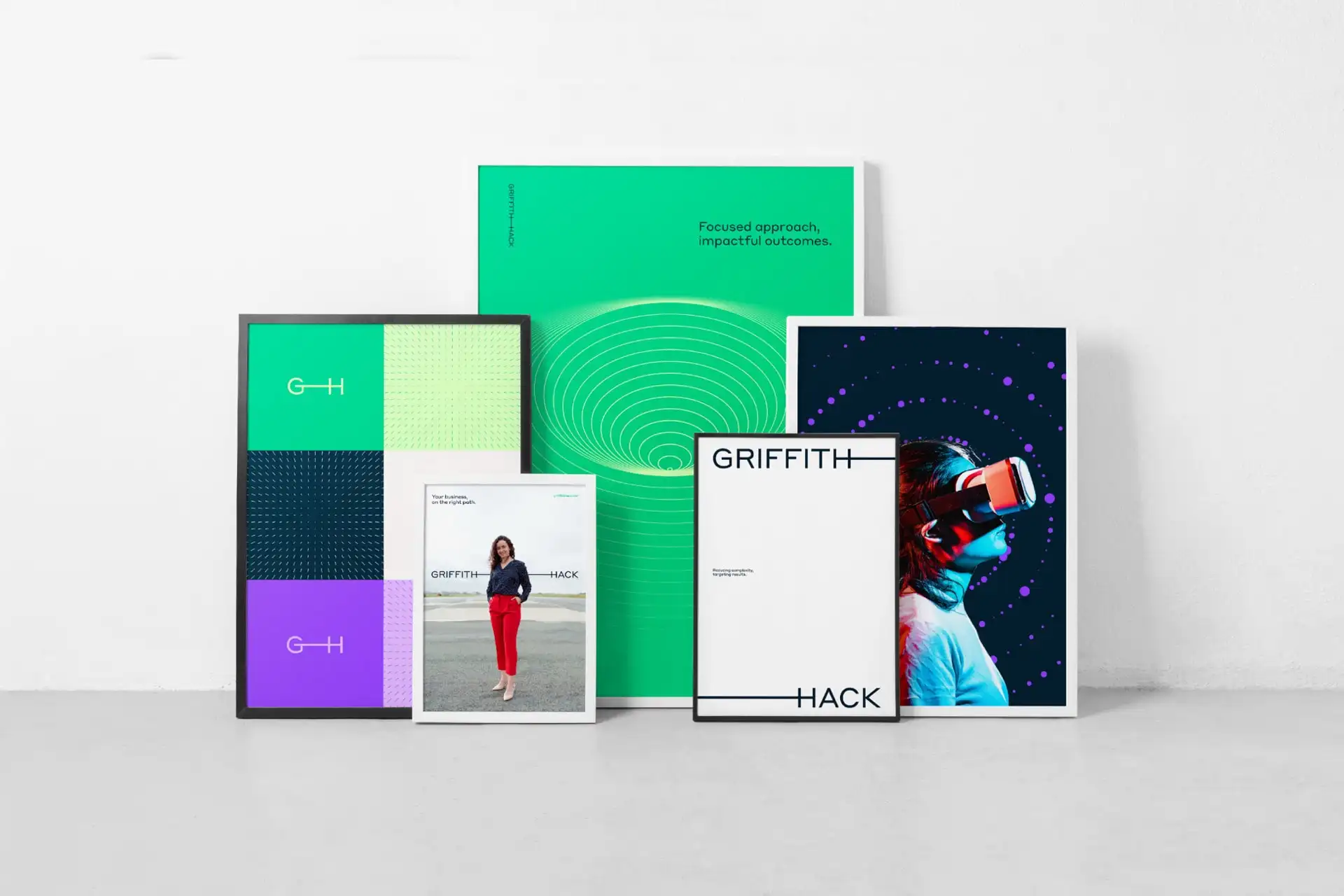
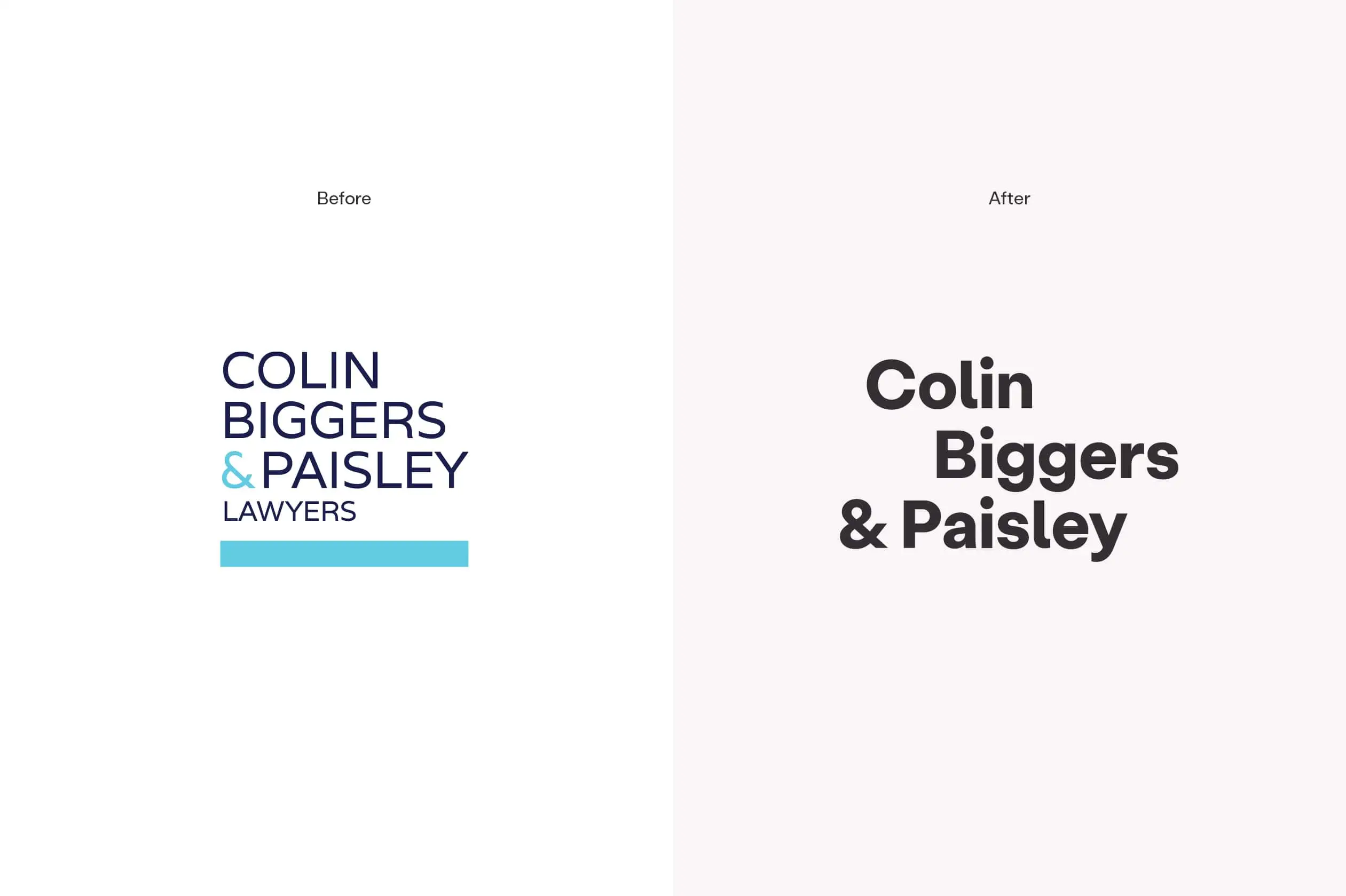
Capturing these attributes was pivotal in the design of the identity: its logo and overall aesthetic. To strike a balance – communicating approachability without compromising professionalism or formality. A brand identity with both gravitas and grace.

Stack of Colin Biggers & Paisley capability statement booklets.
Set of three Colin Biggers & Paisley posters featuring the brand’s graphic system.Colin Biggers & Paisley brand collateral laid out on a blue and white dotted background.
Colin Biggers & Paisley business cards displayed on a green surface, showing the front and back designs.Letterhead on a black folder displaying the Colin Biggers & Paisley brand.
Large Colin Biggers & Paisley billboard in an underground station with the headline “A team of teams” and vertical dotted graphic lines.
Colin Biggers & Paisley colour palette showing brand colours and their tonal variations.Colin Biggers & Paisley booklet being held by a person.

A four-strong palette of rich colours (short of gaudy and garish) brought considerable and considered energy to the identity.

Unapologetically bold – clear and simple – typography gave a personal feel, highlighting the determined clarity and approachability of the practice.

The updated brand has given the practice renewed energy and focus and created a platform for building a stronger presence in market.