Gadens

Greater confidence in a complex world

Impact area

Empowering people

Services

Discovery research

Brand identity

Messaging

User experience design

User interface design

Building a digital experience that reflects the strength of the Gadens brand.
‍
Overview
Gadens is a leading independent Australian law firm with a history dating back to 1874. With more than 120 partners and 760 staff across Australia, the firm advises clients on complex legal, regulatory and commercial matters across a wide range of industries.
The firm's expertise spans banking and finance, corporate and commercial, property and construction, energy and resources, technology, intellectual property, government, disputes and investigations, employment and workplace relations and tax.
Its client base ranges from major Australian and multinational organisations, including more than a quarter of the ASX 200, to government bodies, privately owned businesses and high-net-worth individuals.
Helping clients succeed in a complex world

‍‍Following a national integration strategy in 2024, Gadens emerged as a stronger, more connected firm, bringing together over 120 partners and 760 staff across Adelaide, Brisbane, Canberra, Melbourne, Sydney and an associated office in Perth.

The firm's vision was clear: to strengthen its position in the market as a leading independent Australian law firm.

To support this vision, Gadens needed a digital presence that matched the quality of its services, people and client experience.

‍

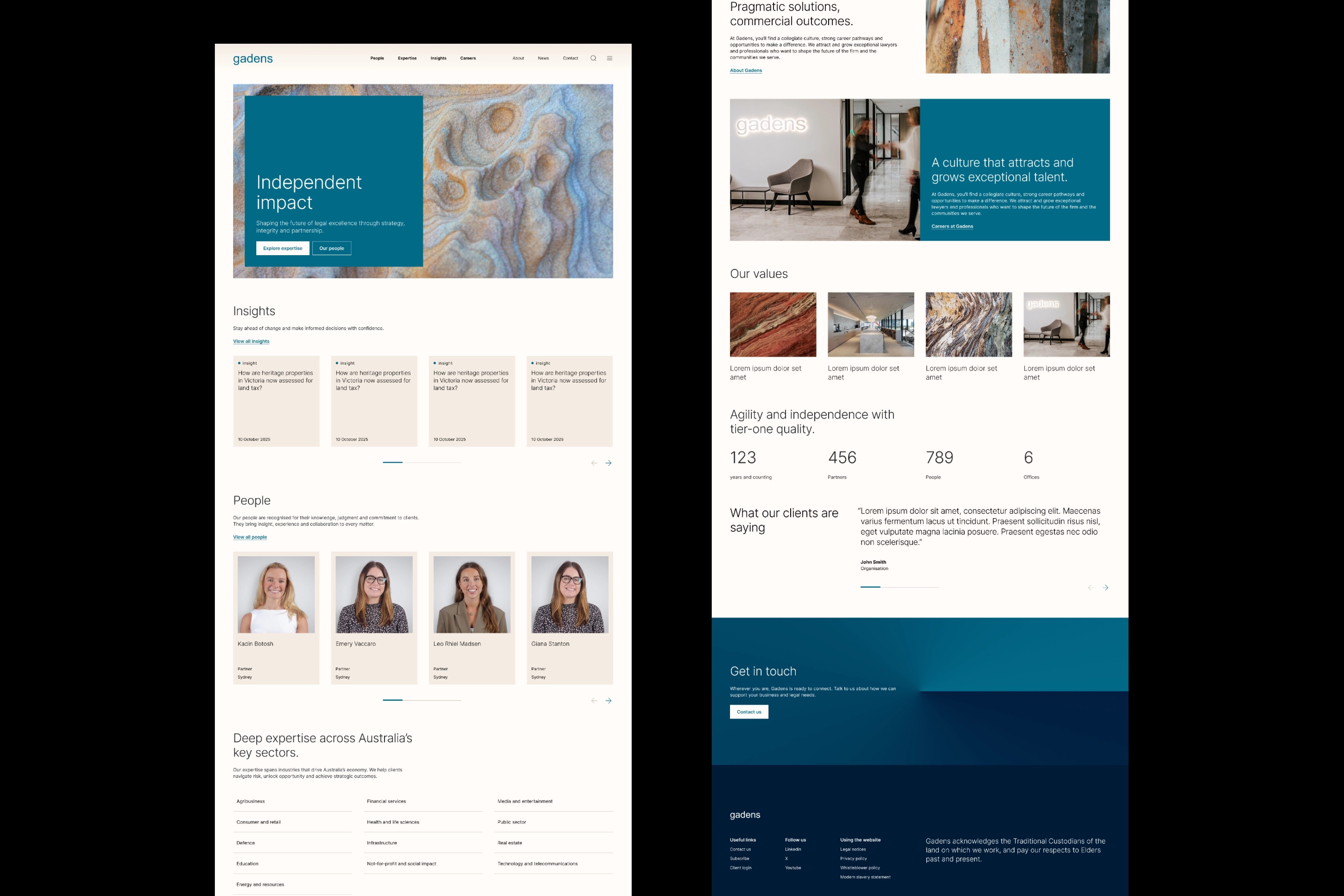
Re-imagining the digital front door

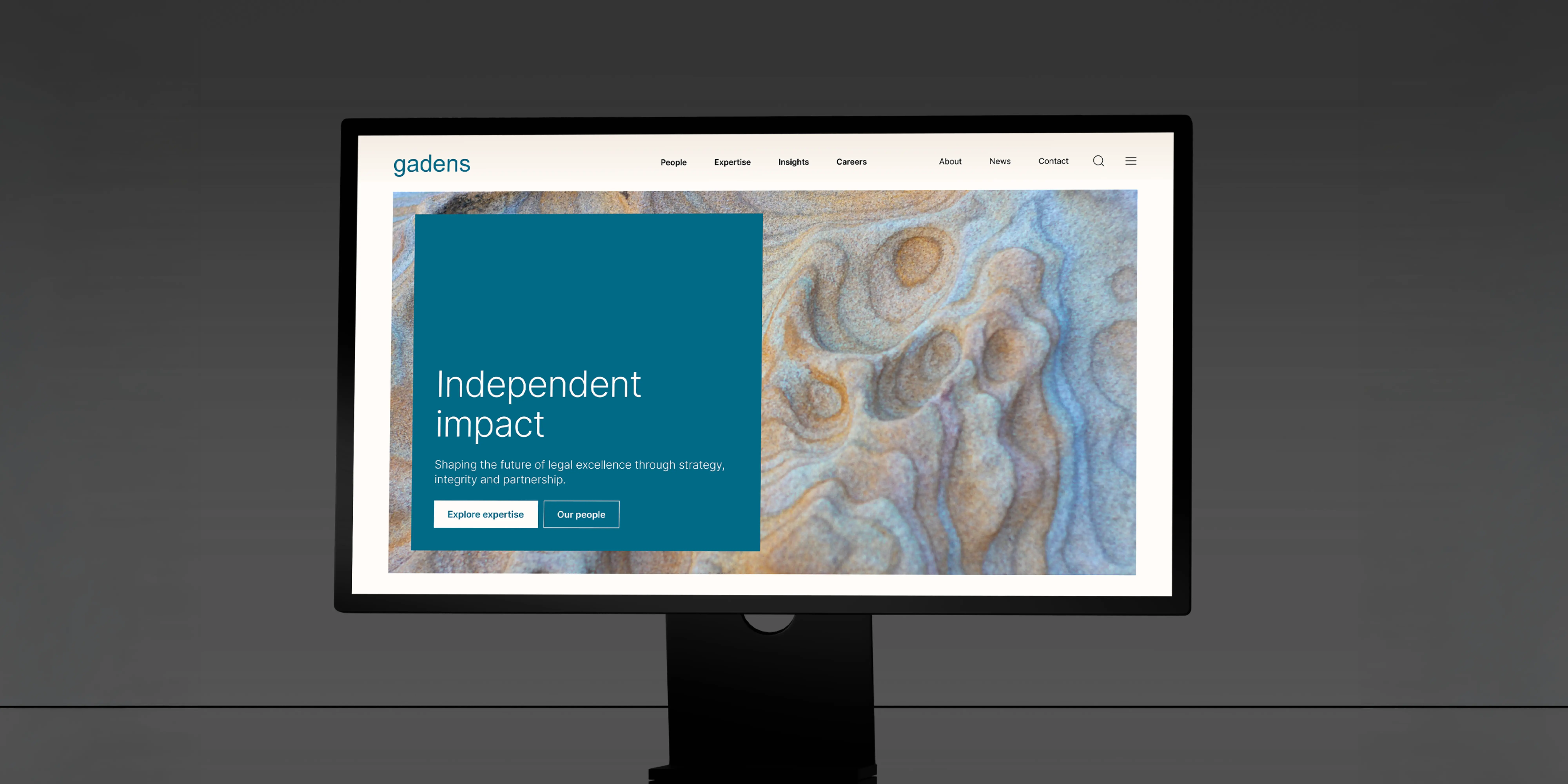
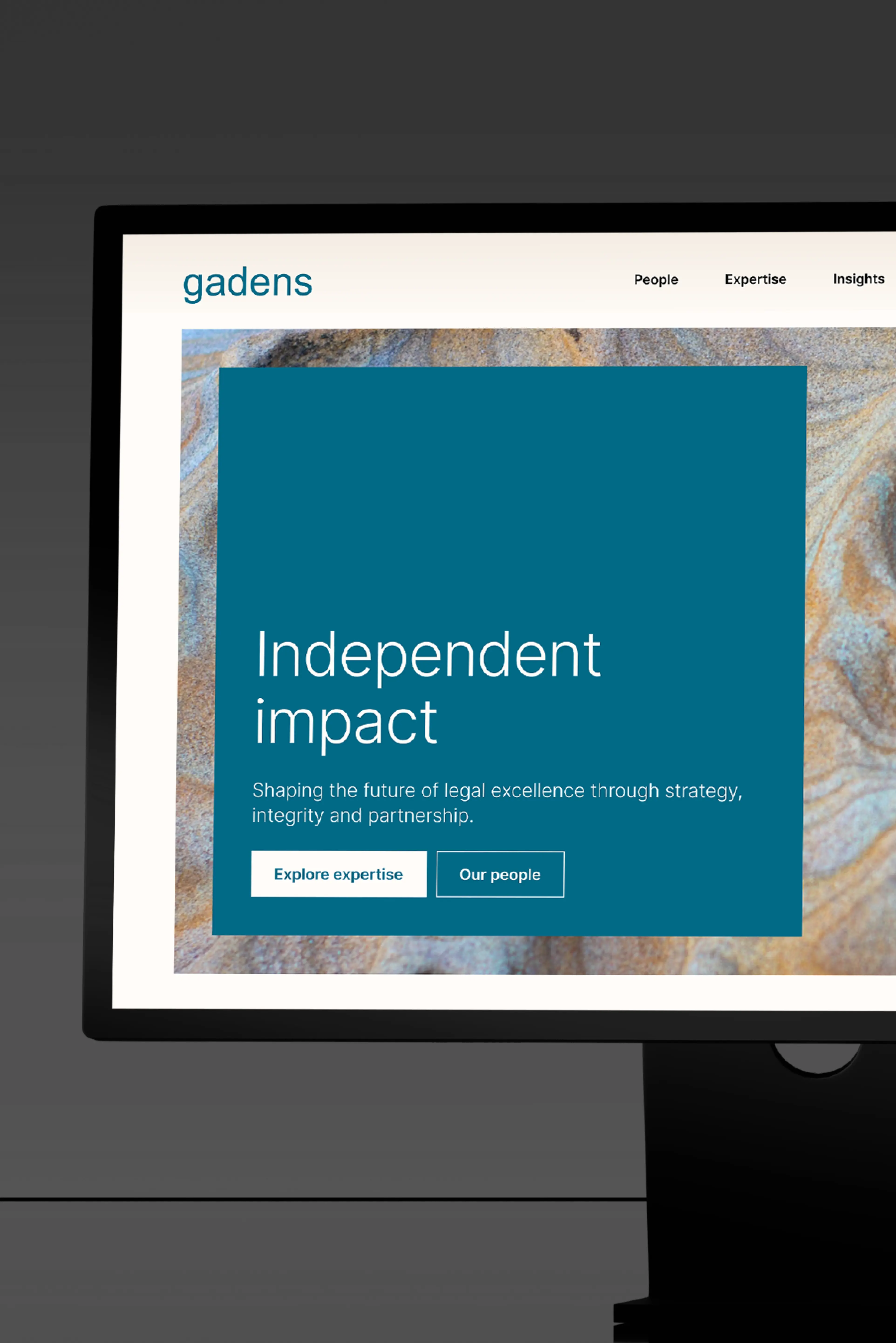
The firm's website is often the first interaction clients, prospects and future talent have with the Gadens brand. More than a marketing channel, it is a platform for engagement, reputation and growth.

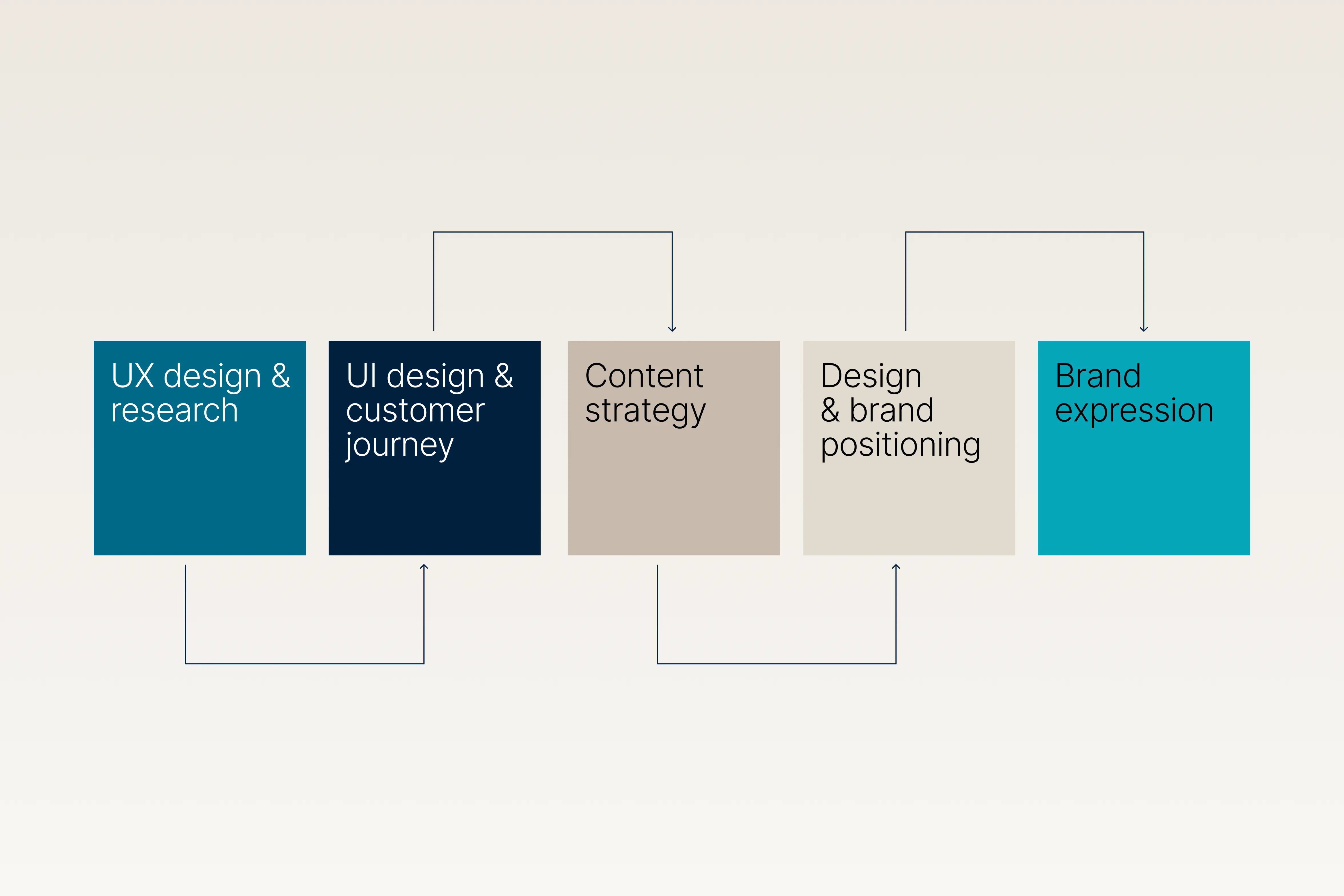
Through a comprehensive review of customer journeys, content strategy and brand expression, Gadens set out to create a website that better reflected who it is today and where it is heading.

The result was a digital experience designed to support business development, strengthen client relationships and attract exceptional talent.

‍

Understanding the challenge

Internal stakeholder discovery sessions – the right amount with the right people – were planned and conducted, to answer Folk and Squiz’s requisite learning goals.We needed to fully understand the nuances, the challenges and opportunities within the project vision. Namely:

  • Strategic direction and brand positioning
  • Business development and client engagement
  • Website content
  • Talent attraction and acquisition
  • Operations, technology, and compliance

Our discovery focused on understanding the current state and pinpointing opportunities to enhance the user experience.

  • Familiarisation and immersion
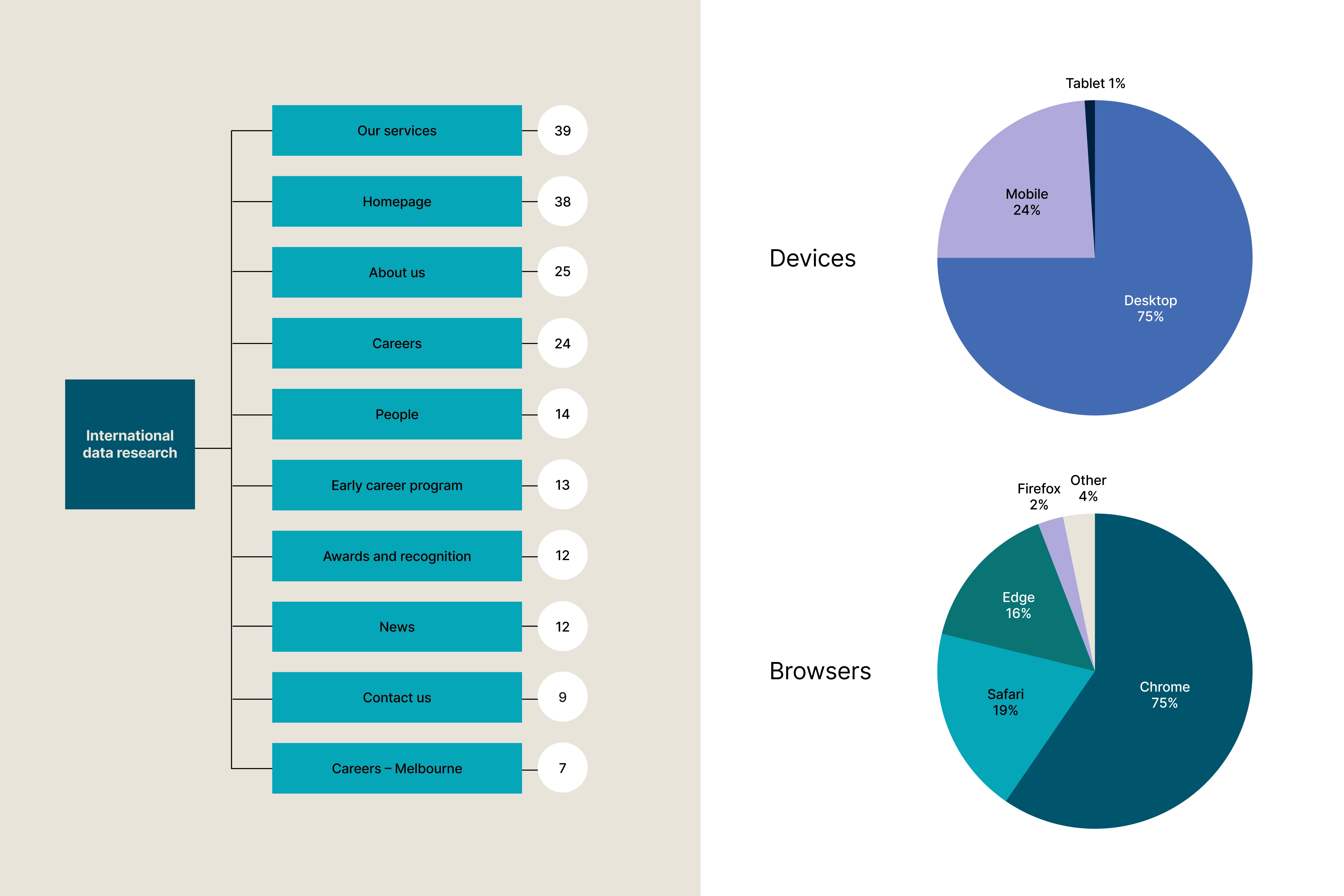
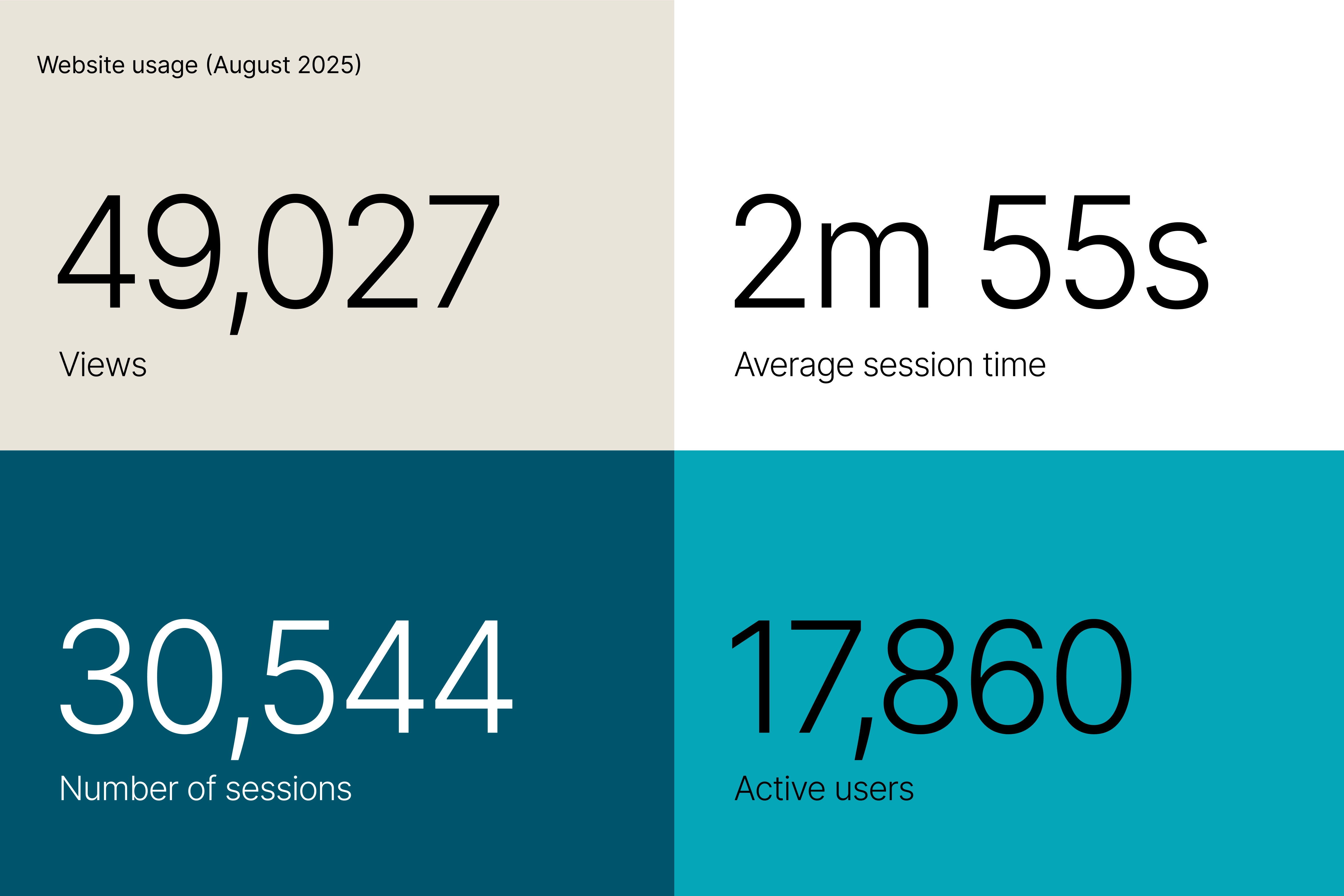
  • Analytics, site, and CMS audit
  • Experience audit
Learnings: what vs ‘so what’

The website was no longer meeting the needs of the external audiences, and internal stakeholders.“Outdated, cluttered, unclear”, it misaligned with the firm’s ambitions, impacting credibility.It needed significant improvement in its:

  • Brand positioning and sector focus
  • Expertise architecture, credentials and people profiles
  • UX: navigation, search and CMS
  • Flexibility in content and design
  • Accessibility standards.
Servicing and surfacing client needs

‍Gadens needed to move away from a ˝laundry list” of services and outdated terminology and adopt a ˝sector-first approach” with client and search-friendly categories.

Differentiation now comes from clarity, consistency, and an independent positioning, while using familiar patterns aiding usability. Rationalised site architecture is now flexible, with the ability to evolve as sectors and services grow.

‍

Speaking confidently, consistently

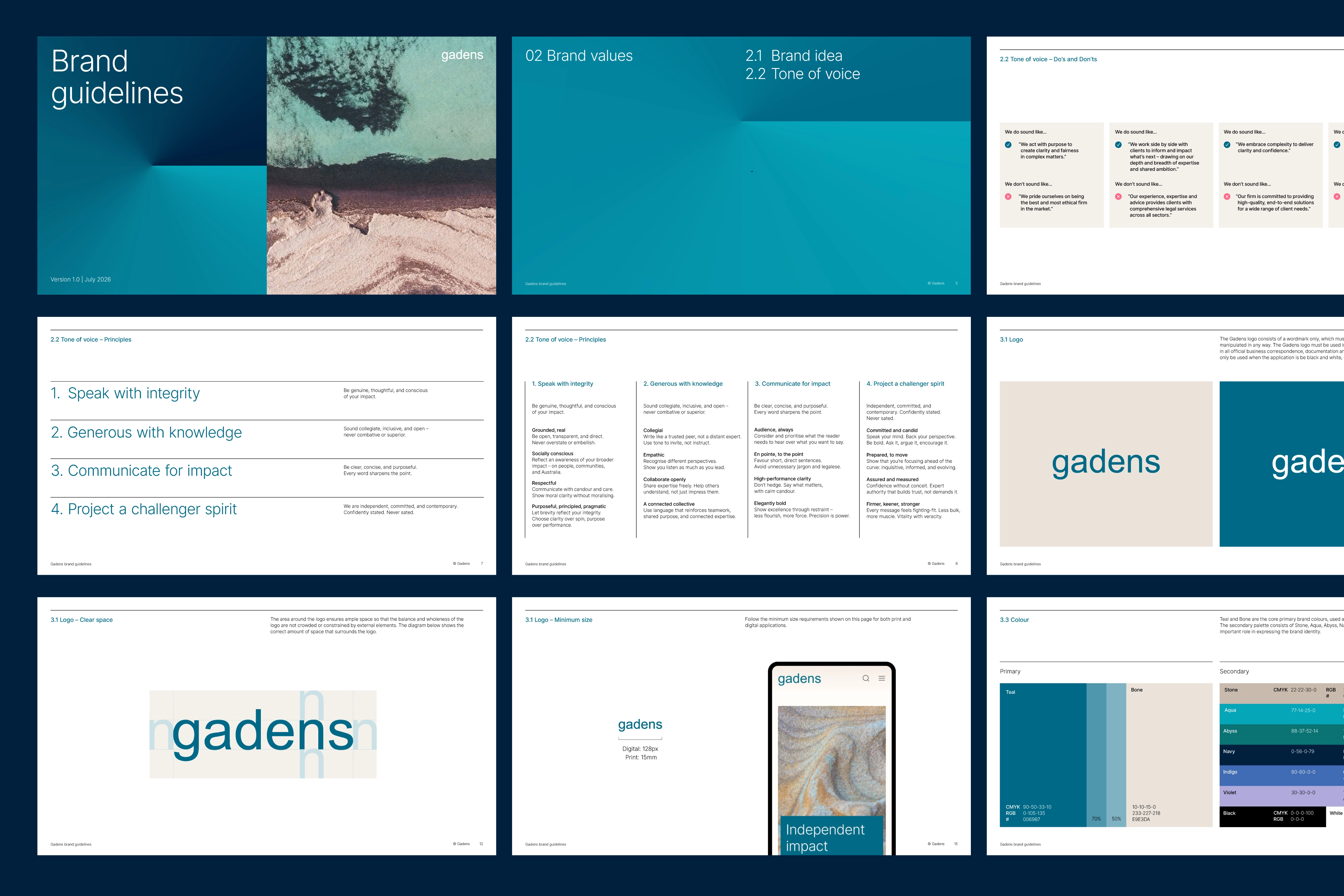
Built upon the strategic vision and website design principles and new brand positioning, we developed a Tone of Voice guideline, to help ensure voice remains consistently pointed and en pointe.

The guideline comprises an over-arching brand voice idea, four voice principles and tactics and practical examples of how to deploy in use.

A decisive and expansive evolution

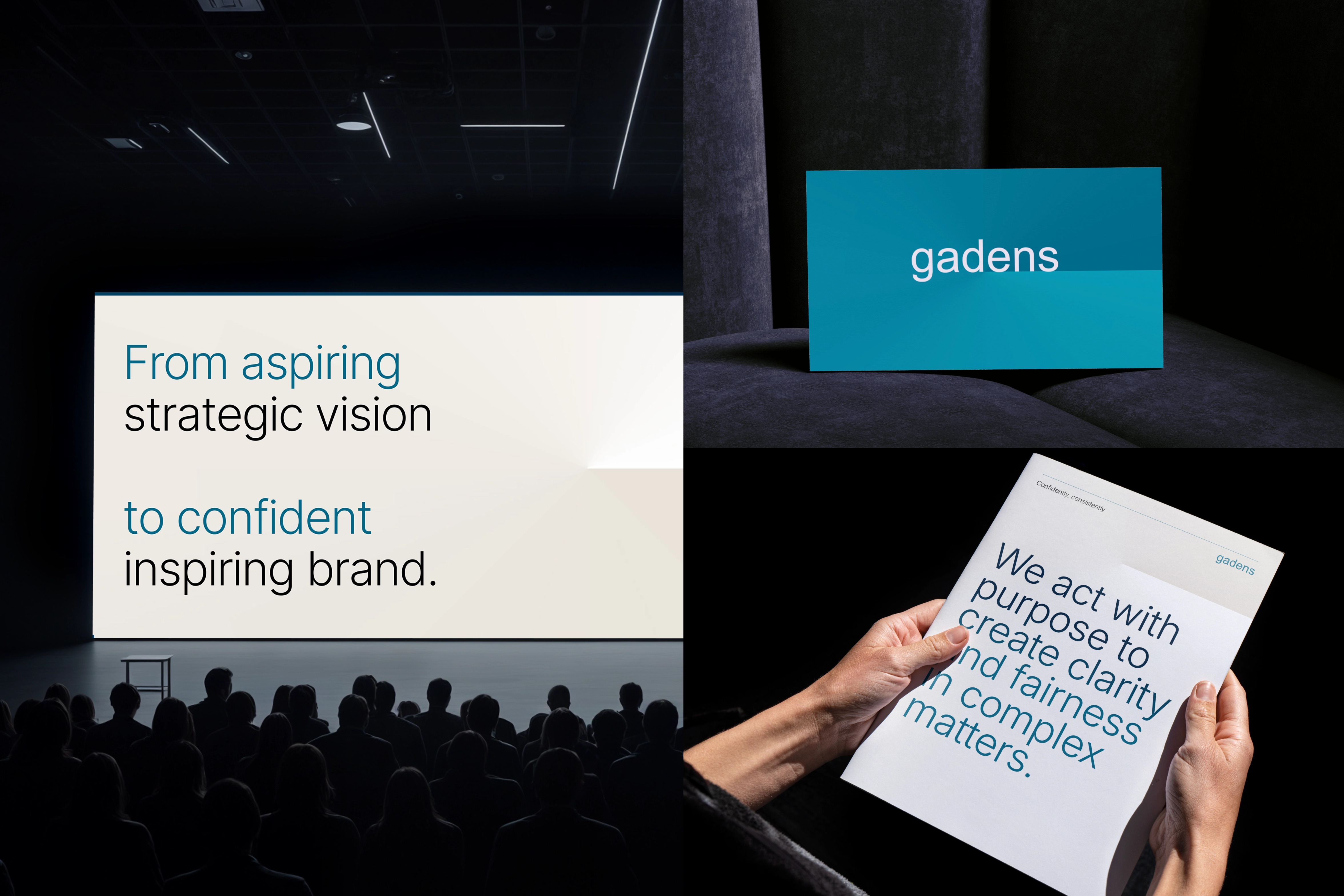
The identity refresh had to balance: a clear shift in positioning, while still clearly Gadens. Presenting a now-and-next Gadens. Evolved. Taking inspiration directly from the aspirational strategy.

The Gadens logo – remaining unchanged – is notably efficient. Independent. Confident. These attributes were embraced throughout the identity refresh.

The perimeter of Gadens’ circular device disappeared, while its ‘horizon’ gradient housed within expanded. Supporting a bigger, broader, ‘across Australia’ positioning. The shifting ‘horizon’ gradient providing a dynamic constant.

Typography is more deliberate. Small type is smaller, keener. Large type larger, stronger. (Be it incumbent ‘Arial’ or introduced ‘Inter’. Similarly, colour has greater contrast – light and shade, fewer mids – derived from the existing palette.

This efficiency allowed imagery to ‘flex’. As an ardent patron of Australian arts, imagery – as natural or man-made ‘canvases’ – added Gadens’ passion to its shared purpose.

Elegant in its efficiency. Independent in its discipline. Less is more effective. More Gadens.