
Thomsons

Raising the bar

Impact area

Empowering people

Services

Discovery research

Brand strategy

Brand identity

Messaging

User experience design

User interface design

Second introduction here

Overview

Thomson Geer had reached an inflection point.

Over more than a decade, the firm had steadily expanded its footprint, growing partner ranks, broadening its capabilities and building credibility in increasingly complex, high-value work. It was no longer competing with the mid-market firms it had emerged alongside. The ambition now was clear, establish the firm as a serious top-tier player.

“We have invested in areas where we believe we can compete at the highest level, and we have built practices that are now recognised nationally and internationally for the quality of their work.”
- Adrian Tembel, Chief Executive Partner

But the brand hadn’t kept pace.

At the same time, the firm embarked on splitting out their ‘Legal and Technology’ services business into a specialised standalone firm that combines lawyers, technologists and operational specialists for institutional clients managing portfolios of “business-as-usual” legal work.

Folk partnered with the firm’s leadership to sharpen the brand and redesign the digital experience to build a clearer expression of the firm they had already become.

Top tier confidence

As part of the repositioning, Thomson Geer became Thomsons.

The leadership team had a strong internal sense of identity. They described themselves as disciplined, direct and commercially astute. Ambitious, but not performative. Serious, but not old-world. The brand needed to reflect this confident and steely stance.

This became the foundation of the repositioning.

We worked through a set of deliberate shifts designed to move the firm into a top-tier space. From challenger to established. From under-the-radar to confident calibre. From an outsider to part of the top rank.

The strategy was not to make Thomsons louder. It was to make the firm more exacting.

A deeper, more deliberate expression

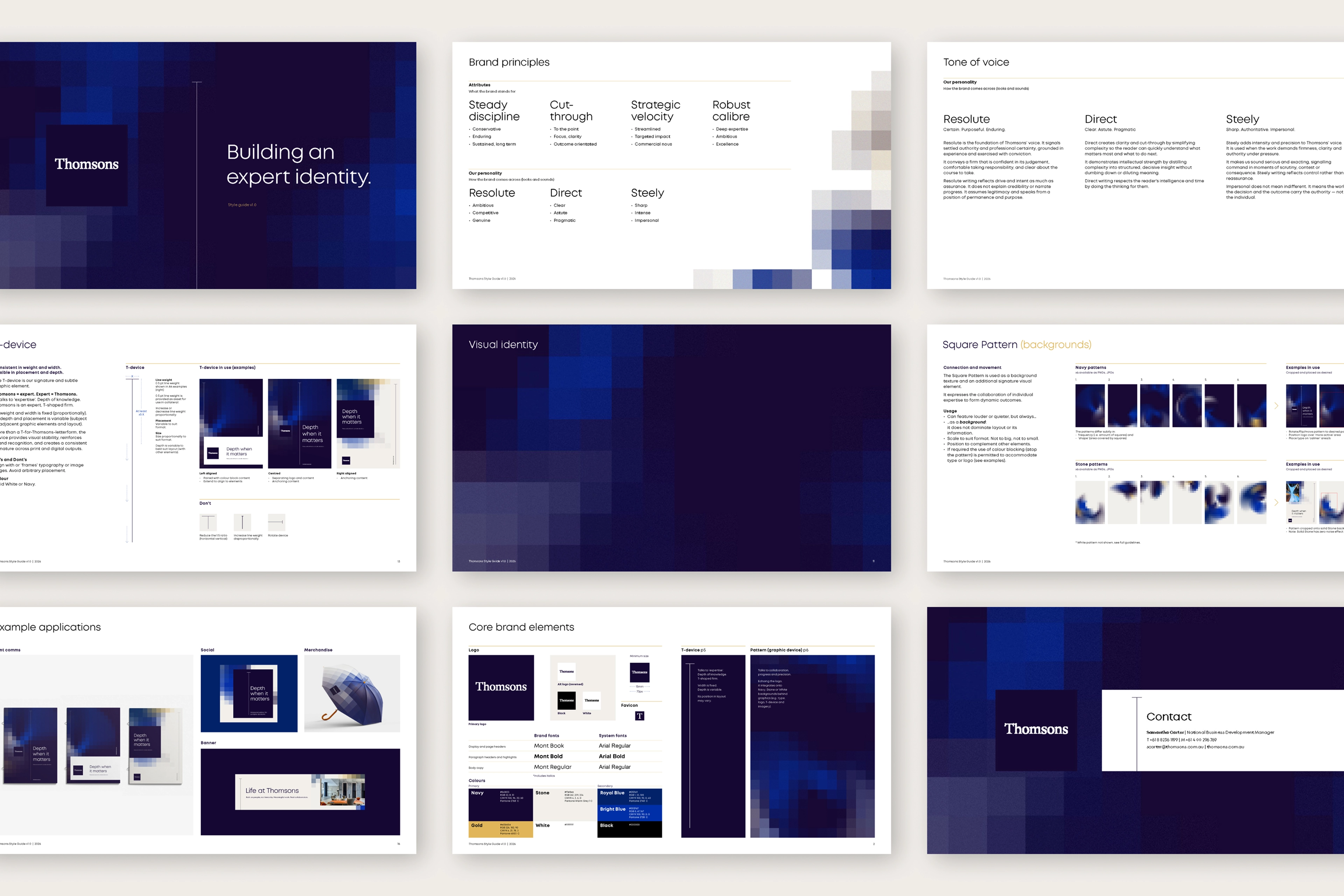
The visual system was designed to express calibre, precision and control.

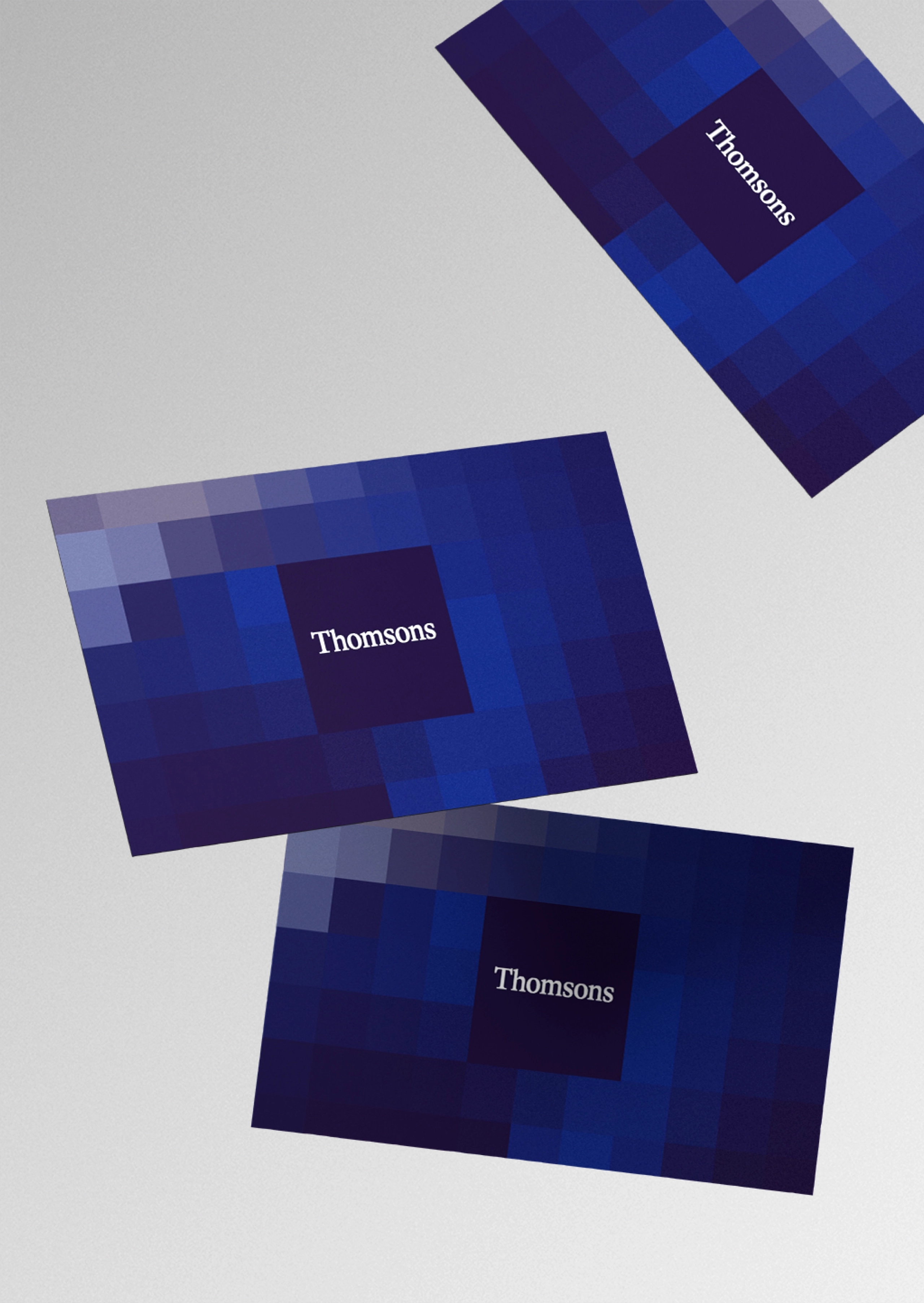
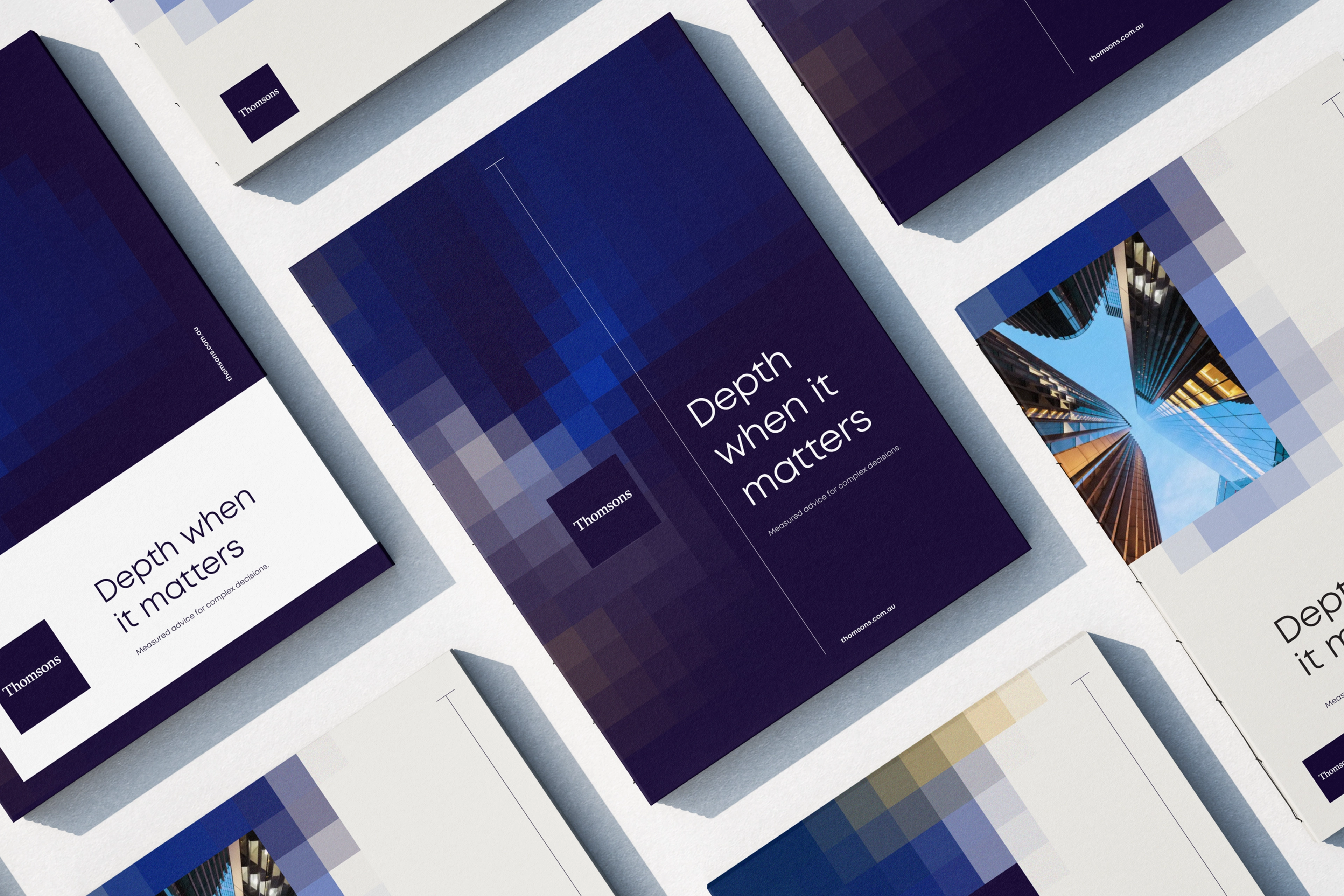
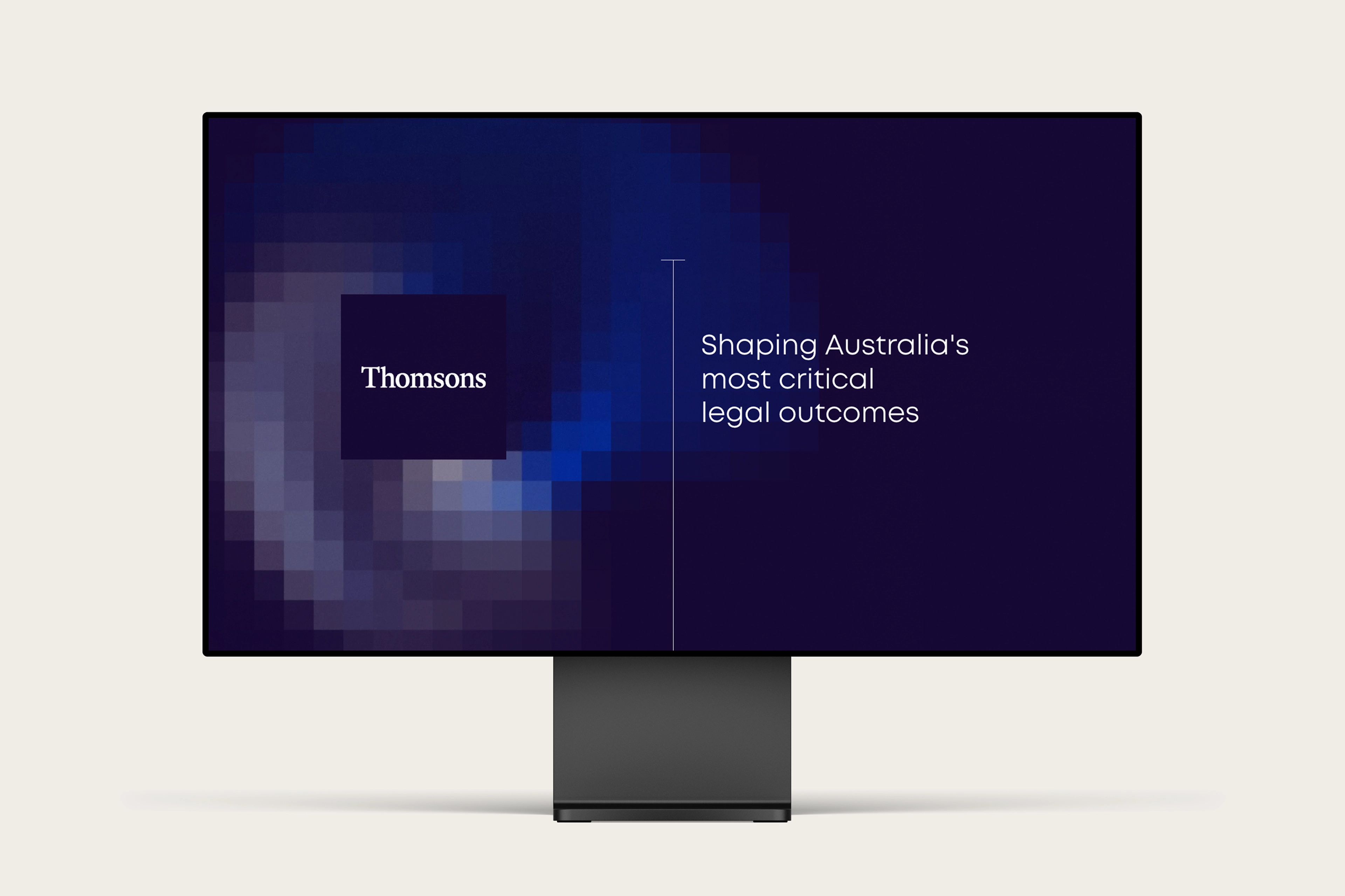
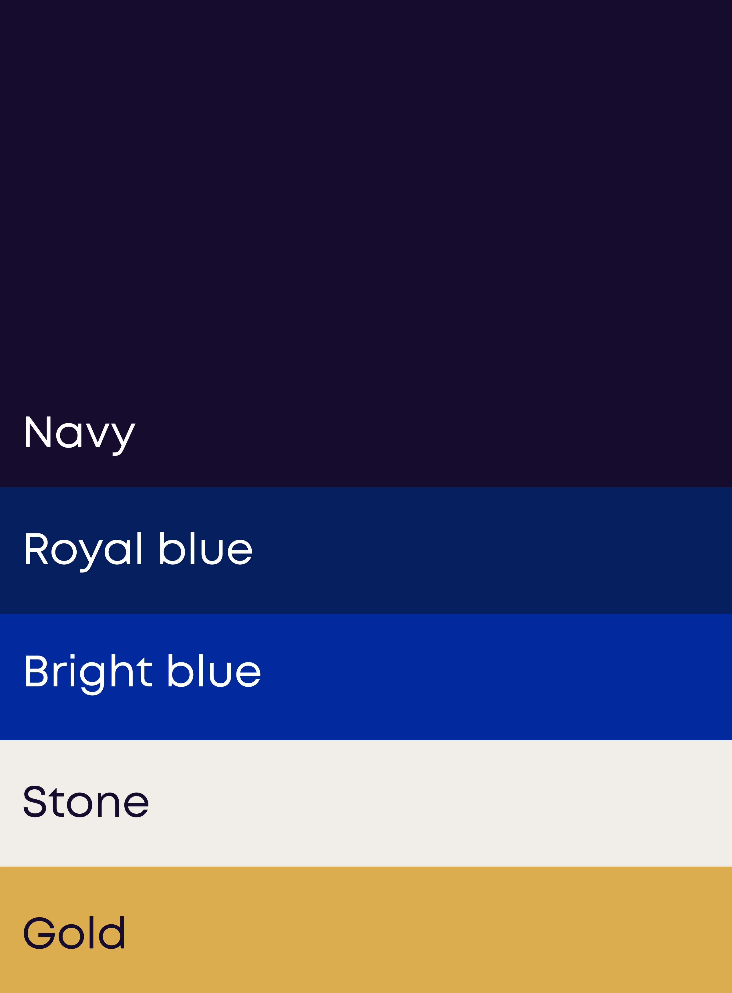
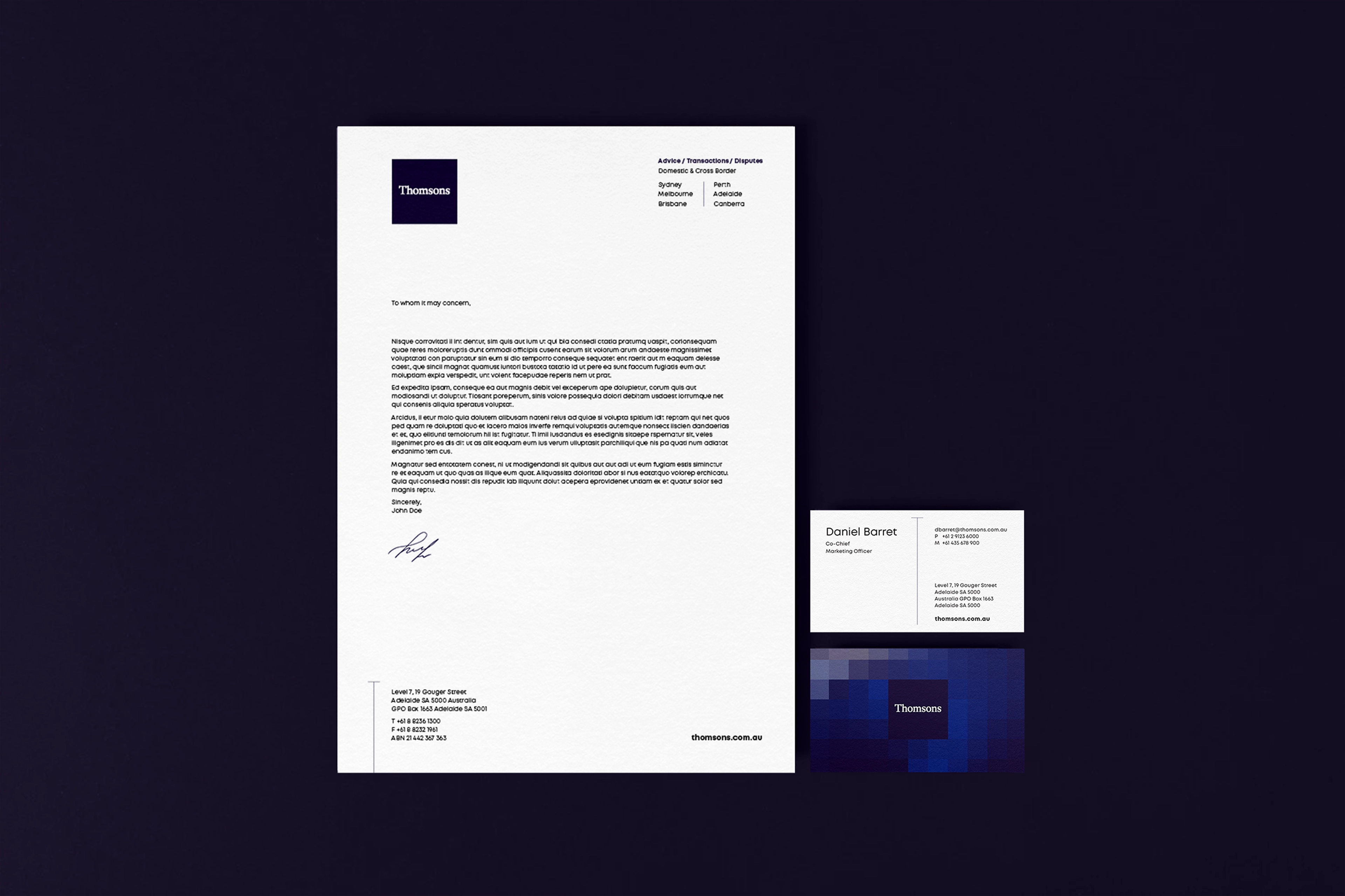
A restrained palette of deep navy, stone and gold introduced a sense of depth and intensity without relying on the visual clichés of corporate law firms. Typography and layouts are confidently calmer to feel more structured, intentional and uncompromising.

Central to the identity is the “T-device”which became a subtle and signature way to express expertise depth and cut-through, while quietly echoing the T of Thomsons. The broader graphic system reinforced this sense of disciplined momentum. Layered square patterns introduced texture and rhythm, while architectural imagery replaced generic corporate photography to create a stronger sense of scale and permanence.

A website to showcase the firm's calibre

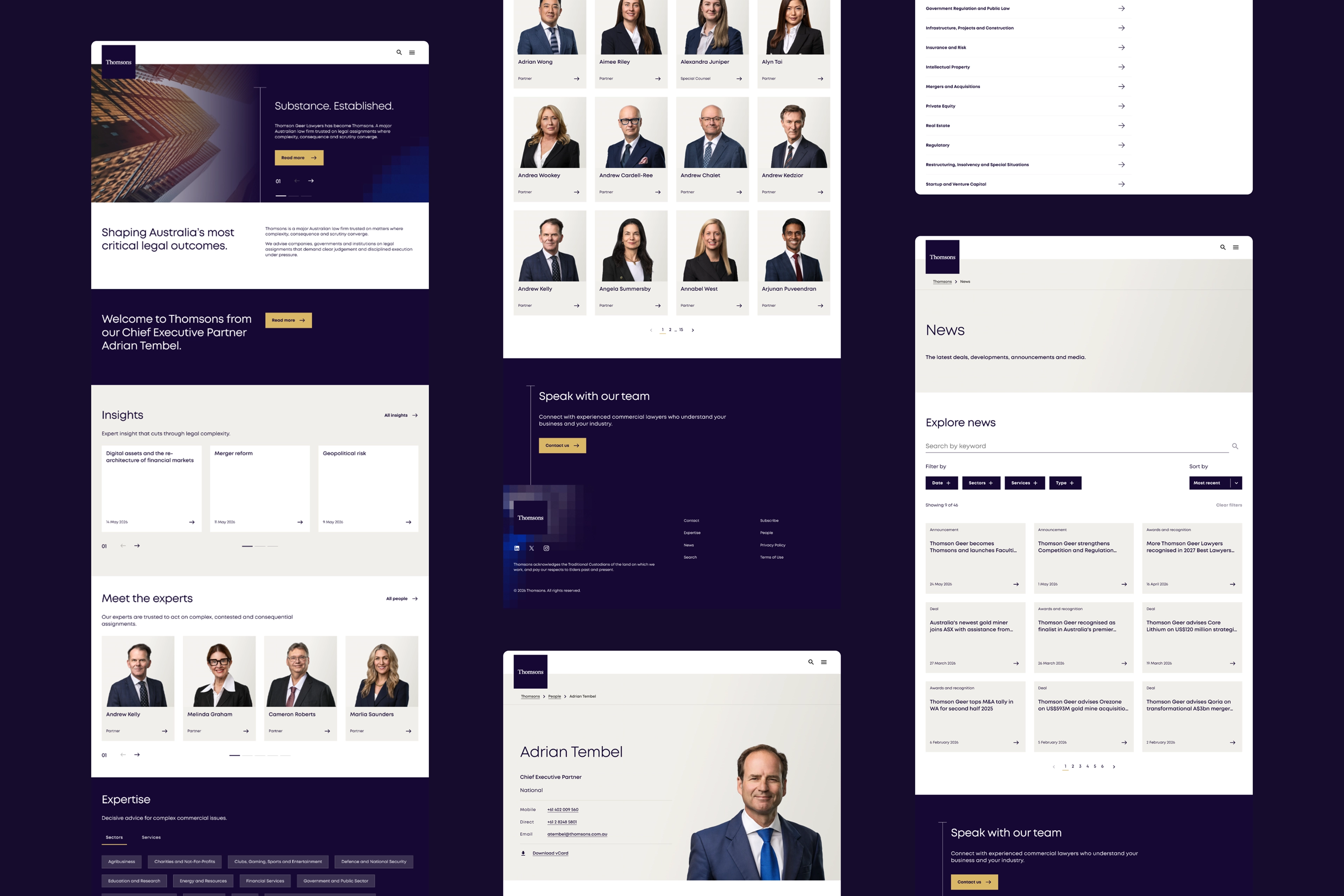
Beyond applying the new branding to the website, the user experience needed to be more effective at validating the firm’s capability and value for prospective clients – locally and internationally.

Clearer messaging established a stronger value proposition, while the information architecture untangled previously blurred sections, separating services from sectors, and news from insights and surfaced thought leadership and deals more prominently.

We created richer connections between the people, practices areas, thought leadership and major deals that enable better validation about the depth and calibre of the firm.

A more defined position

The firm relaunched as Thomsons. No longer a challenger seeking attention, but an established tier 1 firm with confidence, precision and intent. Renewed clarity and directness gave the firm new energy to rally around internally and signalled confidently where the firm sits in the market.