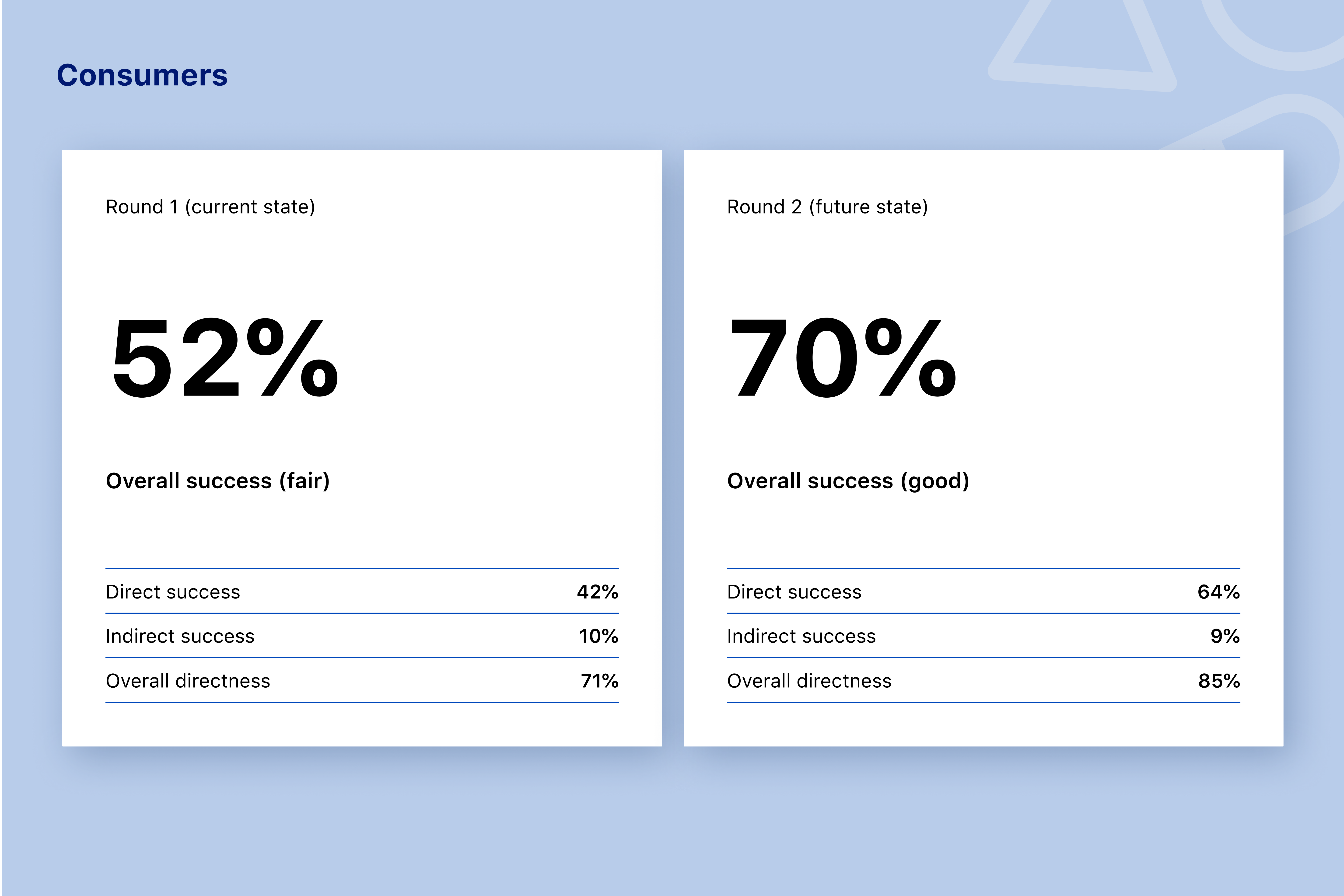
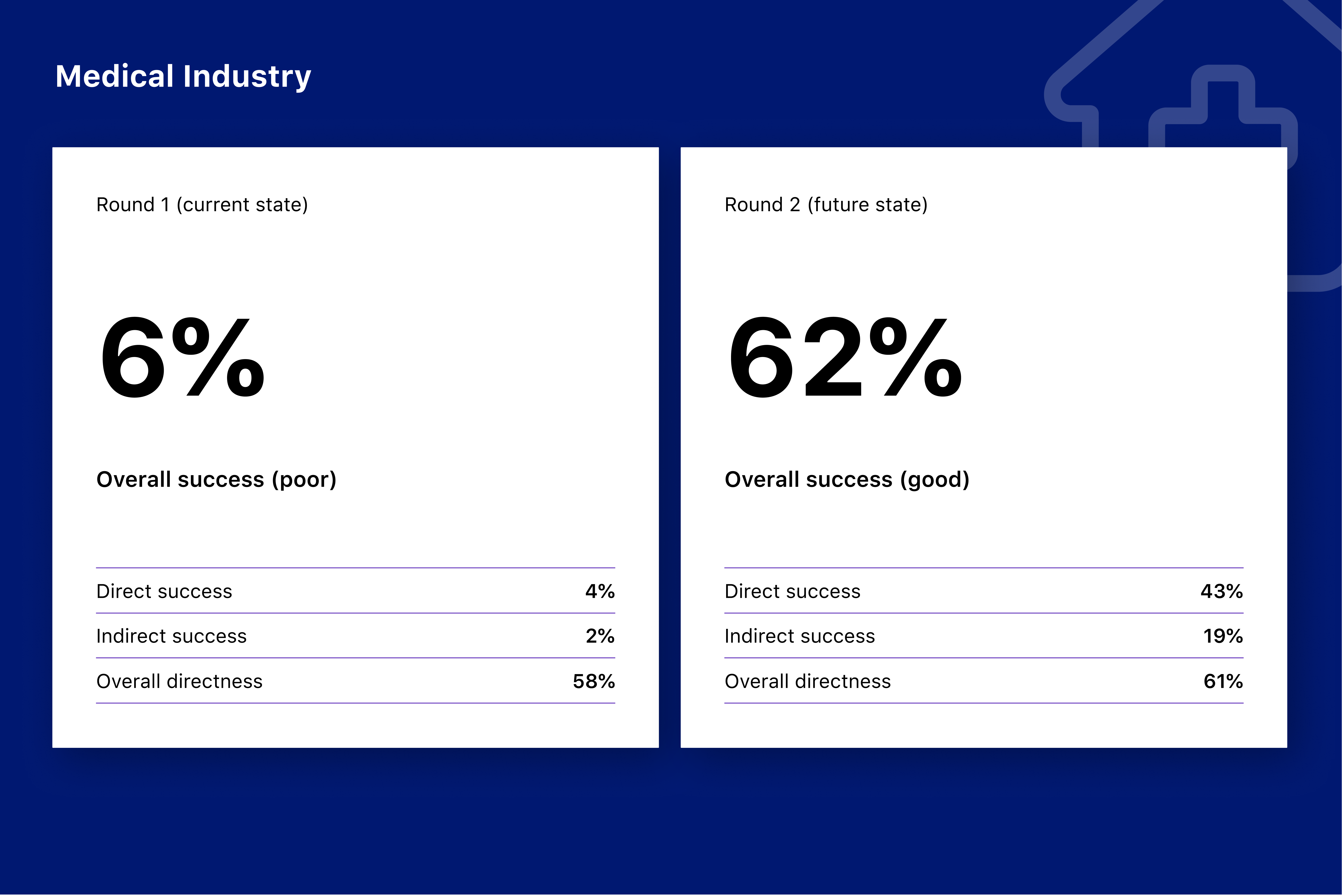
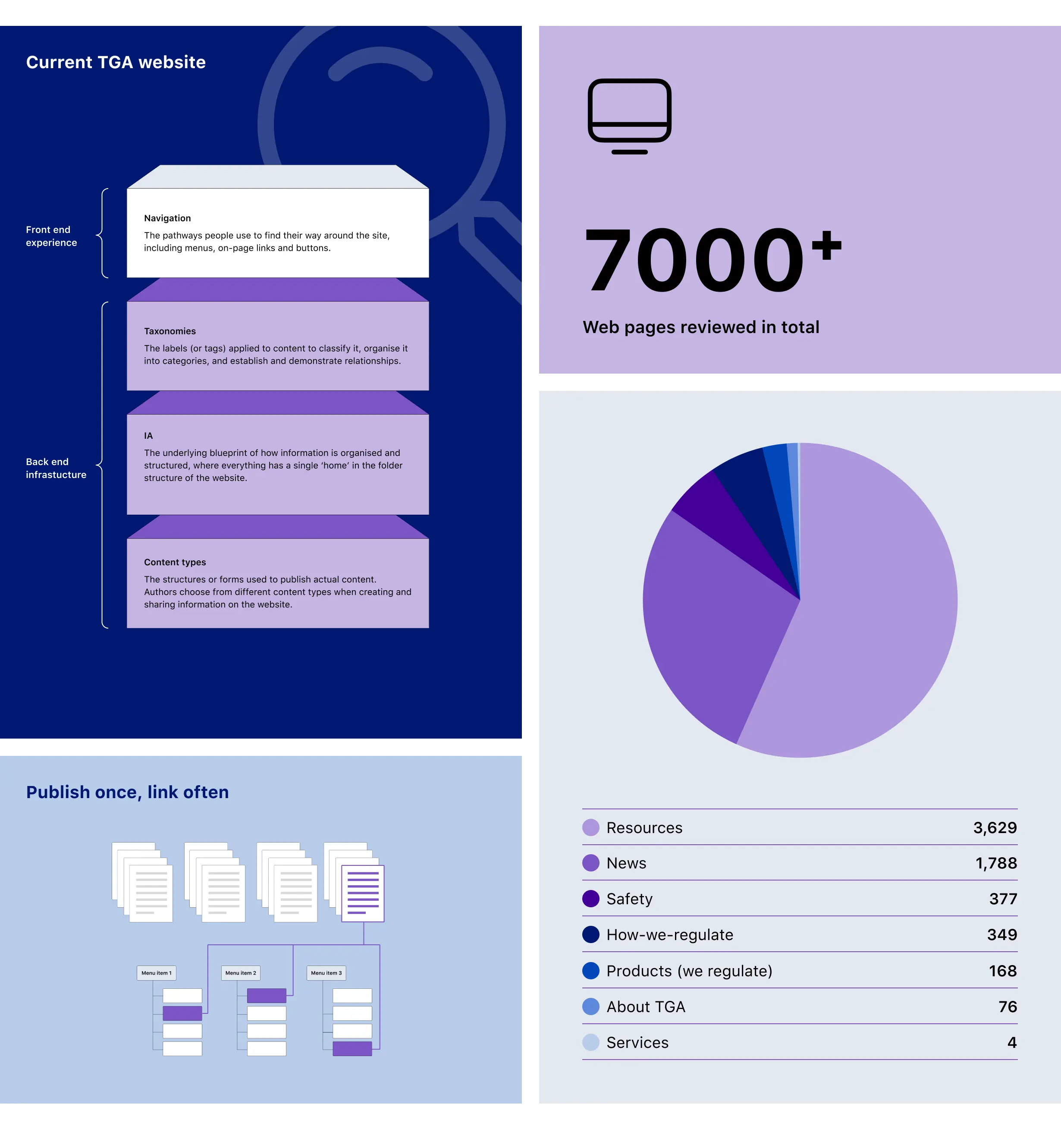
Therapeutic Goods Administration (TGA)

Making complex regulation easier to navigate

Impact area

Health and wellbeing

Services

Discovery research

Content strategy

User experience design

User interface design

Implementation and delivery

Overview

As a follow-on piece to the Digital Transformation Project, we continued working with the Therapeutic Goods Administration to redesign the information architecture (IA) of tga.gov.au. The goal: help industry, health professionals and consumers find what they need quickly, and reduce risks to safety and compliance.

The challenge

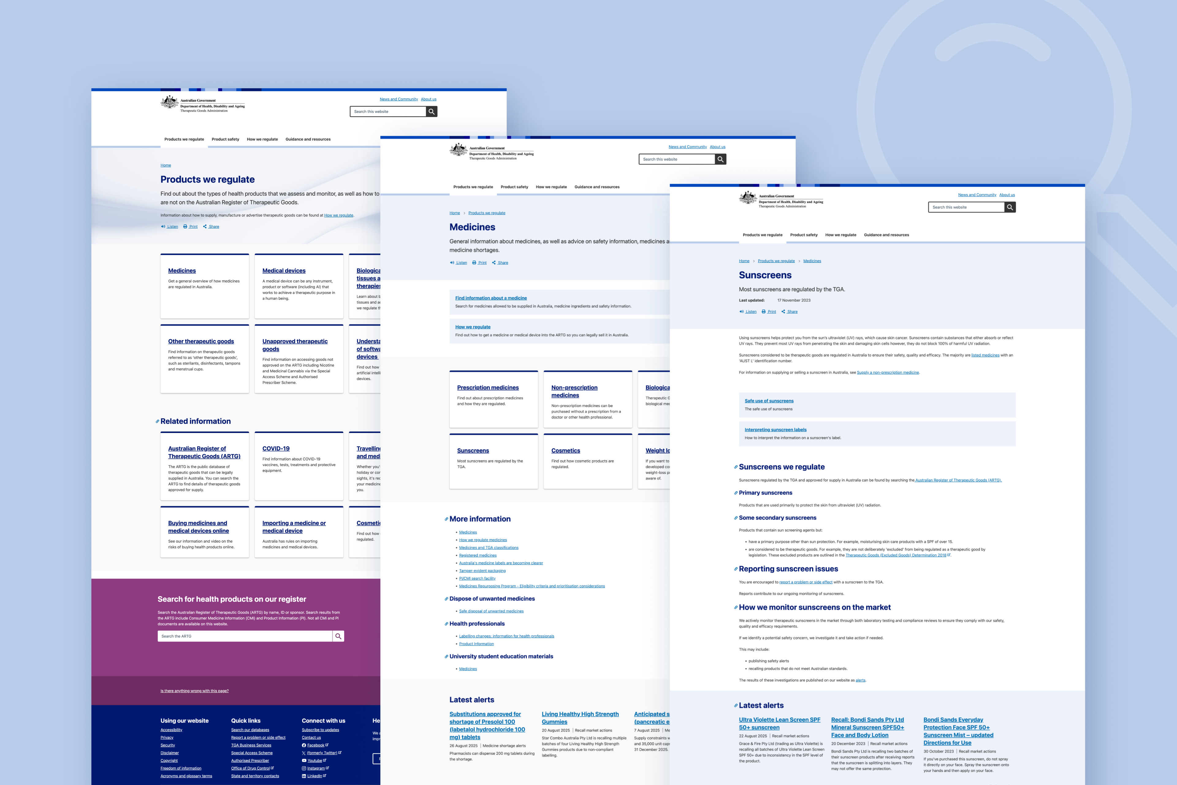
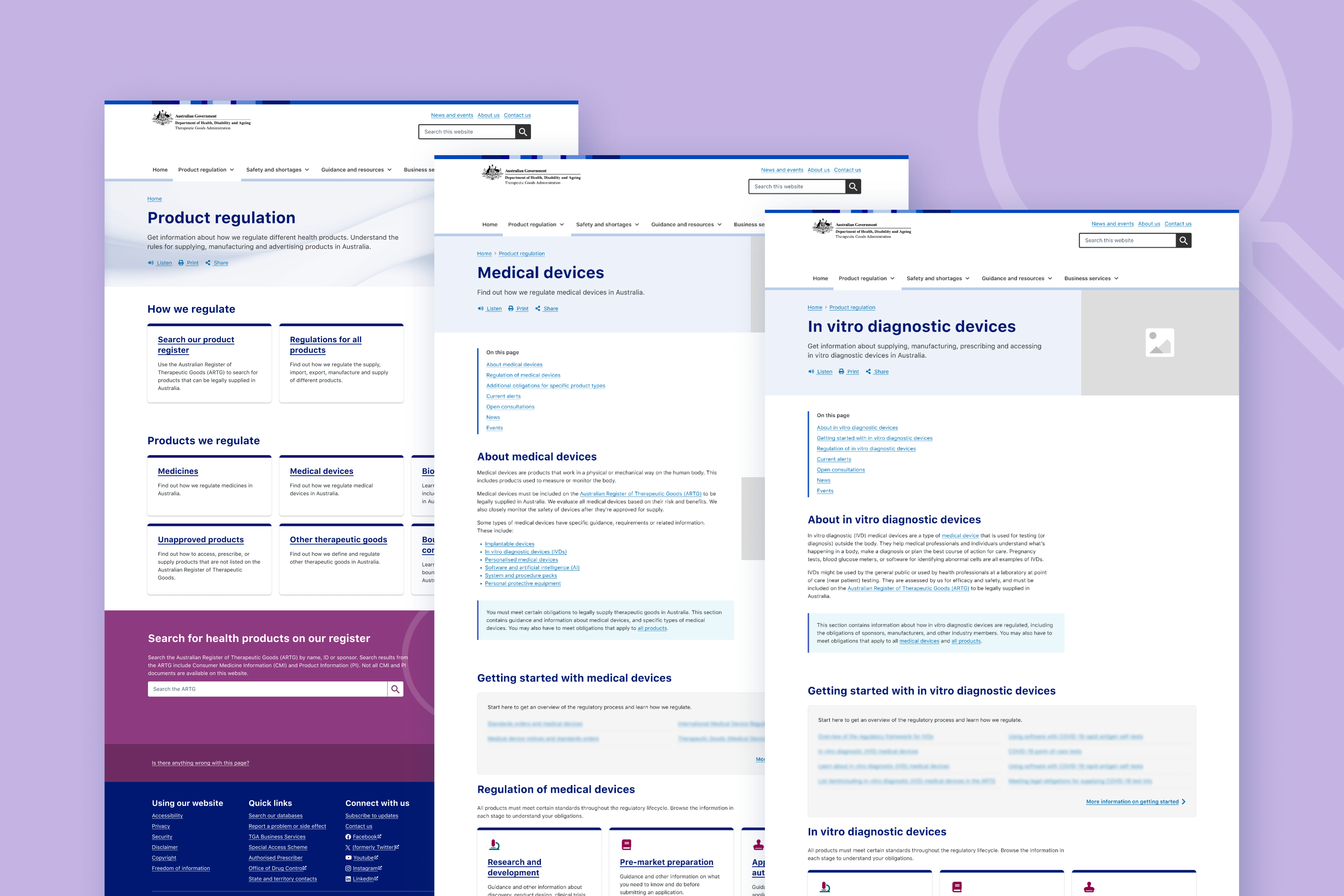
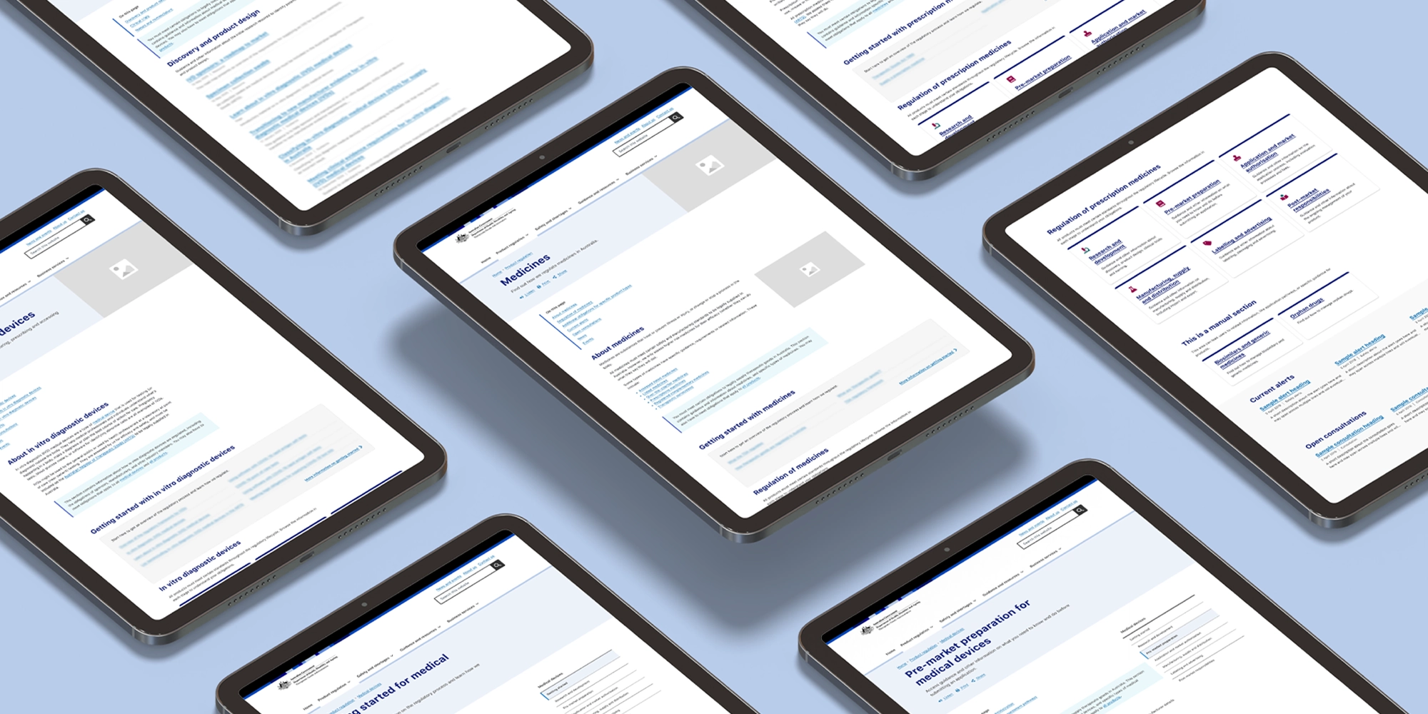
The TGA regulates thousands of therapeutic goods, from prescription medicines to medical devices and emerging technologies. Their website is the front door to this complex regulatory environment. With so much content to sort through, users struggled to find the right information.

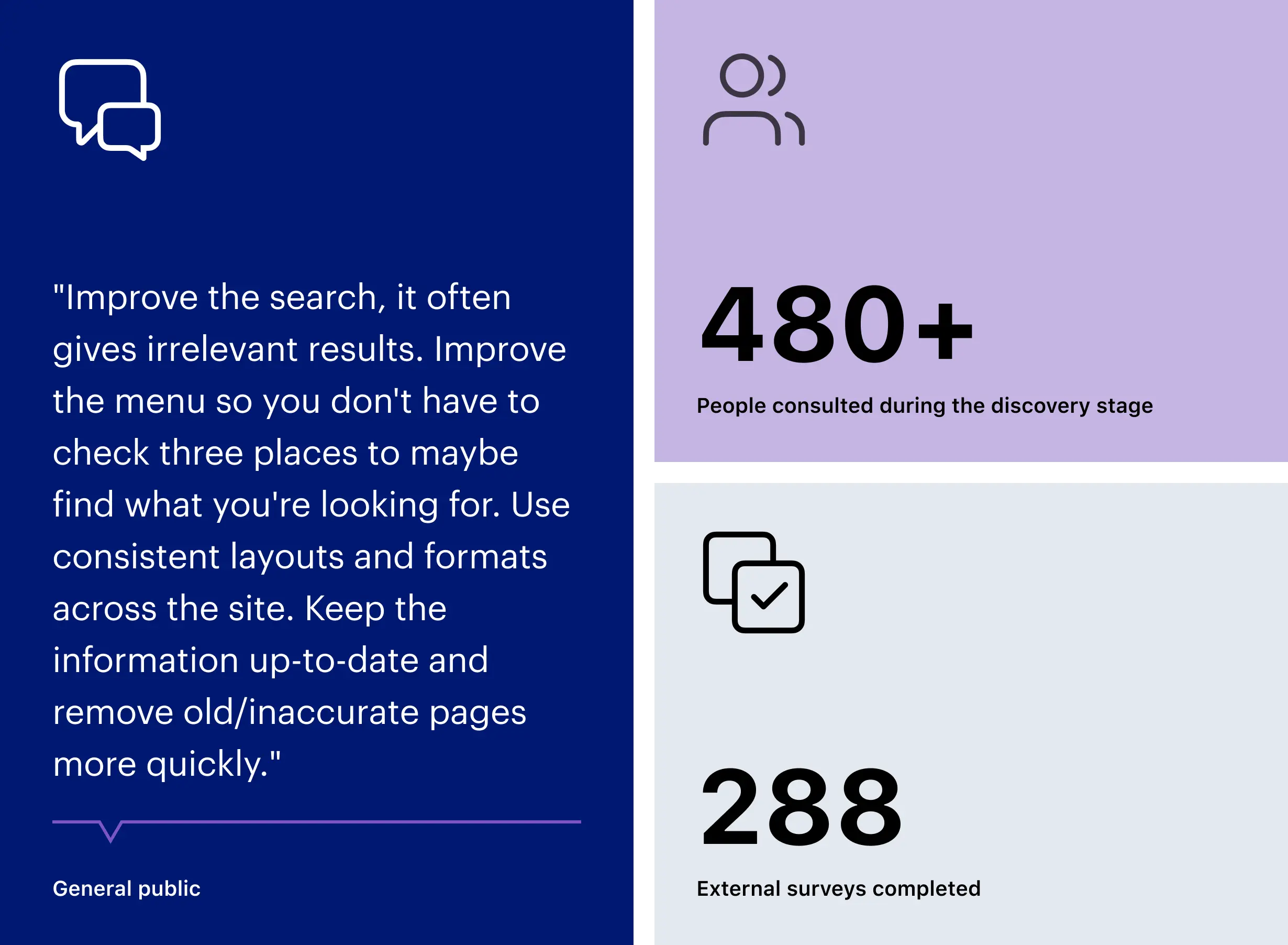
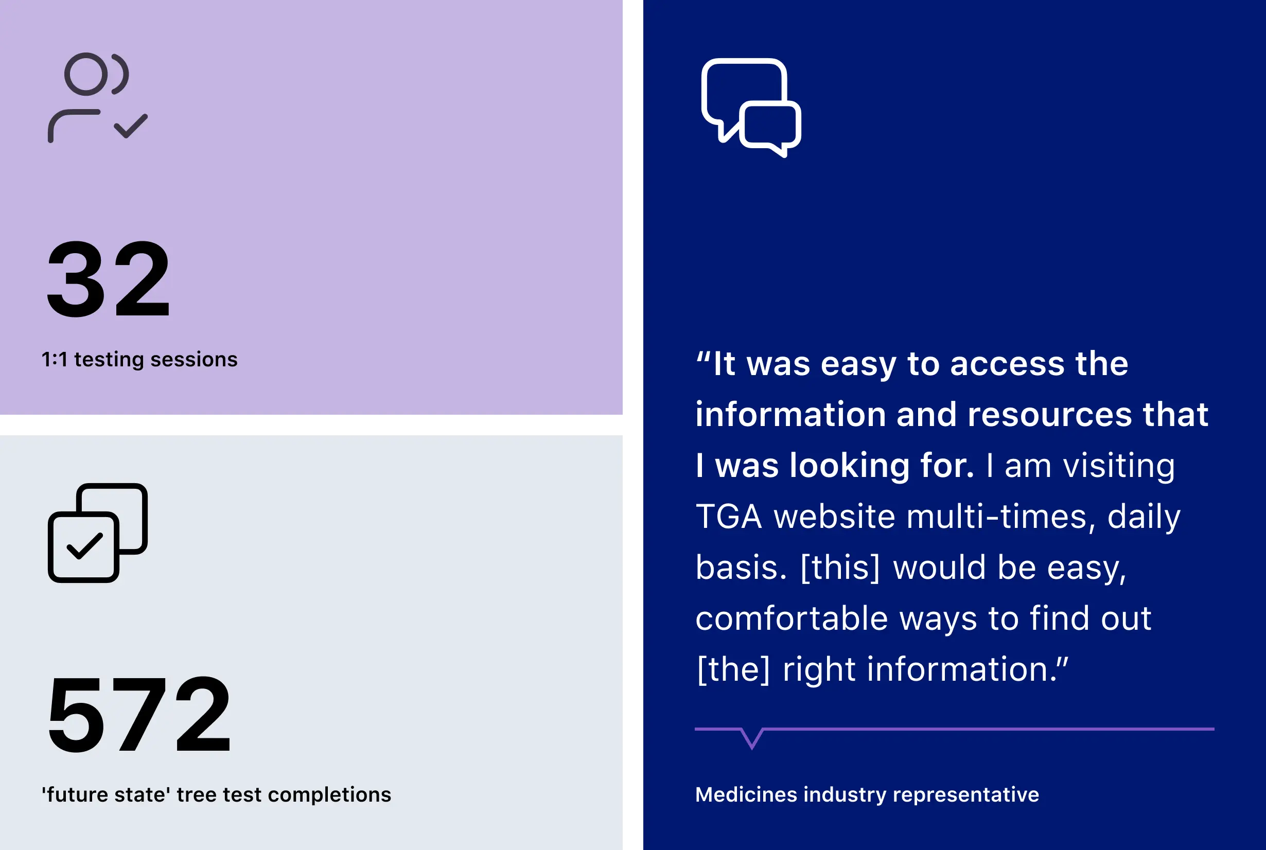
  • Industry users, who may visit the site upward of 20 times a day, were frustrated by unclear navigation.
  • Consumers, who may only visit the site when they have a problem or concern, were turning to TGA for guidance but finding it hard to get through the regulatory related content.
  • Staff were working hard to fill perceived gaps, which often resulted in overlapping or unclear content.

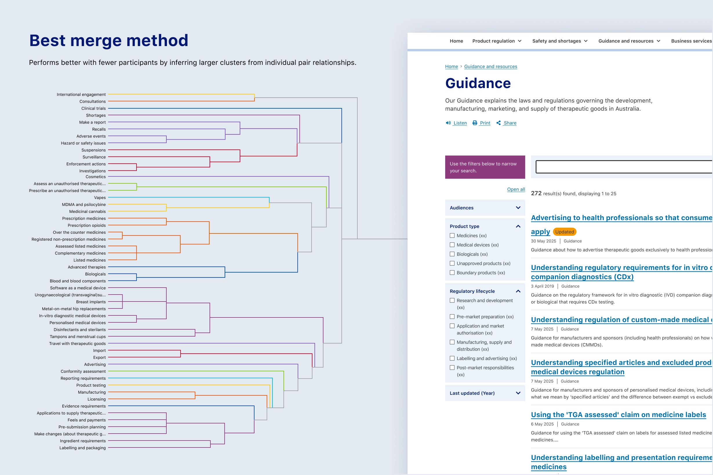
These challenges all came down to the structure of the information. The task was to reorganise information on the website so people could find, understand and act on what mattered to them.

What we did

We started by listening. Through surveys, consultations and a tree test of the existing website, we learned how people found themselves ‘going in circles’ and ‘stuck down rabbit holes’.

With this evidence, we created new organising principles, tested them with real users, and shaped a future state IA and site experience.

At the heart of the new experience was a mega menu to make key pathways more visible and help users discover co-located content. We also designed page templates to better collate compliance-critical content into newly defined categories, tested and refined through 1:1 sessions with users.

This created a structure the TGA could deliver iteratively. Rather than aiming for a single ‘big bang’ launch, changes were implemented step-by-step, delivering value to their users sooner.

The outcomes
Clear categories that match real-world needs.

Information is now categorised in more useful ways - through new taxonomies, labels and system generated on-page lists.

For industry, the categories mirror how regulation considers different product types and the steps sponsors take to bring products to market. For consumers, the categories reflect what matters most, from travelling with prescription medicines to understanding how to buy vapes legally.

These clearer categories informed the site’s navigation, page layouts and search, making it easier for everyone to find what they need and improving the relevance of search results.

Clearer pathways for critical tasks.

In the previous structure, making a report to the TGA was one of the most challenging tasks for users to complete. Information about reporting was spread throughout the site, so we brought it together in a single section, under a clear label.

Using the old navigation structures only 7% of health professionals succeeded when asked to report an adverse event. In the future state, 97% found the right pathway. Better organisation of information has made critical tasks much easier.

Tools for long-term improvement.

The new IA doesn’t just benefit users today. The new categorisation has surfaced overlapping or duplicate content, giving TGA staff visibility of issues that had been hidden in unclear navigation.

With a detailed IA spreadsheet, taxonomy and writing guidance, and annotated page templates, TGA teams are now equipped to refine and maintain the site into the future.